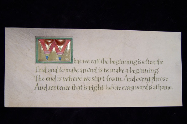
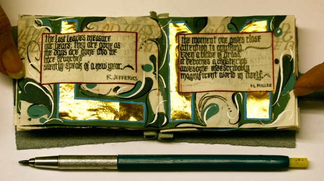
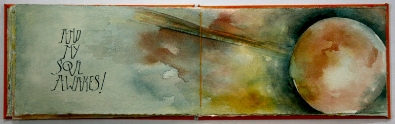
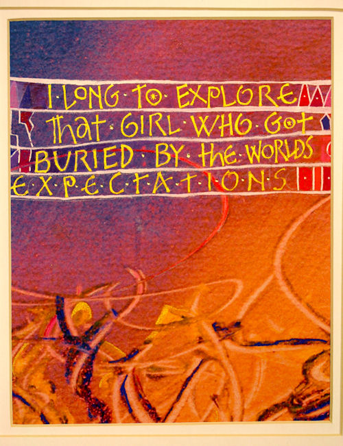
Welcome to Pic of the Week 1, 2010. This work was done in 2009 by
Kim Dixon in Kalamazoo from the first month's class of the Course, "
Modernizing a Traditional Calligraphic Hand ". Here is her own
description of it.
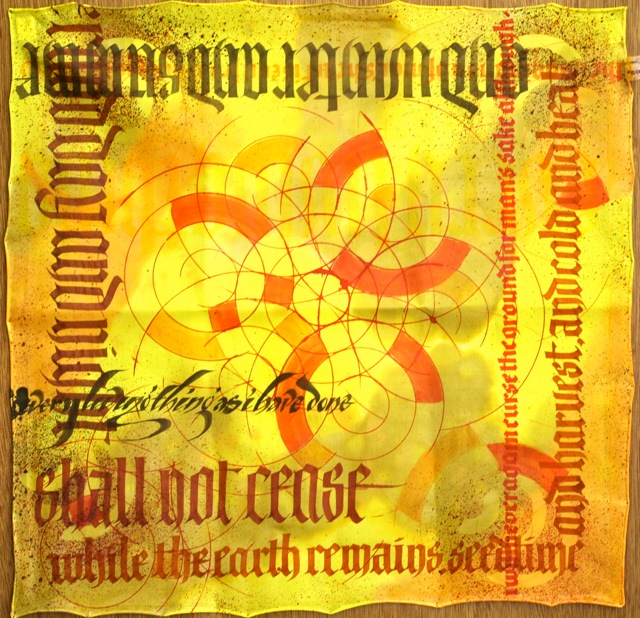
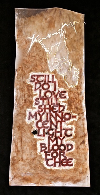
Specs on the the prayer flag. The words are from Genesis 8:
21-22. The DNA helix representing man's lineage continuing after
the flood. The surface is a 22" x 22" china silk scarf. I
Stretched the white silk blank over stretcher bars just like a
cotton canvas. First layer was diluted alcohol based dyes.
Allowing them to free flow on the canvas. Let that dry. Next
layer down is Jacquard No Flow. No Flow makes the surface react
much like working on watercolor paper. Let that dry. The letters
are done with Dynasty Black Gold Flat Wash and Long Handle
Bright brushes. These brushes are worth a gander. Synthetic,
keep their shape, nice bounce. When doing the letters, I used
the same dyes but at full strength. The helix was done with a
compass with a ruling pen attachment. I put foam core behind the
silk so the point had something steady to poke into. I worked
the helix out on paper first. Then the paper helix became a
stencil for spattering with a toothbrush around the edges. After
the artwork was finished it had to be steamed to set the dye.
That means it goes into a steamer built specifically for the
purpose of steaming material for 2-3 hours. It was rinsed to let
out residual dye and ironed. Between Karen and I, we had 4 of
these prayer flags. We, or I should say Karen, stitched them on
to a ribbon so they can hang like flags.
#1
#1
* *
If you enjoyed seeing this or any of the other Pic of the Week
mailings please check out many more works in the slide shows
section
from the PRIMITIVE TO MODERN Course at my website www.reggieezell.com
Reservations are now being taken for 2011 in different
cities,. Thank you, Reggie Ezell
Here comes Pic of the Week 2, 2010. This was done by Sally Theus in 2008 in San Antonio. This is from the sixth month's class of the Course , "Experiencing the book as a New Structure". The book closed is about 12" x 18": open, about 12" x 30". Some of the materials are transparencies, color ink jet and photocopies, silver mylar, acrylics, mat board, and more. A link to more of Sally's work is http://gallery.me.sallytheus#100250
All of the Pic of the Week mailings are now archived and available on the main page of my website. The images are larger and jump off the background :many thanks to my webmaster, Frank Rippel..
Another example of "The Book as a New Structure" is a book I've been working on for three years: EVEREST. A video of it is located on the main page of my website.
If you enjoyed seeing this or any of the other Pic of the Week mailings please check out many more works in the slide shows section
from the PRIMITIVE TO MODERN Course at my website www.reggieezell.com
I'd be delighted to hear any response. Reservations are now being taken for classes in 2011 in different cities. Thank you, Reggie Ezell
#2
* * *
Welcome to Pic of the Week 3, 2010. This work was done
by Bonnie Houser in San Antonio in 2008. It is from the
fifth month's class of the Course, "Design". It is
collage using various papers including stained glass
images manipulated in a computer; metal nibs, and ink:
about 15" x 11".
If you enjoyed seeing this or any of the other
Pic of the Week mailings please check out many more
works in the slide shows section
from the PRIMITIVE TO MODERN Course at my website
www.reggieezell.com
I'd be delighted to hear any response.
Reservations are now being taken for classes in
2011 in Chicago and other cities.
Thank you, Reggie Ezell
#3
Thank you, Reggie Ezell
#3
* * * *
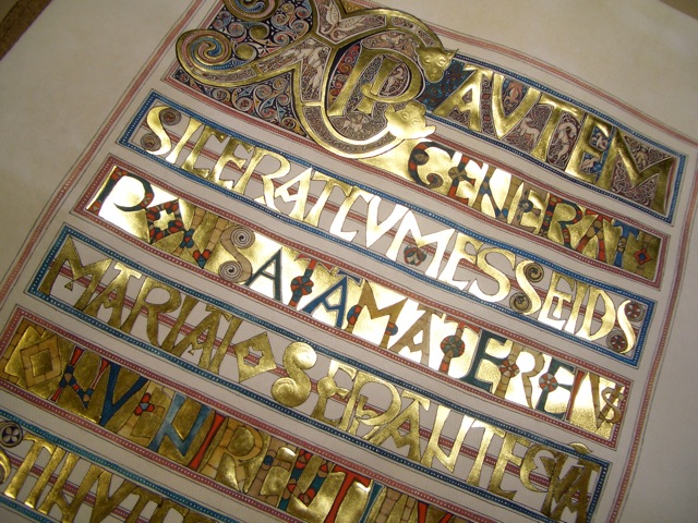
This Pic of the Week is one of the most spectacular works anyone has ever done in any of my classes in thirty years. It was done by Louona Tanner in Salt Lake City in 2007. I'm cheating a little here because it was done in my traditional Year Long Course," 26 Seeds, a Year to Grow". However, in that section of the year I was able to integrate my new "module" on lettering and illumination on vellum that is a central part of PRIMITIVE TO MODERN. Louona is an artist of daunting skill and determination and responded to a challenge.
One of the most beautiful illuminated pages in manuscript books in history is from the Codex Aureus (Golden Book), so called in part because of this singular magnificent golden page. Louona spent months recreating it on vellum. A collective gasp swept the room when the light scintillated across the page and dazzled us, reminding us all what the original work would have looked like over twelve hundred years ago. These designs and materials represent an aspect of the "primitive" lineage of calligraphy that still evokes awe and wonder in us; an aspect we can learn and integrate into our modern visual vernacular.
I usually try to keep the text pretty short on these mailings but in this case the background information helps you appreciate what you are seeing a little more. Materials: gold leaf, acrylics, watercolors, vellum, brushes (some only 3 or 4 hairs). Size: 12"w x 13.5" h
Thank you for your continued input on "Pics". Contact me directly at this email address or 773-202-8321. Reservations are now being taken for the Course in various cities for 2011. Thanks, Reggie
#4
* * * * *
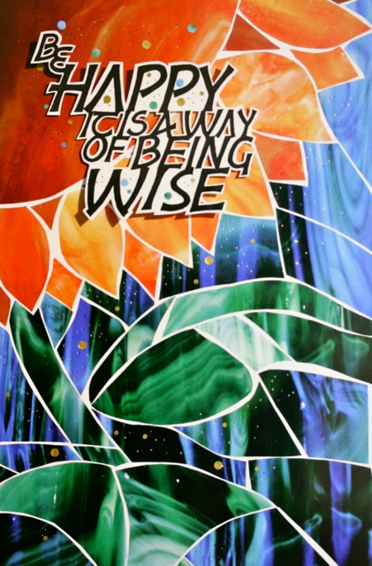
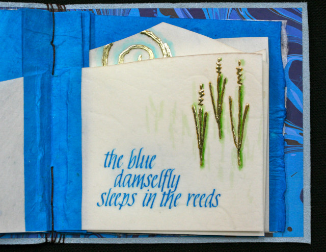
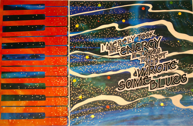
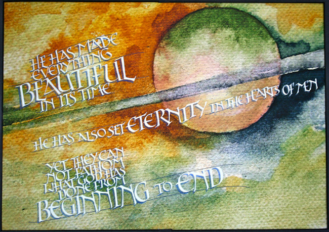
Pic of the Week 5. PRIMITIVE TO MODERN: traditional to
contemporary. That is the contrast ( of about 1300
years! ) between last week's work and this week's.
Thanks to so many of you for all your glowing comments
on Louona's work. This week's Pic is by Kim Dixon from
Kalamazoo in 2009. It is from the fifth month's class,"
Design: Deconstructing the Grid". The final stage of
work here is a piece meant for reproduction. The letters
are on a single piece of paper; metal nibs and ink,
mounted to the background artwork. This is a collage,
most of the papers are digital images of stained glass
manipulated in the computer. It is 11" x 15".
If you enjoyed seeing this or
any of the other Pic of the Week mailings please
check out many more works in the "Slide Shows"
section from the PRIMITIVE TO MODERN Course at my
website www.reggieezell.com
All Pic of the Week images are archived on the
web site. All comments are welcome. Reservations
are now being taken for 2011 in Chicago and
various cities. Thank you, Reggie Ezell
#5
* * * * * *
#5
* * * * * *
Pic of the Week again. This work was done
by Chris Orsolini in Kalamazoo in 2009. It
was done in the fourth month's class
"Primitive to Modern". It is a sculpted
gilding base with 23 kt. gold leaf,
acrylics, watercolors, inks, metal nibs on
watercolor paper about 9" x 12".
Take a peek at the
home page on my web site www.reggieezell.com and
get a larger look at this "Pic" and all
previous ones that we have archived. Lots of
information about the Course PRIMITIVE TO
MODERN is easily accessible from the home
page including dates for 2011. Reservations
are now being taken in various cities
including Chicago. Please keep the comments
coming. Thanks, Reggie
#6
* * * * * * *
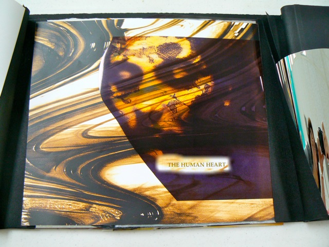
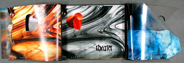
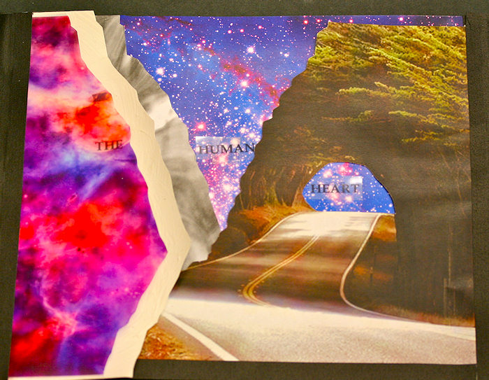
This Pic of the Week was done by LaVerne Parfait in 2007 in Memphis. It was done in the 6th (last) month's session, "Experiencing the Book as a New Structure". This is the cover of her book as seen being worked on in class. All students were assigned the same quote to work with: "The human heart is a theater of longing." The full size is 12" x 18". It is collage using a variety of papers some of which are digital images of stained glass manipulated in the computer.
If you enjoyed seeing this or any of the other Pic of the Week mailings please check out many more works in the "Slide Shows" section from the PRIMITIVE TO MODERN Course at my website www.reggieezell.com
We are sending this mailing out in a slightly different way so as to protect privacy. Hopefully yours will be the only name appearing in the "To" box. All Pic of the Week images are archived on the web site. All comments are welcome. Reservations are now being taken for 2011 in Chicago and various cities. Thank you, Reggie Ezell
#7
* * * * * * * *
Hi Everybody,
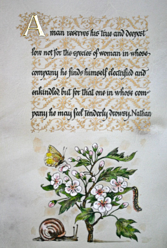
Welcome to Pic of the Week 8, 2010. It was done by Ann Rabinovitz in Memphis in 2007 in the third month's class of the course " Illumination on Vellum". It is about 5" x 8": watercolors, ink, acrylic, and gold leaf on calfskin vellum.
If you enjoyed seeing this or any of the other Pic of the Week mailings please check out many more works in the slide shows section from the PRIMITIVE TO MODERN Course at my website and share them with others.
I'd be delighted to hear any response. Reservations are now being taken for classes in 2011 in Chicago and other cities. Thank you, Reggie Ezell
#8
* * * * * * * * *
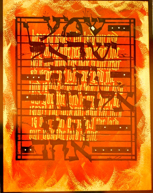
Pic of the Week #9 was done by Leslie Winakur in San Antonio in 2008 in the first month's class "Modernizing a Traditional Calligraphic Hand". The following is Leslie's own description of her process behind the making of this work.
The piece was a commission for a lady who loves red and black. The I painted a piece of 140# cold press paper with acrylic paint in red and gold. I then wrote the English words, "Hear, O Israel, the Lord our God, the Lord is one." I wrote them over and over and over again as a background, in gold gouache, with a modernized, compressed textura sort of hand that was in our handout. I liked that as a background for the Hebrew, because it slants to the right, and I knew the Hebrew would slant a bit to the left, since it's written right to left. I also wanted it as a background because it's a good contrast to the very blocky Hebrew letters.. I then wrote the Hebrew on top of that in black gouache. At first I tried it with a traditional nib and I didn't like the look of it. So I used a cola pen instead and made it very edgy. I did this piece during a time when the international news was especially bad, and lots of people were claiming to be fighting in the name of God. Although I had originally felt that red and black were inappropriate colors for a prayer that is the most basic statement of monotheism, at this point in time the colors seemed just right. What was going through my head as I wrote it was, "What next? How much more can this world take?"
One more thing that I forgot: After I finished the lettering in gouache with the cola pen, I added the broad lines with a large brad edged nib and a ruler, and then the final touch was some gilding here and there. I worked it out so that there were 18 marks7 bands that had gold dots, because 7 is an important number (days of the week, etc.) and then 18 gold dots total (because the numerical value of the Hebrew word for life is 18).
If you enjoyed seeing this or any of the other Pic of the Week mailings please check out many more works in the slide shows section from the PRIMITIVE TO MODERN Course at my website and share them with others. I'd be delighted to hear any response. Reservations are now being taken for classes in 2011 in Chicago and other cities. Thank you, Reggie Ezell
#9
* * * * * * * * * *
"Experiencing the Book as a New Structure" a film by Kim Dixon
In November of 2009 the hearty members of the Kalamazoo class met in the snow covered backwoods of Michigan for the last session of the new Year Long Course: PRIMITIVE TO MODERN. The topic: Experiencing the Book as a New Structure. In February of 2010, even more snow covered, they reconvened (had a party) and shared the work they had done on their books. Kim Dixon, calligrapher and silk artist extraordinaire, graciously photographed everyones artwork and even made a ten minute movie. My elation and gratitude go out to these generous artists for sharing their beautiful works.
Participants: Marijo Carney, Kay Davis, Chris Orsolini, Susan Kavanaugh, Judy Bruzza, Pam Nash, Jane Ewing, Linda Bravada, Tina Lee Cronkhite, Ann Marks, Kim
#10
CLICK HERE TO CONTINUE TO THE MOVIE
this is a large file and may take a minute or two.
#6
* * * * * * *
This Pic of the Week was done by LaVerne Parfait in 2007 in Memphis. It was done in the 6th (last) month's session, "Experiencing the Book as a New Structure". This is the cover of her book as seen being worked on in class. All students were assigned the same quote to work with: "The human heart is a theater of longing." The full size is 12" x 18". It is collage using a variety of papers some of which are digital images of stained glass manipulated in the computer.
If you enjoyed seeing this or any of the other Pic of the Week mailings please check out many more works in the "Slide Shows" section from the PRIMITIVE TO MODERN Course at my website www.reggieezell.com
We are sending this mailing out in a slightly different way so as to protect privacy. Hopefully yours will be the only name appearing in the "To" box. All Pic of the Week images are archived on the web site. All comments are welcome. Reservations are now being taken for 2011 in Chicago and various cities. Thank you, Reggie Ezell
#7
* * * * * * * *
Hi Everybody,
Welcome to Pic of the Week 8, 2010. It was done by Ann Rabinovitz in Memphis in 2007 in the third month's class of the course " Illumination on Vellum". It is about 5" x 8": watercolors, ink, acrylic, and gold leaf on calfskin vellum.
If you enjoyed seeing this or any of the other Pic of the Week mailings please check out many more works in the slide shows section from the PRIMITIVE TO MODERN Course at my website and share them with others.
I'd be delighted to hear any response. Reservations are now being taken for classes in 2011 in Chicago and other cities. Thank you, Reggie Ezell
#8
* * * * * * * * *
Pic of the Week #9 was done by Leslie Winakur in San Antonio in 2008 in the first month's class "Modernizing a Traditional Calligraphic Hand". The following is Leslie's own description of her process behind the making of this work.
The piece was a commission for a lady who loves red and black. The I painted a piece of 140# cold press paper with acrylic paint in red and gold. I then wrote the English words, "Hear, O Israel, the Lord our God, the Lord is one." I wrote them over and over and over again as a background, in gold gouache, with a modernized, compressed textura sort of hand that was in our handout. I liked that as a background for the Hebrew, because it slants to the right, and I knew the Hebrew would slant a bit to the left, since it's written right to left. I also wanted it as a background because it's a good contrast to the very blocky Hebrew letters.. I then wrote the Hebrew on top of that in black gouache. At first I tried it with a traditional nib and I didn't like the look of it. So I used a cola pen instead and made it very edgy. I did this piece during a time when the international news was especially bad, and lots of people were claiming to be fighting in the name of God. Although I had originally felt that red and black were inappropriate colors for a prayer that is the most basic statement of monotheism, at this point in time the colors seemed just right. What was going through my head as I wrote it was, "What next? How much more can this world take?"
One more thing that I forgot: After I finished the lettering in gouache with the cola pen, I added the broad lines with a large brad edged nib and a ruler, and then the final touch was some gilding here and there. I worked it out so that there were 18 marks7 bands that had gold dots, because 7 is an important number (days of the week, etc.) and then 18 gold dots total (because the numerical value of the Hebrew word for life is 18).
If you enjoyed seeing this or any of the other Pic of the Week mailings please check out many more works in the slide shows section from the PRIMITIVE TO MODERN Course at my website and share them with others. I'd be delighted to hear any response. Reservations are now being taken for classes in 2011 in Chicago and other cities. Thank you, Reggie Ezell
#9
* * * * * * * * * *
"Experiencing the Book as a New Structure" a film by Kim Dixon
In November of 2009 the hearty members of the Kalamazoo class met in the snow covered backwoods of Michigan for the last session of the new Year Long Course: PRIMITIVE TO MODERN. The topic: Experiencing the Book as a New Structure. In February of 2010, even more snow covered, they reconvened (had a party) and shared the work they had done on their books. Kim Dixon, calligrapher and silk artist extraordinaire, graciously photographed everyones artwork and even made a ten minute movie. My elation and gratitude go out to these generous artists for sharing their beautiful works.
Participants: Marijo Carney, Kay Davis, Chris Orsolini, Susan Kavanaugh, Judy Bruzza, Pam Nash, Jane Ewing, Linda Bravada, Tina Lee Cronkhite, Ann Marks, Kim
#10
CLICK HERE TO CONTINUE TO THE MOVIE
this is a large file and may take a minute or two.
CLICK HERE FOR A SMALLER VERSION AND FASTER DOWNLOAD
* * * * * * * * * * *
Yep, you guessed it: Pic of the Week. This one was done by Mary Zabrin in Chicago in 2009. Inspired by Adolf Bernd, it was done in the fifth month's class "Design".
It is collage utilizing a variety of papers including photos of stained glass manipulated in the computer: about 11" x 15'. Please give yourself a treat and look at the slide shows at www.reggieezell.com and share them with others.
The answers to most of your questions regarding PRIMITIVE TO MODERN can be found through the main page at the web site. Reservations are now being taken for next years classes in Chicago and other cities. You can also contact me directly at contactreggiereggie@comcast.net or 773-202-8321 . Thanks, Reggie
#11
* * * * * * * * * * * *
Here it is, Pic of the Week. This book was done by Pam Nash in Kalamazoo in 2009 in the sixth (last) month's class "Experiencing the Book as a New Structure". As shown, open, the book is approximately 12" x 30". Some of the materials are color and black and clear transparencies, ink jet prints, a variety of acrylic mediums, boards, gaffers tape, aluminum posts, and other materials. If you enjoyed seeing this or any of the other Pic of the Week mailings please check out many more works in the slide shows section from the PRIMITIVE TO MODERN Course at my website and share them with others.
I'd be delighted to hear any response. Reservations are now being taken for classes in 2011 in Chicago and other cities. Thank you, Reggie Ezell - www.reggieezell.com
#12
* * * * * * * * * * * * *
This Pic of the Week was done by Roann Mathias in 2007 in Memphis. This manuscript book is done entirely on calfskin vellum using gold leaf, acrylic, and watercolors: about 5" x 10". It was homework from the second month's session, "Writing on Vellum"
The answers to most of your questions regarding PRIMITIVE TO MODERN can be found through the main page at the web site.www.reggieezell.com Reservations are now being taken for next years classes in Chicago and other cities.You can also contact me directly at contactreggiereggie@comcast.net or 773-202-8321 . Thanks, Reggie
#13
* * * * * * * * * * * * * *
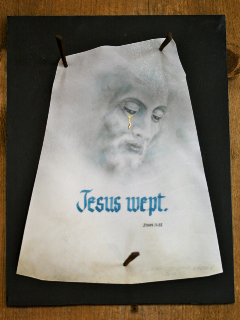
Please suffer my excessive pride in offering this up, my own work, as Pic of the Week. This weekend when I was away teaching the second month's class "Writing on Vellum" in the PRIMITIVE TO MODERN Course, the winner of the Newberry Library Purchase Prize at the Chicago Calligraphy Collective Exhibit was announced. It was my work. My artist's statement and other information follows. The EXPLORATION exhibit will be up at the Newberry Library, 60 W. Walton, Chicago, IL. until May 28.
Title Still: Falls the Rain by Edith Sitwell
Media and Tools: 24 kt. gold leaf, acrylic, and watercolor on calfskin vellum, 10" x 20"
Artist Statement:
This short excerpt is from a poem that was written in 1940 during the air raids on Great Britain. Over the last thirty years I have done it in many media and formats. It continues to have meaning for me. Often the image, the silhouette of Christ, goes misconstrued unless the light is right and the observer takes the time to see that it is there. The letters and flesh are stained. The vellum is pitted with imperfections. Stained, flawed, golden. I hope these suggest the redemptive possibility embodied in the spirit of the poetry. Reggie Ezell
The answers to most of your questions regarding PRIMITIVE TO MODERN can be found through the main page at the web site.
www.reggieezell.com Reservations are now being taken for next years classes in Chicago and other cities.
You can also contact me directly at contact contactreggie@comcast.net or 773-202-8321 . Thanks, Reggie
#14
* * * * * * * * * * * * * *
Pic of the Week again. This one was done just this year by Maria-Helena Hoksch in New Orleans in the first month's class "Modernizing a Traditional Calligraphic Hand". It is done on papyrus with sumi ink, gouache, and metal nibs; about 6" x 8".
The answers to most of your questions regarding PRIMITIVE TO MODERN can be found through the main page at the web site.
www.reggieezell.com Reservations are now being taken for next years classes in Chicago and other cities. You can also contact me directly at contactreggiereggie@comcast.net or 773-202-8321 . Thanks, Reggie
#15
* * * * * * * * * * * * *
This Pic of the Week was done by Jane Doherty in 2009 in Chicago. Click on: http://www.reggieezell.com/thepick/ It was done in the fifth month's session "Design".
This is collage using papers digitally generated, metal nibs, and sumi ink: 11" x 15".
The answers to most of your questions regarding PRIMITIVE TO MODERN can be found through the main page at the web site.
www.reggieezell.com Reservations are now being taken for next years classes in Chicago and other cities. You can also contact me directly at contactreggiereggie@comcast.net or 773-202-8321 .
Thanks, Reggie
#16
* * * * * * * * * * * * * * * *
This work was done in 2009 in Chicago in the third month's class "Illumination on Vellum" by Lynann Babuk. Below is her own description of her work. Click on www.reggieezell.com/thepick
The answers to most of your questions regarding PRIMITIVE TO MODERN can be found through the main page at the web site.www.reggieezell.com Reservations are now being taken for next years classes in Chicago and other cities. You can also contact me directly at contactreggiereggie@comcast.net or 773-202-8321 . Thanks, Reggie
#17
Wisdom A to Z
This book was developed to pass along a study of wisdoms for the next reader to ponder. As well, this was a study in the repetitive process of book making. Having a page with corresponding text of wisdom to go with each of the letters of the alphabet was a daunting task.
Each of the 26 pages can stand on it own behalf; however, created is a rhythm that is accomplished within the totality of the book. Each of the different wisdom statements were chosen, not only for what they say; but also for how they make us think, ponder and explore.
Multiple layers of writing were applied to these small pages. The first layer was from the Holy Bible John 1:1 “In the beginning was the Word, and the Word was with God and the Word was God.” The second layer was the capital letter in 24k gold leaf. A window was then carved out to hold the wisdom for each letter. Tying it all together is an organic leaf and swirl design continuing from the beginning to the end of the book.
Vellum pages formed the 7 signatures’ that made this book. Sumi ink was used for the lettering while 24k gold leaf was on the capital letters; gouache was used for all other design elements. Text was written by 26 different authors’, noted at each location.
The image page size is 2.75”w by 2.25”h, with a leather cover and a self closing strip.
LynnAnn Babuk
Oak Park, Illinois
* * * * * * * * * * * * * * * *
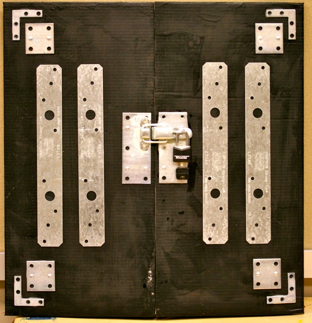
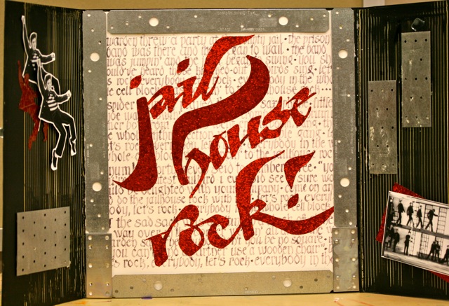
This work was done for by Judy Bilbrey in Birmingham in 2010 from the first month's class "Modernizing a Traditional Calligraphic Hand". The description of her work is as follows.Click on http://www.reggieezell.com/thepick/
This "eclectic" piece was done for homework the first week of the P2M class. The assignment was to use a very traditional form of Black Letter, and then, to offset it with a more whimsical variation. So, this is my "Tribute to Elvis....and Reggie"!
It was done on a tri-fold cardboard piece 15X15 1/2 with the doors "locked", and 30 X 15 1/2 "open". I used regular house paint--flat black --to cover the cardboard and "selected" metal pieces from the aisles at Lowe's. The words of the song are written on Arches text wove in a variation of Fractur with dirty wash/tinted water using a Speedball C-2 nib. The red letters were hand sketched in the "Elvis" hand, created by Reggie, on adhesive-backed glitter scrapbook paper and cut using a combination of computer programs designed for the Cricut cutting machine. The inside doors were combed to make "bars" and the pictures were from the movie "Jailhouse Rock". Thank yuh, thank yuh vera much!
The answers to most of your questions regarding PRIMITIVE TO MODERN can be found through the main page at the web www.reggieezell.com Reservations are now being taken for next years classes in Chicago and other cities. You can also contact me directly at contactreggiereggie@comcast.net or 773-202-8321 . There are now two slots left for cities for 2011. Thanks, Reggie
#18
*********************
Yep, you guessed it: Pic of the Week. Click on: http://www.reggieezell.com/thepick/ This one was done by Kay Davis in Kalamazoo in 2009. It was done in the fifth month's class "Design". It is collage utilizing a variety of papers including photos of stained glass manipulated in the computer: about 11" x 15'. Please give yourself a treat and look at the slide shows at www.reggieezell.com and share them with others.
The answers to most of your questions regarding PRIMITIVE TO MODERN can be found through the main page at the web site. Reservations are now being taken for next years classes in Chicago and other cities. You can also contact me directly at contactreggiereggie@comcast.net or 773-202-8321 . Thanks, Reggie
#19
* * * * * * * * * * * * * * * * * * * *
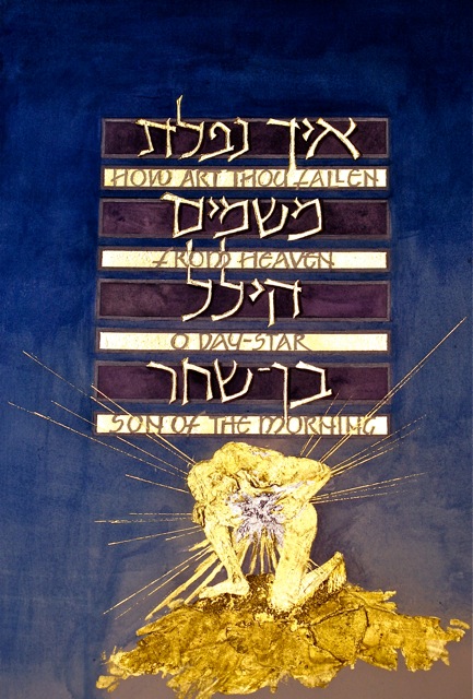
This work was done by Corinna Taylor in Chicago in 2009 in the fourth month's class "Primitive to Modern".
Click on: http://www.reggieezell.com/thepick/ Corinna's own words: The title is "Isaiah 14:12". It's about 12w x 18h. The medium is water colors, including Daniel Smith's Primatek Genuine Amathyst. The gilding is 23k leaf on Instacoll and various textured modeling pastes and gessoes for the figure. The star the figure is holding is palladium leaf. I sneaked a little sepia wash (Pelikan waterproof drawing ink) over the gold to emphasize the textures.
The answers to most of your questions regarding PRIMITIVE TO MODERN can be found through the main page at the web www.reggieezell.com Reservations are now being taken for next years classes in Chicago and other cities. You can also contact me directly at contactreggiereggie@comcast.net or 773-202-8321 . There are now two slots left for cities for 2011. Thanks, Reggie
#20
* * * * * * * * * * * * * * * * * * * * *
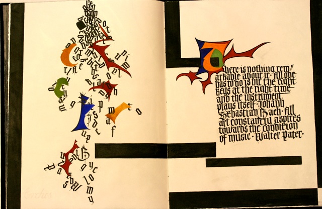
This Pic of the Week was done by Maggie Gillikin in the first month's class "Modernizing a Traditional Calligraphic Hand" in 2008 in San Antonio.
It is 12" tall by about 17" wide (a folio made from a quarter sheet of Schiller, folded in half).
The inspiration for this spread was Rudolph Koch. The theme of the entire book is chaos to order. Therefore all the pieces tumbling on the verso side represent the chaos of the puzzle pieces that lead to the order of the lettering on the recto side. All of the pieces on the recto side are somewhere on the verso side. It was done in gouache and sumi ink on Hahnemuhle Schiller paper. That particular page has quotes about music, and when the notes are just tumbled out as on the verso, it makes noise. When the various components line up, they create a musical line.
Click on http://www.reggieezell.com/thepick/
The answers to most of your questions regarding PRIMITIVE TO MODERN can be found through the main page at the web www.reggieezell.com Reservations are now being taken for next years classes in Chicago and other cities. You can also contact me directly at contactreggiereggie@comcast.net or 773-202-8321 . There are now two slots left for cities for 2011. Thanks, Reggie
#21
********************
This is the sculptured, multilayered cover of a book replete with "windows", opening in multiple directions. It is by Sally Theus from San Antonio, done in the last month's class, "Experiencing the Book as a New Structure", in 2008. http://www.reggieezell.com/thepick/
The book closed is about 12" x 18": open, about 12" x 30". Some of the materials are transparencies inside the book are color ink jet and photocopies, silver mylar, acrylics, mat board, and more. A link to more of Sally's work ishttp://gallery.me.sallytheus#100250 All of the Pic of the Week mailings are now archived and available on the main page of my website. The images are larger and jump off the background...
Another example of "The Book as a New Structure" is a book I've been working on for three years: EVEREST. A video of it is located on the main page of my website.
If you enjoyed seeing this or any of the other Pic of the Week mailings please check out many more works in the slide shows section
from the PRIMITIVE TO MODERN Course at my website www.reggieezell.com
I'd be delighted to hear any response. Reservations are now being taken for classes in 2011 in Chicago and other cities. Thank you, Reggie Ezell
#22
*******************
This work by Carmel Cucinotto Harmon was done this year in New Orleans in the third month's class "Illumination on Vellum". It is about 8 1/2" x 11" using soft pastels applied with a small brush, gold leaf, acrylic, and gouache all on calfskin vellum.
Click on http://www.reggieezell.com/thepick/ The answers to most of your questions regarding PRIMITIVE TO MODERN can be found through the main page at the web www.reggieezell.com Reservations are now being taken for next years classes in Chicago and other cities. You can also contact me directly at contactreggiereggie@comcast.net or 773-202-8321 . There are now two slots left for cities for 2011. Thanks, Reggie
#23
*******************
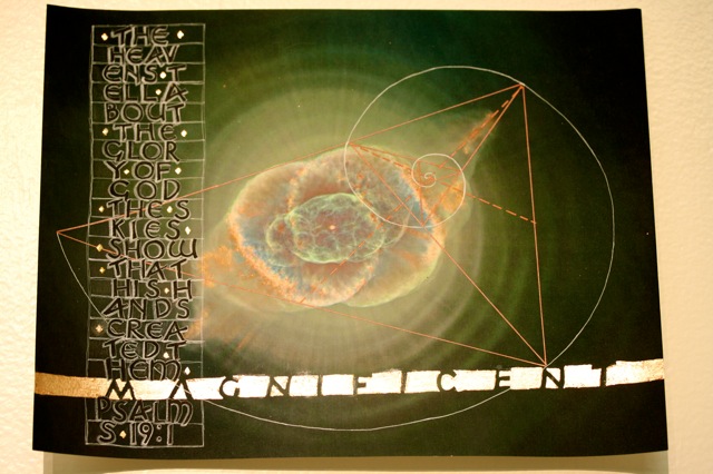
This work was done by Pam Nash in Kalamazoo in 2009 in the third month's class "Illumination on Vellum". Click on http://www.reggieezell.com/thepick/
The piece itself is 8 1/2 x 11" on matte photo paper (because I like the intensity of the colors better), spray fixed very well. I am in the process of redoing it to shrink it just a little so it fits a 8 x 10" matt opening so I just relocated all the stuff I used. I found the fibonachi spiral on Wickipedia and the photo is of the Cat's Eye nebula. The white part of the spiral is done with a white uniball signo pen and the copper part with an American Crafts copper metalic marker. The black letters are done with Moon Palace and the white shadows with a Derwent Chinese White watercolor pencil. The copper leaf finally glued down best over tacky Duo Adhesive. Touch-ups here and there with Derwent Graphitint pencils.
The answers to most of your questions regarding PRIMITIVE TO MODERN can be found through the main page at the web www.reggieezell.com Reservations are now being taken for next years classes in Chicago and other cities. You can also contact me directly at contactreggiereggie@comcast.net or 773-202-8321 . There are now two slots left for cities for 2011. Thanks, Reggie
#24
******************
This piece was done by Peggy Kunkel in the third month's class "Illumination on Vellum" in 2007 in Memphis. In her own words:
This piece has a story. When Keith and I would return from visiting my Mom and Grandmother in Chicago, they would always worry about us. It was a 10 hour trip and we drove. The last thing they would say as we left - "Call and let us know that you arrived safely." If we didn't phone in what they considered a timely fashion, the phone would be ringing when we walked in the door. No matter how many times we told them not to worry and that no news was good news, they still worried. After all isn't that what Mom's are supposed to do?
One day our local newspaper had some Latin quotations in an article and there was "No news is good news." I couldn't resist, I had to do this quotation. Unfortunately, both my Mom and Grandmother are gone but it reminds me of them. I know they would have gotten a laugh out of this piece.
This piece was done on vellum (15" x 6"). The finished design is 8 5/8" by 4 1/2". I used gouache, gold and a pigma pen. My magnifying glasses got a good workout with this piece.
Click on http://www.reggieezell.com/thepick/ The answers to most of your questions regarding PRIMITIVE TO MODERN can be found through the main page at the web www.reggieezell.com Reservations are now being taken for next years classes in Chicago and other cities. You can also contact me directly at contactreggiereggie@comcast.net or 773-202-8321 . There are now two slots left for cities for 2011. Thanks, Reggie
#25
*****************
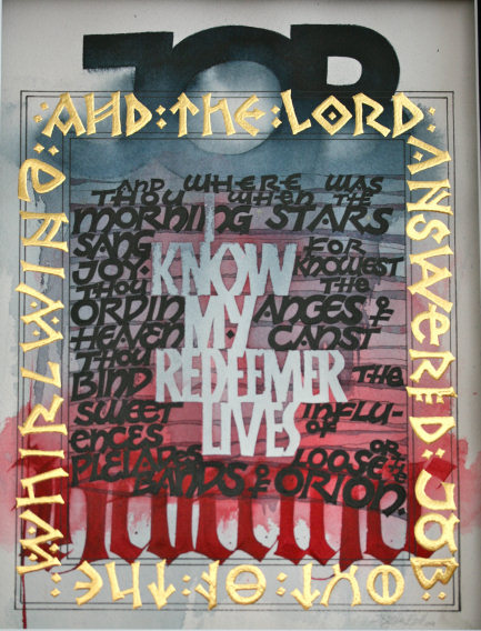
This is a new work by yours truly. I did it in preparation for the upcoming fourth class of the year, "Primitive to Modern". The text is excerpts from the Book of Job. Some of the materials are Horizon, Speedball-B, and EF 66 nibs, watercolors, frisket, spray fixative, acrylics, 24 KT gold leaf, and Arches 300 lb cold press watercolor paper. I had fun creating the alphabet that goes around the border by merging ancient runes with romans. Lots of layering and practice making mistakes on ink jet print copies.
Click on http://www.reggieezell.com/thepick/ The answers to most of your questions regarding PRIMITIVE TO MODERN can be found through the main page at the web www.reggieezell.com Reservations are now being taken for next years classes in Chicago and other cities. You can also contact me directly at contactreggiereggie@comcast.net or 773-202-8321 . There are now two slots left for cities for 2011. Thanks, Reggie
#26
*****************
This work was done for the second month's class, "Writing on Vellum". It is by Jo Miller in New Orleans this year. In her own words:
"The illustrations in this book were made using watercolor on Arches Textwove paper. The text is a playful modified Roman Cap that was written in gouache. The book is 3"x10" when opened. The wording is inspired by my morning study time."
Click on http://www.reggieezell.com/thepick/ The answers to most of your questions regarding PRIMITIVE TO MODERN can be found through the main page at the web www.reggieezell.com Reservations are now being taken for next years classes in Chicago and other cities. You can also contact me directly at contactreggiereggie@comcast.net or 773-202-8321 . There are now two slots left for cities for 2011. Thanks, Reggie
#27
*****************
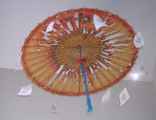
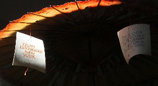
This work was done by Judy Mueller in Columbus this year in the second month's class "Writing on Vellum". Her description:
Choices Umbrella, 30 inches in diameter, 22 inches high, gouache and patent gilding on 9 vellum off cuts, monofilament fibers; shank button, ball chain, two s hooks, and a magnet for hanging. (The ball chain allows it to rotate freely in any air movement.) Written with an acrylic nib from Talas (from Yemen or Israel?) in an offset holder made from a bit of a tree branch (see photo below.) The fine filaments are orange and red, twisted into looped cords so there are no knots where they wrap around the rib ends. Some of the gilded dots were made with Instacoll and others with Golden Tar Gel. ------- In the second P2M class we saw that gilding shows best when it can move in light. After class I found a little vellum triangle abandoned under a table. I carried it home in my wallet, thinking that it could be used for something. In thinking about movement, light on gilding, and sunlight coming through a window, I recalled a Japanese umbrella in our coat closet that was perfect for letting light through, since most of the covering on it had been damaged years ago when it was closed before drying completely. The structure of the umbrella would support a text on vellum. A text was needed. I decided to tell how the umbrella arrived in our household. The story would fit on eight bits of vellum. I had fewer than that, so I added to my small collection by scraping the ink from the large piece of trial vellum with four degrees of preparation which I had been writing on in class. I tried several knives in the scraping process, two of them that worked well were woodcarving tools purchased for making the nib holders mentioned above. Since each vellum piece would rotate, a reader might see either side of any piece first, so the triangle came out of my wallet to show the end=beginning. Each text panel was written so that it did not matter which side was read first. One side is written in the oranges of the broken umbrella paper and the other side is written in the blues of the handle and the ribbon. (The colors had been mixed for a project in our 2005 year-long class and were reconstituted.) A majuscule alphabet avoided having a capital/minuscule letter correctly/incorrectly start a sentence. It does not matter which side of any text is read first. The text progresses in this fashion: Blue: circle Orange: circle Blue: a long time ago Orange: when Susan was a little girl Orange: at school 23 Blue: Mr. Dole was her favorite teacher Orange: one day near the end of the year Blue: he took the whole 3rd grade class on a field trip Orange: from Rochester New York Blue: to the science museum in Toronto Blue: everyone carried a sack lunch Orange: so that they could eat on the bus while traveling Blue: they brought pocket money Orange: for a drink Orange: when she returned at the end of the day Blue: I was surprised Blue: instead of buying a treat at the snack bar Orange: she had purchased a paper umbrella in the museum shop
#28
*****************
This work was done by Sue Kinsey in Tulsa this year for the second month's class, "Writing on Vellum". She describes it :
The book pages are approximately 3 x 3.5 inches and the book is bound with a longstitch binding. I used stick ink, watercolor and lemon gold on calfskin vellum. The four pages of text were made from one long piece of vellum offcut which was cut to leave the bottom and side edges of each page straight (?even?) and the top edge in its natural curves.
Click on http://www.reggieezell.com/thepick/ The answers to most of your questions regarding PRIMITIVE TO MODERN can be found through the main page at the web www.reggieezell.com Reservations are now being taken for next years classes in Chicago and other cities. You can also contact me directly at contactreggiereggie@comcast.net or 773-202-8321 . There are now two slots left for cities for 2011. Thanks, Reggie
#29
****************
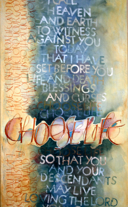
This work (a detail) was done by Jo Miller in New Orleans this year for the second month's class "Writing on Vellum". She describes it:
This piece is a recreation of an illustrated work by Suzanne Moore from the Saint John's Bible. Our homework assignment was to pick a modern master and reproduce it. Sounds easy, right?! Well, not really. Suzanne Moore's piece is very complex and layered. After studying it, I realized there were many layers. So my first task was to determine how many layers and in what order were they accomplished. My recreation was created with watercolor on canvas. The canvas was primed with absorbent ground, then several watercolor washes were applied with workable fixative in between the layers. The writing up the right side was achieved with a #4 Mitchell nib. The focal text "Choose Life" was written twice, once with a Mitchell #2 and once with a pointed pen. The largest body of text was applied with an antique set of type-setter's letters. The paint was applied to the letter and then stamped on the canvas. The process of recreating a masterpiece was a tremendous learning experience, both in layout and design and, also, in technique of application. Click on http://www.reggieezell.com/thepick/ The answers to most of your questions regarding PRIMITIVE TO MODERN can be found through the main page at the web www.reggieezell.com Reservations are now being taken for next years classes in Chicago and other cities. You can also contact me directly at contactreggiereggie@comcast.net or 773-202-8321 . There are now two slots left for cities for 2011. Thanks, Reggie
#30
***************
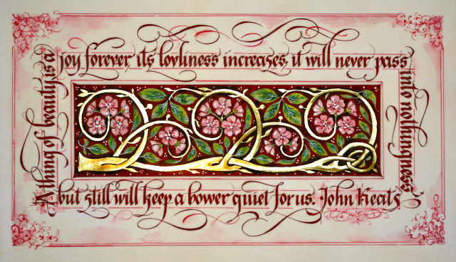
This Pic of the Week was done this Year by Maria-Helena Hoksch in New Orleans of the third month's class "Illumination on Vellum".
In her own words:
About the first piece: Gilded Rose-vine: image approx 13"x7"
I created this piece in response to a recently seen movie Bright Star about the poet John Keats. I just had to create my own "thing of beauty". I went through many drafts to make the lettering fit around four edges of the image evenly. The painting in the middle was inspired by a dull piece of black-and-white clip art in a Dover book, so I had to decide what to gild. I went for the swirling vine instead of the leaves, which was my first thought. I also decided to use colored ink instead of black. The red background was painted around the vine, leaves, and blooms, very time consuming, not recommended. As my gilding did not turn out crisp, I went around it at the very end with pointed pen and black sumi ink. I used optivisor most of the time, which I found absolutely essential to painting small and detailed image. Materials used: calfskin vellum, Cadmiun red deep gouache, various watercolors and gouaches, Mitchell 2 1/2 nib, fine brushes, pointed pen, ruling pen, gold leaf on gesso and instacol base, sumi ink mixed with ox gall liquid.
The answers to most of your questions regarding PRIMITIVE TO MODERN can be found through the main page at the web www.reggieezell.com Reservations are now being taken for next years classes in Chicago and other cities. You can also contact me directly at contactreggiereggie@comcast.net or 773-202-8321 . There are now two slots left for cities for 2011. Thanks, Reggie.
#31
*************
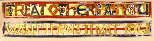
This work was done by Dana Jacobson in Birmingham this year in the third month's slass "Illumination on Vellum". She describes it:
This version of The Golden Rule on vellum measures 13" (w) X 3.25" (h). It began as an assignment to do a piece in a traditional style. The vellum I needed had not yet arrived from Pergamena, so I decided to do a practice piece in the style of the Codex Aureus that Reggie had instructed us on in class. I intended for it to be a practice piece while I waited for my vellum shipment. I used Instacol, acrylic gesso, patent and 23k gold, watercolors, a ruling pen, an EF66 Brause nib, a Micron pen, and brushes, (and a lot of hot air).
Click on http://www.reggieezell.com/thepick/ The answers to most of your questions regarding PRIMITIVE TO MODERN can be found through the main page at the web www.reggieezell.com Reservations are now being taken for next years classes in Chicago and other cities. You can also contact me directly at contactreggie@comcast.net or 773-202-8321 . There are now two slots left for cities for 2011. Thanks, Reggie
#32
*************
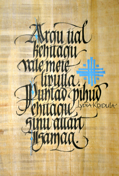
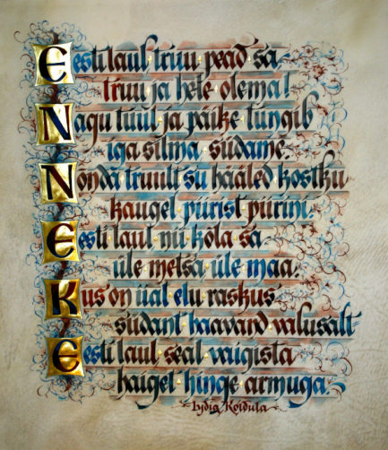
This Pic of the Week was done by Maria Helena Hoksch this year in New Orleans for the third month's class "Illumination on Vellum". She describes it:
Estonian Folk Song:
image approx 14"x15"
I've done several pieces by this famous estonian female poet of the 1800's Lydia Koidula. The text is about how folk song is flying over the forests and villages, immersing every heart and consoling pain, how it is true and bright. So I had decided to use jolly watercolors and at the same time take some remote inspiration from the Codex Aureas, prescribed homework. My variation of gothic felt fitting because of the historic background of the poem, and it's also my favorite go-to script. I used just two colors for this piece: WN Indian Red and Turquoise. I fed them to the nib with two separate brushes changing from one color to the other every few letters. All tones in between are created by the two colors getting mixed in the pen. I cleaned the pen to get true colors every now and then. I truly recommend this technique - the result is a surprise and somewhat unpredictable, like unwrapping a present. I washed and melted color with brush in between the lines, and found that vellum can be very well used as watercolor paper!
Materials used: Thick spotted vellum, gold leaf, C-1 nib, pointed pen, ruling pen, fine brushes.
Click on http://www.reggieezell.com/thepick/
The answers to most of your questions regarding PRIMITIVE TO MODERN can be found through the main page at the web www.reggieezell.com Reservations are now being taken for next years classes in Chicago and other cities. You can also contact me directly at contactreggiereggie@comcast.net or 773-202-8321 . There are now two slots left for cities for 2011.
Thanks, Reggie
#33
*********
This work was done by Mary Lou Sherman in Birmingham this year for the second month's class "Writing on Vellum". She describes it:
Howdy! What an honor! Do I become 'rich' along with the 'famous'? lol I used a piece of particle board that I found in the garage...wanted to try something besides paper to work on. Slathered it w/molding paste and then painted it w/acrylic paint. Found out that it was hard to write on...bumpy and acrylic paint does not like sumi ink, so...I wrote on Arches text wove paper and then proceeded to glue the strips of writing onto the bumpy surface w/E6000. Worked the paper into all the bumps so that it looked like part of the molding paste. Antiqued it w/a watered down acrylic wash...added some copper squares that were left over from another project, added some of my found beach glass and walla...my homework. Hope this helps you and thanks for thinking that my work is good enough to show the world. I'm truly humbled. Hugs, ml ;)
Click on http://www.reggieezell.com/thepick/ The answers to most of your questions regarding PRIMITIVE TO MODERN can be found through the main page at the web www.reggieezell.com Reservations are now being taken for next years classes in Chicago and other cities. You can also contact me directly at contactreggie@comcast.net or 773-202-8321 . There are now two slots left for cities for 2011. Thanks, Reggie
Reggie's Home Page: http://www.reggieezell.com/
#34
**********************
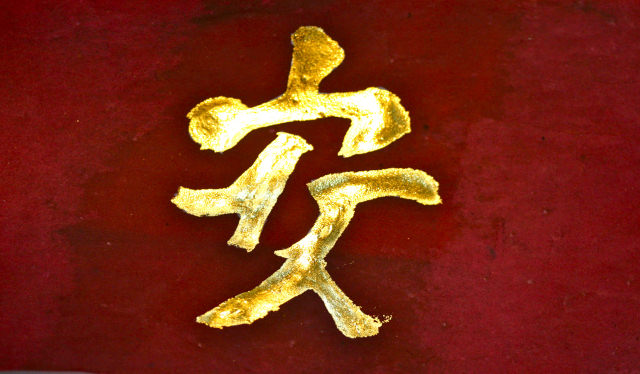
This work was done by Rose Hoy in New Orleans this year in the fourth month's class "Primitive to Modern". The area shown is about 3" x 6". In Rose's own words: "This is the Chinese character that represents peace. Chinese calligraphy is perfect for the gilding process."The background is calfskin vellum stained with brazilwood dye. The 23 kt gold leaf is on layers of two different acrylics.
Click on http://www.reggieezell.com/thepick/ The answers to most of your questions regarding PRIMITIVE TO MODERN can be found through the main page at the web www.reggieezell.com Reservations are now being taken for next years classes in Chicago and other cities. You can also contact me directly at contactreggie@comcast.net or 773-202-8321 . There are now two slots left for cities for 2011. Thanks, Reggie
#35
**************
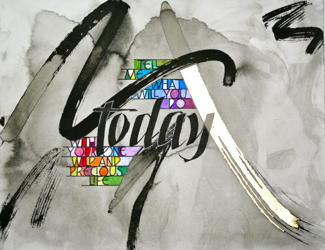
This work was done this year by Sue Kinsey in Tulsa in the third month's class "Illumination on Vellum".
This started as a 10 x 13 inch piece of sink art, Sumi ink on Arches Text Wove, that had lived for several months in a drawer. It was a place to start for homework in trying to imitate Dick Beasley. I did a lot of trial and error on the text placement. Wrote TODAY with sumi ink and used Dr. Martin’s bleedproof white, watercolor and colored pencil on the color section. The sink art swash on the right was gilded with 24k gold.
Click on http://www.reggieezell.com/thepick/ The answers to most of your questions regarding PRIMITIVE TO MODERN can be found through the main page at the web www.reggieezell.com Reservations are now being taken for next years classes in Chicago and other cities. You can also contact me directly at contactreggie@comcast.net or 773-202-8321 . There are now two slots left for cities for 2011. Thanks, Reggie
#36
**************
This work was done this year by Teresa J. Wilber in Tulsa for the fifth month's class of the year, "Design: Deconstructing the Grid".
It is 11 1/2 x 17 1/2. Materials used are watercolor paper, Moon Palace Sumi ink, Micron markers, xacto knife, Styrofoam, gold foil, and paint chips. The Duke Ellington quote is hand-lettered and photocopied for layout, with images of stained glass manipulated in the computer and photocopied for reproduction.
Click on http://www.reggieezell.com/thepick/ The answers to most of your questions regarding PRIMITIVE TO MODERN can be found through the main page at the web www.reggieezell.com Reservations are now being taken for next years classes in Chicago and other cities. You can also contact me directly at contactreggie@comcast.net or 773-202-8321 . There are now two slots left for cities for 2011. Thanks, Reggie
#37
***********
This work was done by Jo Miller in New Orleans this year for the forth month's class "Primitive to Modern".
"This piece was inspired by our homework to make the 'Codex Aureus' or Golden Book our own. In the codex the lines of text alternate from gold letters on one line to letters surrounded by gold on the next. As I thought about this, I had the idea of ribbons of gold cutting through the page. These ribbons would intersect the lines of text letter in a free flowing motion and not be confined to specific lines.
This piece is on a 13" square piece of calf vellum. The raised gilding was created with instacol on top a layer of painters gesso. The flat gilding was created with 2 layers of gum ammoniac. 23kt patent gold was used for all of the gold work and loose leaf palladium was used for the silver frame. "
Click on http://www.reggieezell.com/thepick/ The answers to most of your questions regarding PRIMITIVE TO MODERN can be found through the main page at the web www.reggieezell.com Reservations are now being taken for next years classes in Chicago and other cities. You can also contact me directly at contactreggie@comcast.net or 773-202-8321 . There are now two slots left for cities for 2011. Thanks, Reggie
#38

************
This work was done by Maria-Helena in New Orleans this year for the fourth month's class "Primitive to Modern". Here is the info about the artwork piece
Species of Women, 10"x15"
This piece was inspired by one of the great manuscript books Mira Calligraphiae Monumenta of late 16th century, in modern print by Getty Museum. The calligraphy, and the botanical paintings in the book were done by two separate artists who never met, an amazing fact. Attempting to do both the lettering and painting was going to be a challenge. My piece is inspired by several different pages in the book. Once I picked out the botanical I wanted to follow, I selected my quote to go with it online. I used the proportions from the book to figure out interlinear spaces. The golden ornamentation between lines is often used in Mira Calligrahiae, and was a must, one of the things I most admired, and a useful way of decorating even on the 21st century. I came up with my own version of the ornamentation, which is simpler than the ones in the book, of course, and done with pointed nib in golden watercolor. For lettering style I turned to my beloved Gothisized Italic, as both gothic and italic are often used in the book. For the Botanical, I did a line drawing in ink first, and filled in with watercolors. At the end, my vast admiration for this manuscript was only humbly expressed, and my study of it continues....
Materials used: Calfskin vellum, black sumi ink, golden Japanese watercolor, gold leaf, various watercolors, Mitchell 2 1/2 nib, pointed pen, fine brushes
Click on http://www.reggieezell.com/thepick/ The answers to most of your questions regarding PRIMITIVE TO MODERN can be found through the main page at the web www.reggieezell.com Reservations are now being taken for next years classes in Chicago and other cities. You can also contact me directly at contactreggie@comcast.net or 773-202-8321 . There are now two slots left for cities for 2011. Thanks, Reggie
#39
*********
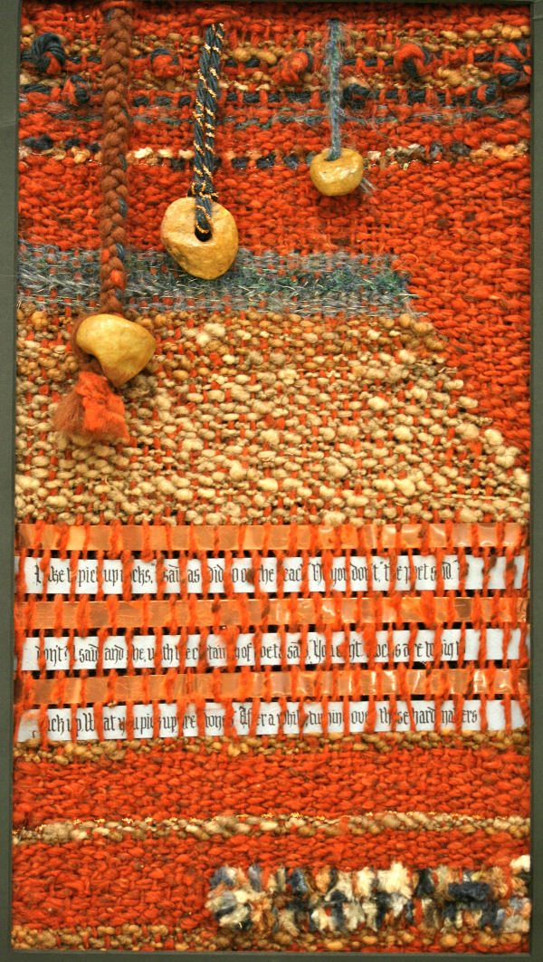
This Work was done by Mary Lou Sherman this year in for the fourth month's class "Primitive to Modern". In her own words:
I took a fiber arts course and one of our projects was to study how to dye fibers with natural dyes and then work them into a 3 dimensional piece of art work using weaving techniques. I had to build my frame, dye my fibers and then weave them. I had never wove anything except a pot-holder for my Mom...way back in the dark ages, so this was a BIG challenge for me. I had an Ursla LeGuin poem about rocks that I had been wanting to do and some rocks that I had found that had natural holes in them. Reggie had just introduced me to his new Black Letter alphabet. So I thought...why not integrate some calligraphy into my weaving. I lettered on blue Ingres with stick ink and wove the poem into the piece using copper in between the lines of writing. I've never been a conventional person so it all seemed to fit together nicely. The finished weaving was 24" x 14" unframed. It was a project that just seemed to evolve. My goal in life...have fun... and this was FUN! hugs, Mary Lou
Click on http://www.reggieezell.com/thepick/ The answers to most of your questions regarding PRIMITIVE TO MODERN can be found through the main page at the web www.reggieezell.com Reservations are now being taken for next years classes in Chicago and other cities. You can also contact me directly at contactreggie@comcast.net or 773-202-8321 . There are now two slots left for cities for 2011. Thanks, Reggie
#40
*************************
This week is on HOLD:
.Click on http://www.reggieezell.com/thepick/
The answers to most of your questions regarding PRIMITIVE TO MODERN can be found through the main page at the web www.reggieezell.com Reservations are now being taken for next years classes in Chicago and other cities. You can also contact me directly at contactreggie@comcast.net or 773-202-8321 . There are now three slots left for cities for 2011. Thanks, Reggie
#41
***************
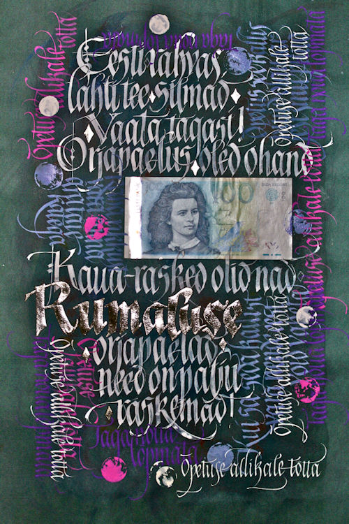
This work was done by Maria-Helena Hoksch In New Orleans for the fourth month's class "Primitive to Modern". Her comments on her work:
STUPIDITY, in Estonian, 18''x12''
This is a poem about how the chains of stupidity are heavier to carry than that of slavery and foreign rule. It also is about being a slave to money, and the author of the poem Lidya Koidula also happens to be on the Estonian 100 crone bill that I "collaged" into the artwork. The aim here was to create a very layered piece, to keep adding layers and textures. I started with a watercolor sponge wash on a dark blue paper. Then I did the main white lettering, that is the only part meant to be legible, leaving one word to be gilded. I added all kinds of colors, with different nib sizes, that were just leftover mixes from several jobs. Some of the colors are outright obnoxious and very intense, that I would never use on a classy piece, but did here. I sprayed between every layer with matte fixative to be able to letter on top. Not at any stage were any of the elements of this piece planned, contemplated, or thought out. Midway through the job I thought it would be fun to use coins as stamps and made round prints with them. The fact that I was using paper and not vellum made me very playful and spontaneous, as paper feels like such a disposable material after all the work I have done on vellum recently. Materials used: Bugra paper, Various gouaches, metal nibs, coins and bills, watercolor sponging, palladium leaf gilding.
Click on http://www.reggieezell.com/thepick/
The answers to most of your questions regarding PRIMITIVE TO MODERN can be found through the main page at the web www.reggieezell.com Reservations are now being taken for next years classes.
You can also contact me directly at contactreggie@comcast.net or 773-202-8321 . There are now three slots left for cities for 2011. Thanks, Reggie
#42
***********
This piece was done by Jo Miller in New Orleans this year for the fourth month's class "Primitive to Modern". In her own words:
Reggie's class has been such an inspiration for me. Not only in the things he has taught us in class but even more so in the homework assignments given. Learning his creative process has prompted me to think outside the box and to utilize things in a different way. Like this piece. The background is a photograph of a small canvas I had previously painted. I took a picture of the 4x5 canvas, brought that file into Photoshop and enlarged it. Then printed the image on a 11x17 piece of Epson Velvet art paper. The paper was coated with spray fixative before the text was written with gouache. I really liked the effect of the enlarged canvas texture. Also, the freedom of working on a print. Need a do-over? No problem!
Click on http://www.reggieezell.com/thepick/
The answers to most of your questions regarding PRIMITIVE TO MODERN can be found through the main page at the web www.reggieezell.com Reservations are now being taken for next years classes.
You can also contact me directly at contactreggie@comcast.net or 773-202-8321 . There are now three slots left for cities for 2011. Thanks, Reggie
#43
*****************
This work was done in Tulsa this year by Sue Kinsey for the fifth month's class "Design; Deconstructing the Grid"
This piece was a stretch for me working in totally different elements than what I’m used to. I began with the basic feather shape, enlarged it and began “exploding” it a little at a time. It took a bit of trial and error but in the end it turned out to be a good exercise in design and layout, use of color and the hot foil pen!
It is 11 1/2 x 17 1/2. Materials used are watercolor paper, Moon Palace Sumi ink, Micron markers, xacto knife, styrofoam, gold foil, and paint chips.
Click on http://www.reggieezell.com/thepick/
The answers to most of your questions regarding PRIMITIVE TO MODERN can be found through the main page at the web www.reggieezell.com Reservations are now being taken for next years classes.
You can also contact me directly at contactreggie@comcast.net or 773-202-8321 . There are now three slots left for cities for 2011. Thanks, Reggie
#44
**********
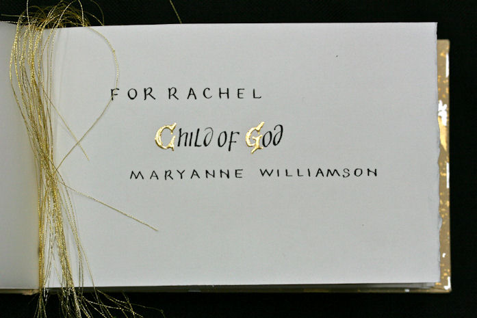
This work is by Lynda Jolly form Tulsa in this year's second month class "Writing on Vellum". She describes it:
This book is about 6 ½” by about 4 ¼” and was a college graduation present for our daughter. The text, by Maryanne Williamson, is erroneously attributed to Nelson Mandela’s 1994 inaugural address. Due to concerns about folding and sewing the vellum, I machine sewed the odd shaped, vellum off-cuts to 90# Arches hot press watercolor paper. A classmate suggested accentuating and showing off the gold stitches made with the sewing machine (“embrace the baby,” so to speak). The book was bound with a long stitch binding and the pages alternate between vellum and Arches. To protect the gold on every page, a piece of Dick Blick heavy duty tracing paper was inserted between every page. I made a small “dummy” book for text and page layouts. The ink was Moon Palace Sumi (I could not get any other stick ink to work) and a Mitchell 6 nib.
Click on http://www.reggieezell.com/thepick/
The answers to most of your questions regarding PRIMITIVE TO MODERN can be found through the main page at the web www.reggieezell.com Reservations are now being taken for next years classes.
You can also contact me directly at contactreggie@comcast.net or 773-202-8321 . There are now three slots left for cities for 2011. Thanks, Reggie
#45
**********
This work was done by Mary Lou Sherman in Birmingham for the third month's class "Illumination on Vellum".
Thanks for 'pic'n' me. This piece came as a new discovery. I'm NOT a 'puter person so this was a whole new process for me. I took a photo of a piece of my paste paper that I had made. The original colors were blues, greens, and yellows. I put it into a simple photo shop program where you could manipulate the size and color. It was a very elementary program...but, you know my goal in life is to have fun. So, I fooled around with the color and size and printed it on arches text wove paper...8 1/2" x 11". WOW! I had a whole new look to a piece of old paste paper. I then lettered with gold "Fine Tec" watercolors and used white gouache for the lines. I enhanced some of the lines with colored pencil and put a few gold dots using the hot foil pen. Walla...fun again. Thanks for all the ideas you put in my head!!!
Click on http://www.reggieezell.com/thepick/
The answers to most of your questions regarding PRIMITIVE TO MODERN can be found through the main page at the web www.reggieezell.com Reservations are now being taken for next years classes in Chicago and other cities. You can also contact me directly at contactreggie@comcast.net or 773-202-8321 . There are now two slots left for cities for 2011. Thanks, Reggie
#46
**********
This photo was taken of a work in progress last week in Birmingham. It is by Ron Ross from Nashville. This was the sixth class (last) of the year,
"Experiencing the Book as a new Structure". Some of the materials used: varieties of papers coated with numerous acrylic mediums, color transparencies, photographic images manipulated in the computer, gator board, matt board, quotation in type to temporarily "block in" where calligraphy will follow, gaffers tape, aluminum post and screws, and others. In his own words;
“ I believe the the best way to in-vision your book is to collect as many backgrounds as possible and spread them out on the floor. The winding road and night sky seemed to be a natural. The tunnel at the end of the road was the perfect entry to the heavens.
Click on http://www.reggieezell.com/thepick/
The answers to most of your questions regarding PRIMITIVE TO MODERN can be found through the main page at the web www.reggieezell.com Reservations are now being taken for next years classes in Chicago and other cities. You can also contact me directly at contactreggie@comcast.net or 773-202-8321 . There are now two slots left for cities for 2011. Thanks, Reggie
#47
**********
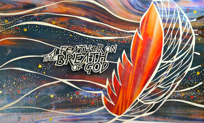
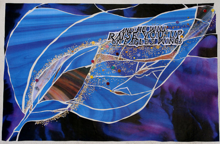
This work was done by Ginny Haller this year in Columbus, Ohio for the fifth month's class "Deconstructing the Grid". It is 12" x 18", a colage technique, using color photocopy images that have been manipulated in the computer as well as metallic foils, metal nibs, and sumi ink. In her own words...
"I love the hymn "On Eagles Wings", the words and the music. As Reggie described this project and told us to select a short quote, these words came to mind. I didn't want to labor over the drawing of an eagle and realized the image of a feather could convey the same thoughts and feelings. I loved how the shapes and colors emerged during the process."
Click on http://www.reggieezell.com/thepick/
The answers to most of your questions regarding PRIMITIVE TO MODERN can be found through the main page at the web www.reggieezell.com Reservations are now being taken for next years classes in Chicago and other cities. You can also contact me directly at contactreggie@comcast.net or 773-202-8321 . There are now two slots left for cities for 2011. Thanks, Reggie
#48
**********
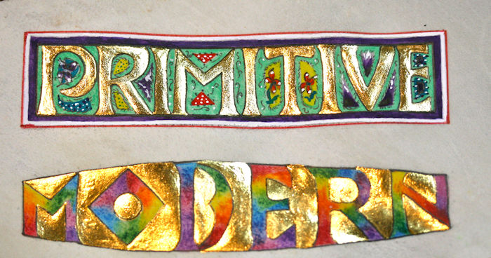
This work was done by Carmel Cucinotto Harmon in New Orleans this year for the fourth month's class "Illumination on Vellum". In her own words:
For this "Primitive to Modern " piece:
I wanted to show a comparison yet similar technique between old/new. I used gold patent leaf for both. For"primitive" I worked with gouache for background and designs. The gold went on like a charm for this one, but, when it came to "modern" I really had to work at getting the gold leaf to adhere. I had to lay a second layer of Instacol over the first layer of gold in order to get it to adhere. This section of the vellum was rather "prickly" and perhaps that is why I had so much trouble. I used colored pencils in the order of the rainbow to fill in the "modern" letters. I used a 'French curve" to calculate the different heights of the letters in 'modern'. This took some time trying to figure it out and many layouts. Lettering is on vellum and measures 8" x 4". I am very honored to have my work on display. Thank you.
Click on http://www.reggieezell.com/thepick/
The answers to most of your questions regarding PRIMITIVE TO MODERN can be found through the main page at the web www.reggieezell.com Reservations are now being taken for next years classes in Chicago and other cities.You can also contact me directly at contactreggie@comcast.net or 773-202-8321 . There are now three slots left for cities for 2011. Thanks, Reggie
#49
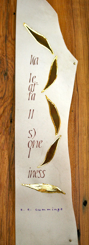
*********
This work was done by Eugenia Uhl in New Orleans in the third month's class "Writing on Vellum". In her own words:
This one says, "A leaf falls loneliness". It's gouache and gold leaf on vellum. It's nailed to a piece of old pine.
The poem is one I have loved forever. The shape of the vellum was a natural for the long skinny format. I have since scraped off the "ee cummings" in purple, just didn't like it, and have redone it in black. It looks better. This piece is about 20 inches long. I loved the flow of the gouache on the vellum. I think the irregularity of the vellum adds to the overall effect. And that piece of wood was the one left over piece we had after fixing our ceiling that was ruined in hurricane Katrina. And it fit perfectly!
Click on http://www.reggieezell.com/thepick/
The answers to most of your questions regarding PRIMITIVE TO MODERN can be found through the main page at the web www.reggieezell.com Reservations are now being taken for next years classes in Chicago and other cities. You can also contact me directly at contactreggie@comcast.net or 773-202-8321 . There are now three slots left for cities for 2011. Thanks, Reggie
#50
*********
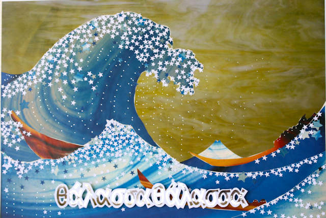
This work was done this year by Judy Mueller in Columbus, Ohio for the fifth month's class "Design; Deconstructing the Grid". In her own words:
I did this piece with my brother in mind. He has been looking ahead to retirement from a job that is frustrating, in a place he wants to leave. He searched for a piece of land on which to build a house and workshop, looking during every summer and Christmas vacation for the last ten years. He looked in Alaska and Upper Michigan and Maine. A year ago he finally found a very overgrown piece of land on the coast in eastern Maine. The land is so overgrown that you can't see the water without taking a long, difficult hike. He spent all summer clearing an old driveway through the brush and brambles from the road to the place where he will build a home in the future. I went to see him at the end of August and we walked to see how far he had gotten in his labors. When we came through the trees at the end of the path he called out "Θάλασσα Θάλασσα." (Thalassa! Thalassa!) And then he told me the story:
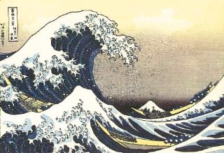
In 401 B.C.E. an army of 14.000 Greek mercenaries set off on on an expedition to help Cyrus the Younger take the throne of Persia from his brother, Artaxerxes II. The army fought to a victory near Babylon, but Cyrus was killed in the battle, making the effort irrelevant and the expedition a failure, with the army stranded in the middle of enemy territory in Mesopotamia, more than a thousand miles from home. Many of the Greek officers were killed or captured. Xenophon was one of three remaining leaders elected by the soldiers who then encouraged the remaining 10,000 to march north, without food or supplies, across deserts and snow-filled mountain passes toward the Black Sea and the Greek shoreline cities. More than five months into the arduous trek, as they were marching, a great roar was heard, starting at the front of the line. Those in the back strained to hear what was happening. The word came back: Θάλασσα Θάλασσα (The sea! The sea!) Xenephon wrote a history of this time, which is commonly used as the first book of readings in Greek classes. All Greek students know these words. The collage is made of photos of colored glass (courtesy of Reggie) and chads from a paper punch. The the design is from a Japanese wood- block print (attributed to both Hokusai and Hiroshige. I think the former is correct):
#51
*********
This work was done by Michele Boyce from New Orleans this year for the forth month's class "Primitive to Modern".
In her own words:
Once upon a time there was a young lady who never did her homework. She loved all the beautiful pencils, schoolbags, sharpeners and crayons but never remembered to pack the ones she was told she would need the next day. Besides that, she called out in class and talked when the teacher was giving instructions.
Needless to say, she grew up and ended up in Reggie’s class. Not once, not twice but three times. Nothing had changed. She still loved her pencils, crayons and sharpeners and never did her homework or prepared for class.
She had met her match, Reggie Ezell, “Teacher of Teachers”. When she forgot her velum, Reggie had it. When she forgot to die it, Reggie did it. When she didn’t bring her layout, Reggie helped. What was she to do? She had no choice! She had to create a piece.
Yes, the piece below was created by that procrastinating, forgetful, sleep challenged student. It was done on a small piece, about 3 by 5”, dyed velum, the loose leaf gold was applied over Insticol and details were applied with shell gold. This was fun and I have created a piece I am proud of showing.
Thanks to Reggie, prepared or not, I know that somehow, some calligraphic angel will always be there to help me.
Click on http://www.reggieezell.com/thepick/
The answers to most of your questions regarding PRIMITIVE TO MODERN can be found through the main page at the web www.reggieezell.com Reservations are now being taken for next years classes in Chicago and other cities. You can also contact me directly at contactreggie@comcast.net or 773-202-8321 . There are now three slots left for cities for 2011.
This is the last "Pic" for 2010. It's been a wondrous, frightening, transcendent year. So many people have been so kind, worked so hard. Thank you.
"God bless us one and all!" May love come to you in the next and all following years. Sincerely, Reggie
#52
*********