Week #1
This work was done by Maria Helena in New Orleans in 2010 in the fourth month's class "Primitive to Modern". In her own words:
BLUE AND WHITE
14'' x 5'', black sumi ink and watercolor on vellum. I prepared this simple layout for the second month's class, and lettered and gilded it in the classroom. We were given a piece of vellum in the previous class to develop a layout for at home. The size and shape of the vellum is what Reggie happened to hand out to me. I was happy to get a pretty large piece. The haiku I used as a text was written for me by a loved one, so it has a lot of meaning to me. A few months later, being bored, I pulled out the lettered piece at home and decided to use some illustration to finish it up, as I felt it deserved more attention. I used a single blue Windsor Newton watercolor and applied it with pointed pen, then melted with a fine brush into a watercolor wash of different values. I was inspired by the blue and white china that I collect and have a kitchen full. Mitchell and Brause nibs were used for the lettering of this piece.
The answers to most of your questions regarding PRIMITIVE TO MODERN can be found through the main page at the web www.reggieezell.com Reservations are now being taken for next years classes. You can also contact me directly at contactreggie@comcast.net or 773-202-8321 . There are now three slots left for cities for 2012. Thanks, Reggie
* * * * * * * * * *
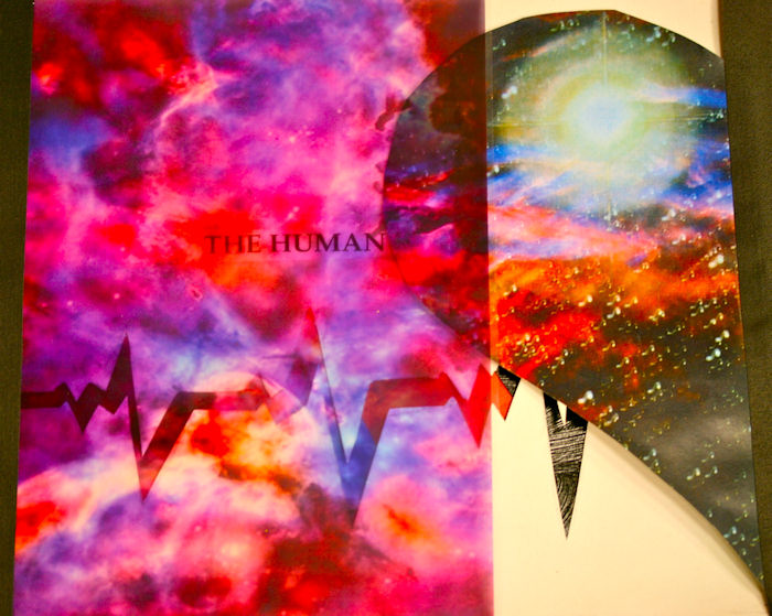
Week #2
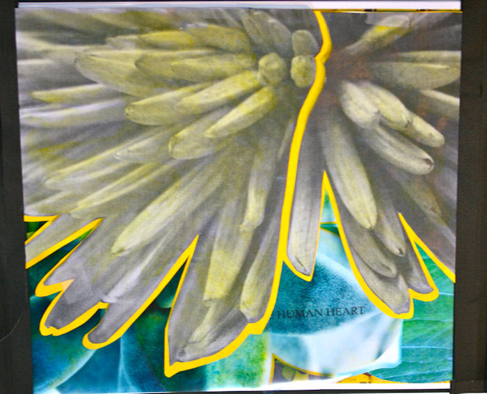
This work was done by JUDY Bilbury in 2010 in Birmingham for the sixth month's class "Experiencing the Book as a New Structure". In her own words:
This is the book, we began creating, in the last class of P2M. The quote was "The human heart is a theatre of longing". I immediately envisioned a human heartbeat line. As you go through my book, it shows life, heartbreak, and love--all mysterious encounters of the heart. I have yet to create the theatrical part using the Comedy & Tragedy masks of theatre--still incorporating the human heart symbols. Then in the last part, it will all be thrown out into the vast universe.
The materials shown on this page/view were: colored transparency paper, then a piece of a color print on Mohawk copy paper, and finally I cut out the lifeline on the sheet of Arches that we "gel--ified" in class.
The answers to most of your questions regarding PRIMITIVE TO MODERN can be found through the main page at the web www.reggieezell.com Reservations are now being taken for next years classes. You can also contact me directly at contactreggie@comcast.net or 773-202-8321 . There are now three slots left for cities for 2012. Thanks, Reggie
* * * * * * * * * *
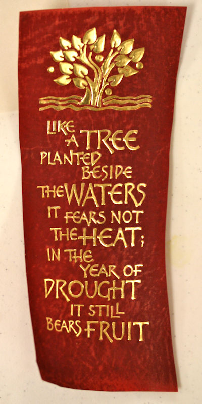
Week #3
This work was done by Sue Kinsey in 2010 in Tulsa For the fourth month's class "Primitive to Modern". In her own words:
This started with dividing up a batch of brazil wood dye (cooked up by another class member)…in July…in Oklahoma…outdoors. I then took the dye home and dyed several pieces of vellum. I had gilded this tree image on the dyed vellum in class and really liked it. So I decided to do it again and take a little more time with it, adding an extra layer of gesso before the instacol. I used 24 kt loose leaf gold. The verse from Jeremiah seemed perfect to go with the tree and the water. I tried to edit the verse to shorten it but could only leave out so much without changing the overall meaning. So, at that point, I totally lost my mind and decided to do most of the whole verse in gold. The overall size of the vellum is about 9 x 3 ½ inches so the lettering size is rather small in places. I spent many hours over the course of about 10 days wearing an opti visor and working on the detail of the lettering.
The answers to most of your questions regarding PRIMITIVE TO MODERN can be found through the main page at the web www.reggieezell.com Reservations are now being taken for next years classes. You can also contact me directly at contactreggie@comcast.net or 773-202-8321 . There are now three slots left for cities for 2012. Thanks, Reggie
* * * * * * * * * *
Week #4
This work was done by George Dorsey in Birmingham in 2010 for the fifth month's class "Design: Deconstructing the Grid".
It is 11 1/2 x 17 1/2. Materials used are watercolor paper, photocopied images manipulated in the computer, Moon Palace Sumi ink, Micron markers, xacto knife, styrofoam, gold foil, and paint chips.
In his own words: Just like a "Hairdresser" I got 'Happy" with the "Xacto Knife".....Enjoyed watching the lifted lettering, color, deconstruction, cut-outs, and foil pen really "Pop" in the Photograph.
The answers to most of your questions regarding PRIMITIVE TO MODERN can be found through the main page at the web www.reggieezell.com Reservations are now being taken for next years classes.
You can also contact me directly at contactreggie@comcast.net or 773-202-8321 . There are now three slots left for cities for 2012. Thanks, Reggie
* * * * * * * * * * * *
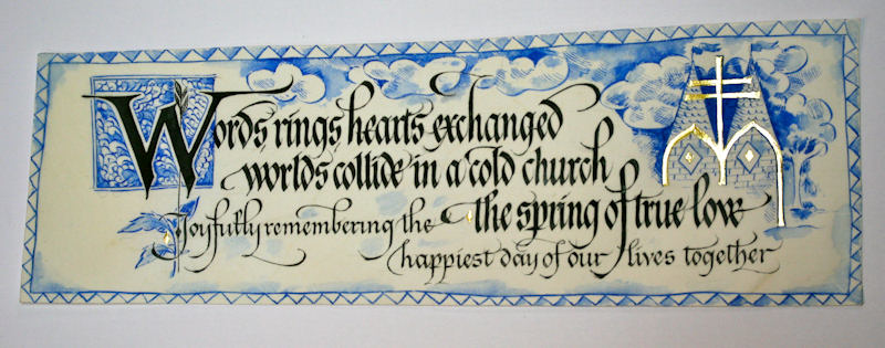
Week #5
This work was done by Eugenia Uhl in New Orleans in 2010 for the fourth month's class "Primitive to Modern". In her own words:
This is the book that I visualized from the first weekend when you gave us those first pieces of vellum to sand. I received these 3 that fit together perfectly for a horizontal book. I thought about making it for months. I am glad I waited until the end because everything we did/learned brought me to making this book. The vellum was dyed in coffee, much like your instruction for brazil wood dye, but not as long in the coffee, it stains pretty fast. I also used only one prong of the stapler going around in the hopes that one hole would be less noticeable than 2 because I did not want to change the shape of these 3 pieces of vellum, they just fit together as is. I sewed them to Japanese papers with binder's thread. The vellum pages have images that I transferred with acetone, a Chartpack pen. It actually dried up in the middle but I just dipped it into acetoner and the felt tip worked great for getting just the areas that I wanted. The lettering is gouache and sumi ink with gold leaf. I outlined the letters with a marker and hated it. So, luckily I had a practice piece of vellum that had the same lettering on, which I washed off a bit, and the effect worked well to rid my letters of that terrible outline. So, I dabbed at them with a paper towel, then a sprinkle of Schmincke gold dust, then looked back and said, "Done." Thank you Reggie. It was an amazing year, it changed my calligraphy life.
The answers to most of your questions regarding PRIMITIVE TO MODERN can be found through the main page at the web www.reggieezell.com Reservations are now being taken for next years classes. You can also contact me directly at contactreggie@comcast.net or 773-202-8321 . There are now three slots left for cities for 2012. Thanks, Reggie
* * * * * * * * * * * *
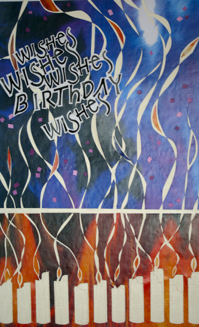
Week #6
This work was done by Michele Boyce in 2010 in New Orleans for the fifth month's class "Design: Deconstructing the Grid".
In her own words:
Please forgive me. I was hungry when I wrote this.
Recipe for Birthday Card
1 Year Long Reggie Class
1 Waxed Art Paper
3 Color Copies of Stained Glass
1 Lesson with a B-3 Nib
5 Tsp. of Inspiration
1 Tbs. of Encouragement
6 Tbs. Patience
A Couple of Tears of Frustration
Meet with a supportive calligraphy guild and talented teacher. Mix all together with love. After baking for awhile bring to printer
and have it printed on photo paper, 4 per page, and fold into birthday cards.
The answers to most of your questions regarding PRIMITIVE TO MODERN can be found through the main page at the web www.reggieezell.com Reservations are now being taken for next years classes. You can also contact me directly at contactreggie@comcast.net or 773-202-8321 . There are now three slots left for cities for 2012. Thanks, Reggie
* * * * * * * * * * * *
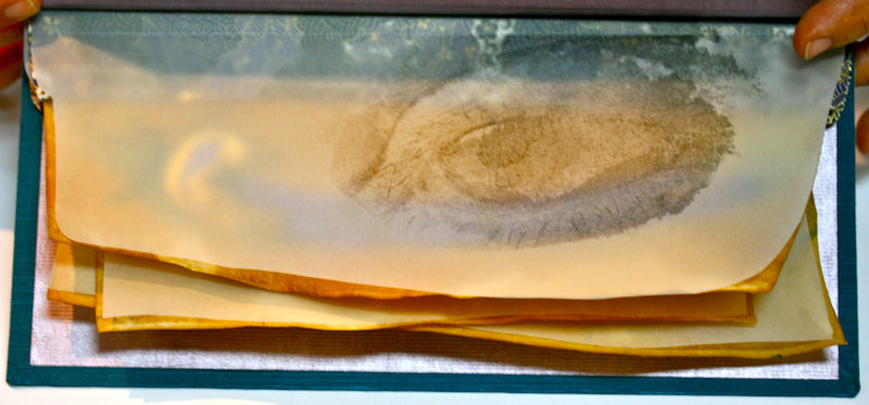
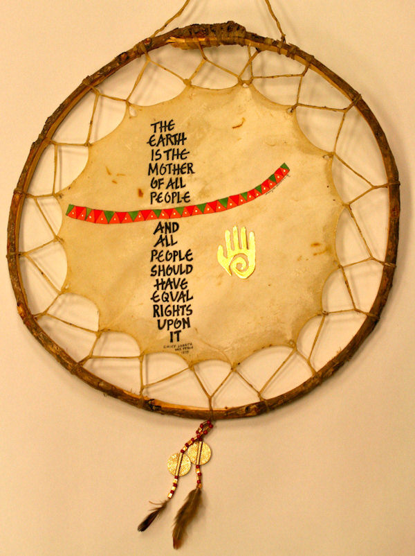
Week #7
This work was done by Mary Lou Sherman in 2010 in Birmingham for the second month's class "Writing on Vellum". In her own words:
We worked on vellum that Reggie had provided us, but a fellow class-member, Judy Bilbry, had found these Native American dream catchers at a local truck stop. So, I had to try writing on a different kind of skin. I'm not sure exactly what kind of skin this is but I prepared it in the same way that I had prepared the skins that I had gotten from Reggie. The surface was very much like what I had been writing on. I used sumi ink as my writing fluid and watercolor for the colored band. The 'healing hand' was gilded using acrylic gesso, Instacol, and patent gold. Walla...another fun project. Thanks Reg! You are such an inspiration to me!!! ml
The answers to most of your questions regarding PRIMITIVE TO MODERN can be found through the main page at the web www.reggieezell.com Reservations are now being taken for next years classes. You can also contact me directly at contactreggie@comcast.net or 773-202-8321 . There are now three slots left for cities for 2012. Thanks, Reggie
* * * * * * * * * * *
Week #8
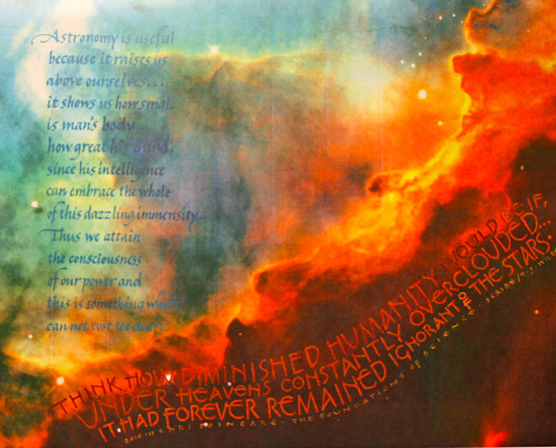
This work was done by Teresa Wilbur in 2010 in Tulsa for the fourth month's class "Primitive to Modern". In her own words:
As learned from Reggie in the Primitive to Modern class, I searched the internet for images taken by the Hubble telescope to use as a background. I selected one that would give a light enough background to allow the lettering to be featured, and then copied the image, with our inkjet printer onto an 8-1/2"x11" piece of Arches Text Wove. The Henri Poincaré quote had two sections, which I decided needed to be separated and each have a different lettering style. To help decide placement onto the Hubble image, I wrote each section out on plain Arches paper, and then copied them onto transparencies (another Reggie-tip). Before directly lettering onto the image, it was twice sealed with a spray-fix, letting it dry between coats. I lettered directly onto the image with a gouache color that would blend with the background, without interfering with the image. There were some words that were too light or dark and got lost in the image color. So, I went back with a lighter or darker value, and, with help from my Optivisor, I stippled in the color with an EF66, so I wouldn't distort the letterform. The second section of the quote was lettered, using the same techniques-- again, with subtle colors that could be read, without detracting from the background image. The credit line was included, with date, the quote's author and source, and my name as scribe. Finally, I put one more light coat of spray-fix over the completed piece for protection. Because this was for a client, I made a color copy and had the piece scanned onto a flash drive for my records. I must also note that the client was so excited about this idea for the piece she had commissioned, since it was a gift for her husband, who happens to hold a degree in astronomy.
The answers to most of your questions regarding PRIMITIVE TO MODERN can be found through the main page at the web www.reggieezell.com Reservations are now being taken for next years classes. You can also contact me directly at contactreggie@comcast.net or 773-202-8321 . There are now three slots left for cities for 2012. Thanks, Reggie
* * * * * * * * * *
Week #9
This work was done by Carmel Cucinotta Harmon in New Orleans in 2010 for the second month's class "Writing on Vellum". In her own words:
For the pages in this book I used vellum; and book board for the covers. I used Mitchell #3, #3-1/2 and #5 nibs and foundational hand for writing. At first I thought to do the capitals in gold leaf - which was over kill. After many work ups, I finally decided to use 2 colors for the "W"..inspired by the capital letters from "Illuminating the Word". The illumination is gold leaf, gouache, colored pencil and sumi ink (EF-66 nib). Our assignment was to use Japanese binding which just about killed my fingers working so small. I think I will use 'cloth' for the book cover next time. The paper I used splits when opening and closing the book. The book measures 3 x 3-1/2. I know many make books much smaller and one day I will give it a try. Thank you Reggie.
The answers to most of your questions regarding PRIMITIVE TO MODERN can be found through the main page at the web www.reggieezell.com Reservations are now being taken for next years classes. You can also contact me directly at contactreggie@comcast.net or 773-202-8321 . There are now three slots left for cities for 2012. Thanks, Reggie
* * * * * * * * * * *
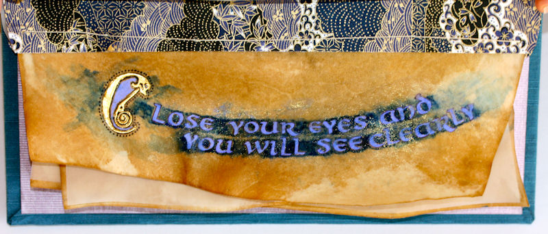
Week #10
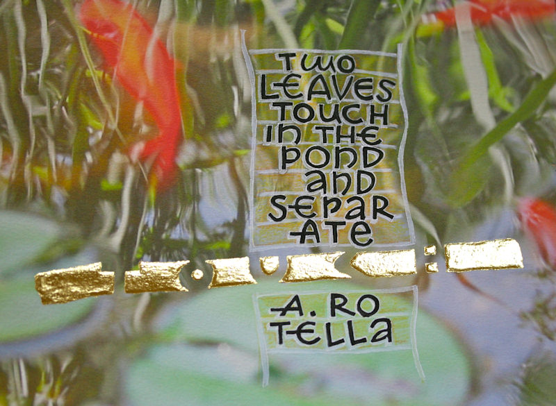
This work was done by Eugenia Uhl in 2010 in New Orleans from the fourth month's class "Primitive to Modern". In her own words:
This piece is a photograph of mine of a pond with goldfish that I manipulated in photoshop to look dreamy. I wanted the asian poem I picked to be reflected in the contents of the photograph, goldfish seemed to match. I used arches 90 lb through my ink jet printer, sumi ink and golf leaf with just a light layer of gesso and instacol, wanted the gilding to be kind of flat. And the letters have some color pencil highlights around then, mainly the same techniques you showed us in class, just a different photo and poem.
The answers to most of your questions regarding PRIMITIVE TO MODERN can be found through the main page at the web www.reggieezell.com Reservations are now being taken for next years classes. You can also contact me directly at contactreggie@comcast.net or 773-202-8321 . There are now three slots left for cities for 2012. Thanks, Reggie
* * * * * * * * * *
Week #11
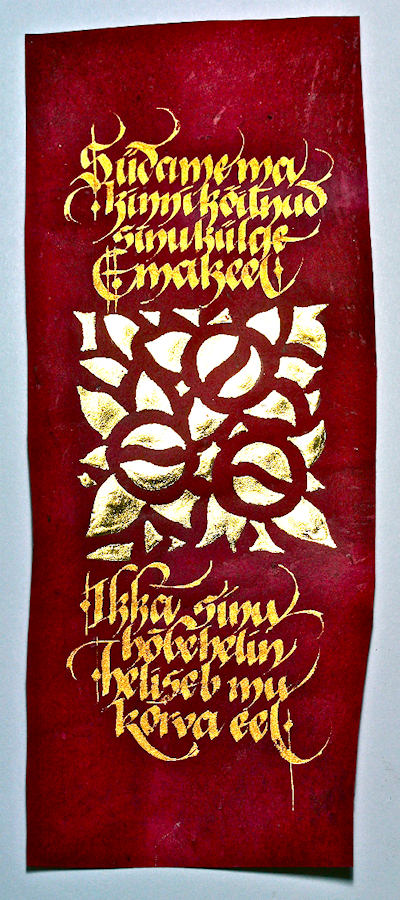
This piece was done in 2010 by Maria-Helena Koksch in New Orleans for the fourth month's class "Primitive to Modern". In her own words:
ESTONIAN TONGUE, in Estonian, 3"x7"
This work is done on a piece of purple vellum, died with brazilwood chips, provided in class by Reggie. The tiny poem is about how estonian language jingles like a golden bell and ties to the strings of soul. I used optivisor the whole time I was making this little piece. I used very fine brush to apply the base for the detailed gilding, first with gesso, and later with instacol. The lettering is done with Japanese watercolor sold in a round ceramic dish, fed with the brush to Brause 2 1/2 nib. It is a pity that the purple vellum is so hard to find or make, as it is fine surface for gilding and golden lettering. What a contrast!
Materials used: Died calfskin vellum, gold leaf, fine brush, metal nib, golden watercolor
The answers to most of your questions regarding PRIMITIVE TO MODERN can be found through the main page at the web www.reggieezell.com Reservations are now being taken for next years classes.
You can also contact me directly at contactreggie@comcast.net or 773-202-8321 . There are now three slots left for cities for 2012. Thanks, Reggie
* * * * * * * * * * * *
Week #12
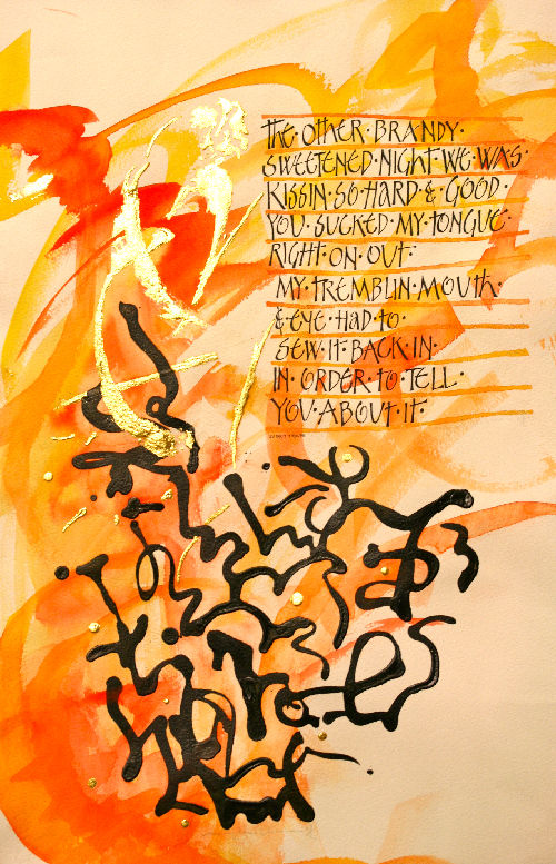
This work was done by Mary Lou Sherman in 2010 in Birmingham for the fourth month's class "Primitive to Modern". In her own words:
Thanks for pic'n me. This was an experiment. I had watched Massimo Polello on Utube and tried duplicating the liquid that he used in some of this pieces. I came up with a mixture of Golden's Tar Gel and Golden's black Fluid Acrylic paint mixed with some water. I first used a fluid mask and made gestural marks. Then I made more gestural marks using watercolors. My poem was by Quincy Troupe. He is originally from the Mississippi Delta and the poem is very strong and raw to me and I tried to interpret this into my gestural marks. The black marks are the black, acrylic mixture done with a lot of feeling and emotion. I removed the fluid mask and that's where the gold went. My experiment was successful and as always...I had FUN!!!
The answers to most of your questions regarding PRIMITIVE TO MODERN can be found through the main page at the web www.reggieezell.com Reservations are now being taken for next years classes. You can also contact me directly at contactreggie@comcast.net or 773-202-8321 . There are now three slots left for cities for 2012. Thanks, Reggie
*******************
Week #13
This work was done by Jo Miller in 2010 in New Orleans for the fourth month's class "Illumination on Vellum". In her own words:
This piece was created as a final draft for a vellum piece. The thought was to create my version of a contemporary take on the 'Codex Aureus'. It is created on Arches textwove paper and measures approximately 9"x9". The raised letters were created with painter's gesso and instacol. Instacol alone was used for the flat ribbons of gold. The border was created with gesso and instacol and gilded with loose leaf palladium. When I was gilding the raised portion of the letters, I had a couple of small mishaps where I gilded too soon and had a squeeze out of the instacol on the paper. Unfortunately the instacol would not scrape off completely. That's where the black came in as a fix for the stained spots. I used sumi ink to paint in the letters and used a sketch and wash pencil for the gray washes around the gilded portion of letters. The addition of the black gave the piece a very dramatic effect. Since it was a final draft I felt free to experiment with options and created something very different from what I had in mind.
The answers to most of your questions regarding PRIMITIVE TO MODERN can be found through the main page at the web www.reggieezell.com Reservations are now being taken for next years classes. You can also contact me directly at contactreggie@comcast.net or 773-202-8321 . There are now three slots left for cities for 2012. Thanks, Reggie
* * * * * * * * * * * * *
Week #14
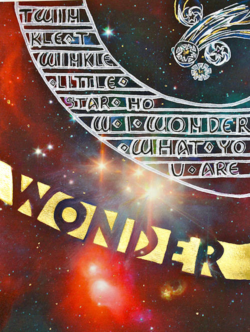
This work was done by Ginny Haller in Columbus Ohio in 2010 for the third month's class "Illumination on Vellum". In her own words:
Using techniques taught in the “Illumination on Vellum” class, I decided to capture a sense of childlike awe of the universe. The background is an image of the Corona Cluster taken by the Hubble Telescope and displayed on the NASA website. It was downloaded and printed out on arches textwove paper via my HP Photosmart 6300 Printer. After spray-fixing the printed image, I transferred my design onto the image using Saral transfer paper. The lettering on the ladder, the structure of the ladder and the “shooting stars” in the upper right corner, were then done using Dr. Martin’s Bleedproof White and an EF 66 nib. The negative spaces of the word “Wonder” are 23K patent gold laid on a base of gesso and instacol. Portions of the background were enhanced with Prismacolor pencils. A final touch of small gold and multi-colored stars was added via a hot foil pen.
The answers to most of your questions regarding PRIMITIVE TO MODERN can be found through the main page at the web www.reggieezell.com Reservations are now being taken for next years classes. You can also contact me directly at contactreggie@comcast.net or 773-202-8321 . There are now three slots left for cities for 2012. Thanks, Reggie
* * * * * * * * * *
Week #15
This work was done by Maria-Helena Hoksch in New Orleans in 2010 for the Second month's class
"Writing on Vellum". In her own words:
Writing On Stone and Sand
Sumi Ink and Gouache on Deerskin, 13"x18"
This is a poem in Estonian about two kinds of love, one cut in stone, the other written on sand. Hence the contrasting scripts, heavy and light. The rich color of the skin really reminds you of either stone or sand, beautiful natural background to have! I went for some quite dense lettering for parts of this work, cutting out almost all of the negative space between letters. The lighter lettering I struggled with more, as I had to add some flair to keep it from being boring, some playfulness. My problem is that I want to add too much of the playful often times. I had seriously reign myself in. I went through six drafts. At the end I decided the piece needed some pop, so I brought out my beloved tool - a ruling pen. It always helps to enhance a piece, I find. I got inspiration from manuscripts and put in red lines in between lines of lettering.
The difference is that I put them in after, in manuscripts they put them in first.
The answers to most of your questions regarding PRIMITIVE TO MODERN can be found through the main page at the web www.reggieezell.com Reservations are now being taken for next years classes. You can also contact me directly at contactreggie@comcast.net or 773-202-8321 . There are now three slots left for cities for 2012. Thanks, Reggie
* * * * * * * * * *
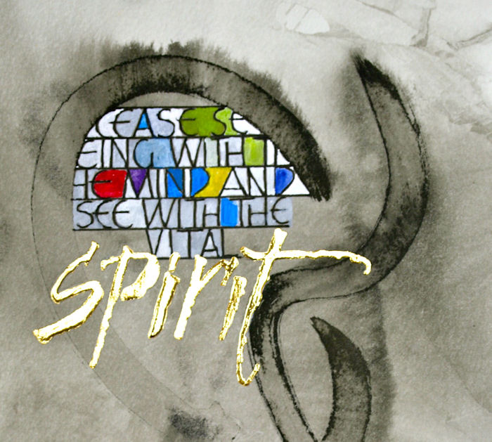
Week #16
This work was done by Sue Kinsey in 2010 in Tulsa for the third month's class "Illumination on Vellum". In her own words:
SPIRIT : This is done on Arches text wove with sink art previously done with sumi ink. I made several photocopies of the blank sink art page then made a transparency of the word “spirit” which was written loosely with a folded nib. Then I began to play with the positioning of the text as well as the word Spirit. The color is done in a combination of Dr. Martin’s bleedproof white, watercolor and colored pencil. The black lettering is done with Micron markers and “Spirit” in 24k gold.
The answers to most of your questions regarding PRIMITIVE TO MODERN can be found through the main page at the web www.reggieezell.com Reservations are now being taken for next years classes. You can also contact me directly at contactreggie@comcast.net or 773-202-8321 . There are now three slots left for cities for 2012. Thanks, Reggie
* * * * * * * * * *
Week #17
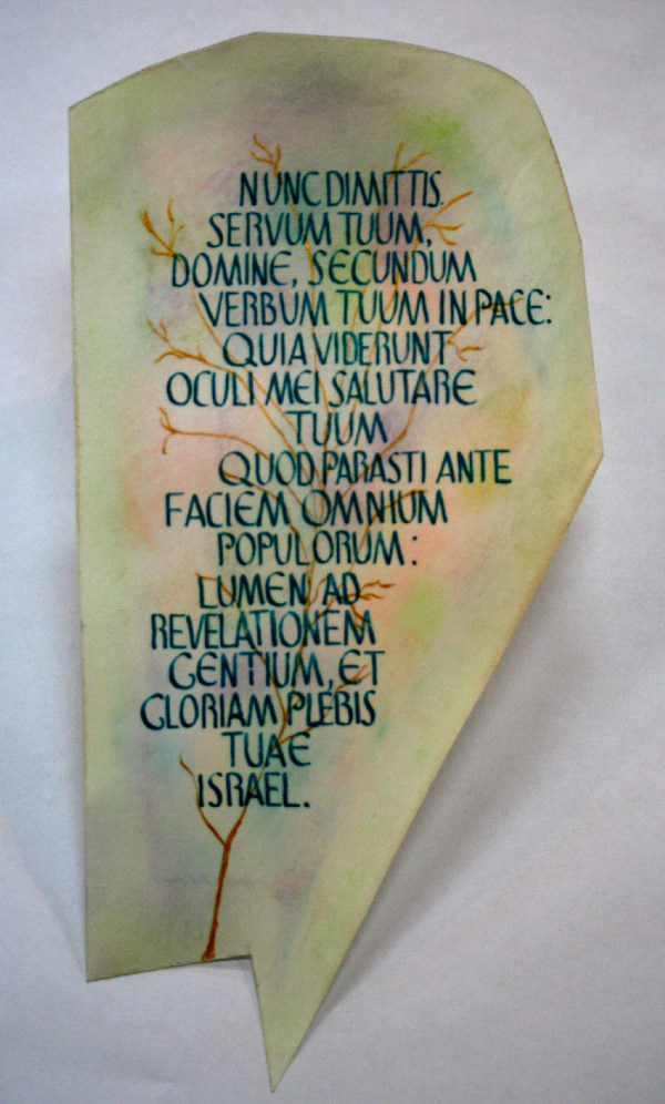
This work was done by Carmel Cucinotta Harmon in 2010 in New Orleans from the third month's class "Illumination on Vellum". In her own words:
This piece was inspired by a work done by Hazel Dolby in "Illuminating the Word".. (pg. 102). The quote is "Song of Simeon" from Luke 2:29-32. I decided to write in Latin for esthetic impact. The background is a rubbing of soft pastels using a cotton cloth. I spray fixed after applying the pastels and used a mixture of primary blue, primary yellow and white gouache to get the writing color. Used a #5 Mitchell nib. I tried to duplicate the hand done by Ms. Dolby. The gold tree was painted with Schmincke Gold. Work is done on vellum and measures 5" x 8".
I really like using soft pastels on vellum..they work so well together. Thank you Reggie.
Click on http://www.reggieezell.com/thepick/ The answers to most of your questions regarding PRIMITIVE TO MODERN can be found through the main page at the web www.reggieezell.com Reservations are now being taken for next years classes.You can also contact me directly at contactreggie@comcast.net or 773-202-8321 . There are now three slots left for cities for 2012. Thanks, Reggie
* * * * * * * * * *
Week #18
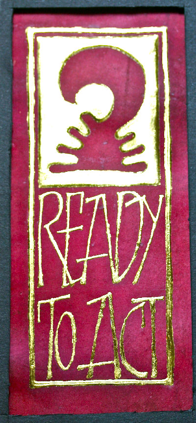
This piece was done by Jo Miller in New Orleans in 2010 for the fourth month's class "Primitive to Modern". In her own words:
This piece was created on the red vellum that Reggie provided for us in the third class. The 23kt patent gold was laid on top of a raised base created with a layer instacol over a layer of painters' gesso. We were to incorporate a symbol and text in a strong, bold and simple design. The symbol used here is an African symbol meaning "willingness to act". So often I talk of the things that need to be done but fall short of actually acting on those things. This piece is a reminder to me not to be a hearer only, but a doer. 3" x 7".
The answers to most of your questions regarding PRIMITIVE TO MODERN can be found through the main page at the web www.reggieezell.com Reservations are now being taken for next years classes.
You can also contact me directly at contactreggie@comcast.net or 773-202-8321 . There are now three slots left for cities for 2012. Thanks, Reggie
* * * * * * * * * *
Week #19
This work was done by Mary Lou Sherman in 2010 in Birmingham for the fourth month's class "Primitive to Modern". In her own words:
Lots of gold!!! I used yellow gold on this project. I wanted to see if I could gild a large area successfully. Using loose leaf gold was a bit of a challenge. Not as easy as the patent gold and I found that I wasted a lot. Once I learned how to handle the gold things went much smoother. It was a big learning experience. I first wrote my letters that I planned on gilding with a liquid mask. We had learned a Dick Beasley technique and I tried to duplicate it. I used watercolor to fill in the background and then lettered around the edge using a 'B' nib and an EF66 to enhance the lettering. I then used watercolor to color some of the negative spaces around the letters. I then lettered my poem. Lastly, the gold went on. Another fun project that Reggie had instigated for me. Thanks for all you do!!!
The answers to most of your questions regarding PRIMITIVE TO MODERN can be found through the main page at the web www.reggieezell.com Reservations are now being taken for next years classes. You can also contact me directly at contactreggie@comcast.net or 773-202-8321 . There are now three slots left for cities for 2012. Thanks, Reggie
* * * * * * * * * *
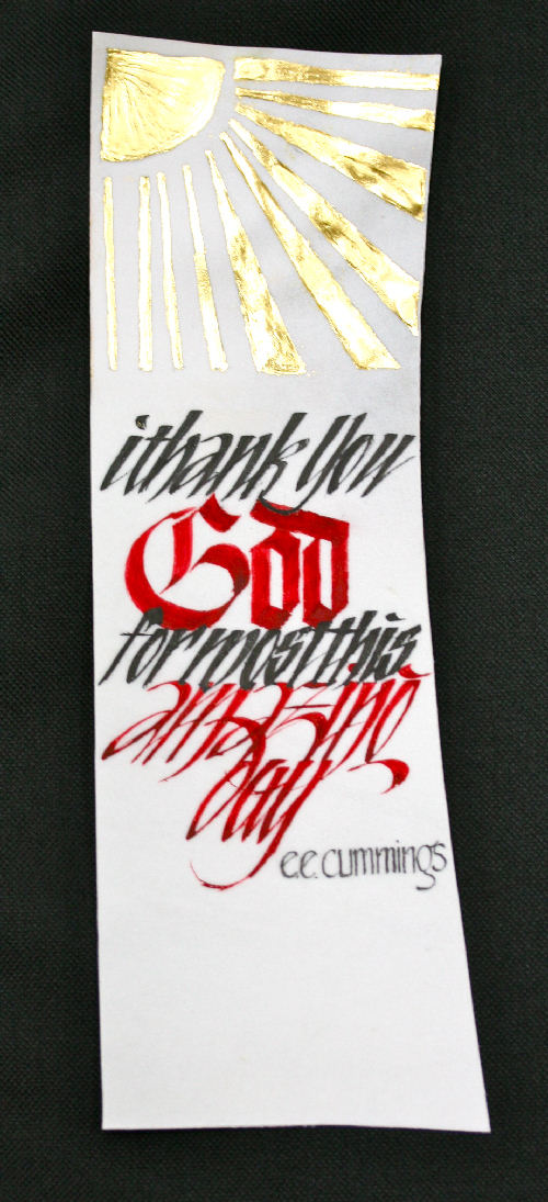
Week #20
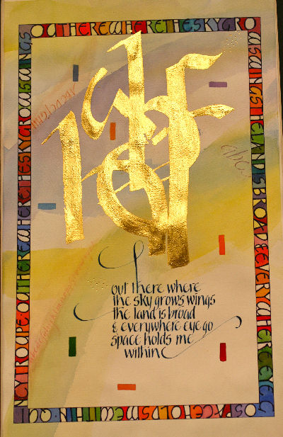
This work was done by Caroline Benediktson in 2010 in Tulsa in the second month's class "Writing on Vellum". I her own words:
Okay, for the e e cummings piece:
10.5" x 3.5 " patent gold, ink stick and gouache on vellum. Second month of course. The assignment was to integrate traditional and modernized Black letter variations in one piece with a symbol in gold on vellum. The symbol is a concoction from the Aztec sun symbol and a photo of sun radiants.
Click on http://www.reggieezell.com/thepick/ The answers to most of your questions regarding PRIMITIVE TO MODERN can be found through the main page at the web www.reggieezell.com Reservations are now being taken for next years classes. You can also contact me directly at contactreggie@comcast.net or 773-202-8321 . There are now three slots left for cities for 2012. Thanks, Reggie
* * * * * * * * * *
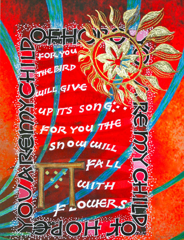
Week #21
I did this work last year. In part it was to be as an example of the project students would be doing in the fourth month's class "Primitive to Modern". The integration of the design elements were inspired by works of Dick Beasley. The sculpted gilding was inspired by Donald Jackson. The background was a watercolor wash that was manipulated in the computer and printed on watercolor paper, 9"x12", with archival pigmented inks. Other materials are gouaches, sum ink, color pencils and watercolors. For the gilding: acrylics, 24 kt and lemon golds, and shell gold that has been tooled into.
This Native American poem expresses the kind of hope you feel when a new soul comes into this world and you think,” Maybe this one will make a difference.”I calligraphed the entire poem twenty-six years ago for my son Garrett’s birth announcement. One quarter of a century removed from that first rendering, in this excerpt, I wanted to restate the hope and faith I feel because of my son’s presence on this earth.
The answers to most of your questions regarding PRIMITIVE TO MODERN can be found through the main page at the web www.reggieezell.com Reservations are now being taken for next year’s classes. You can also contact me atcontactreggie@contactreggie.net or 773-202-8321. There are now three slots left for cities for 2012. Thanks, Reggie
* * * * * * * * * *
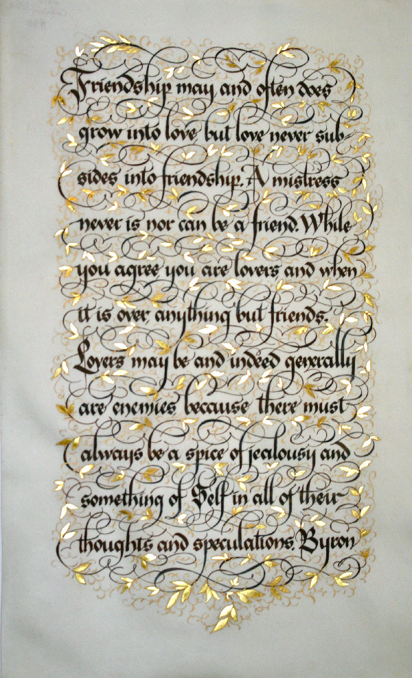
Week #22
This work was done by Maria-Helena Hoksch in 2010 in New Orleans. In her own words...
Love and Friendship
10"x16", walnut ink, gouache, watercolor and gold leaf on calfskin vellum
I made this piece for the last of Reggie's classes, at the end of the year. It's creation was somewhat triggered by the great manuscript book Mira Calligraphiae Monumenta, one of my great inspirations over last year. I mean, whenever you run out of ideas or feeling uninspired, just look in that book. The Gothicized Italic used by me here is almost as wide as batarde, rather hard to space as you can see from a few spacing errors. I decided to combine it with some pointed pen flourishes (which is really my everyday work with my everyday tool). Some planning went into the flourishes first, but later I just kept adding them, making sure I am creating an even fabric of them that eventually formed a background for the lettering, without overpowering it. The gilded leaves were added next, and then some more pointed pen work in golden watercolor to define the leaves. The golden watercolor creates like a "fog" around the flourishes and further emphasizes the "woven fabric" look, something I did not plan, rather discovered. The vellum I used is really fine and transparent so it makes the whole piece glow, something you cannot really get from paper. I felt that using any color would have been too much....
The answers to most of your questions regarding PRIMITIVE TO MODERN can be found through the main page at the web www.reggieezell.com Reservations are now being taken for next years classes. You can also contact me directly at contactreggie@comcast.net or 773-202-8321 . There are now three slots left for cities for 2012. Thanks, Reggie
* * * * * * * * * * *
Week #23
This work was done by Judy Bilbury in 2010 in Birmingham for the fifth month's class DESIGN, Deconstructing the Grid". In her own words:
I was in the "Who Dat" city of New Orleans for the fifth month's work of P2M. Looking back, I can see many parallels.
We selected a "canvas" of distorted and broken color patterns. Next, we chose a written goal for the outcome. Using a lot of imagination to envision this goal (enhanced with a little creative manipulation), we carved a design--arranged, re-arranged, and re-built it--to provide a lovely and inspiring work, that represented the original goal.
Tools used: Mohawk 11x17 copy paper, exacto knife, repositioning pad, hot foil pen, colored pencils, "pop-dots", and Photoshop.
Lettering was done in a variation of Romans using a B3 nib and a micron pen.
What a great experience!......TKS, Reggie, for sharing this technique.
The answers to most of your questions regarding PRIMITIVE TO MODERN can be found through the main page at the web www.reggieezell.com Reservations are now being taken for next years classes. You can also contact me directly at contactreggie@comcast.net or 773-202-8321 . There are now three slots left for cities for 2012. Thanks, Reggie
* * * * * * *
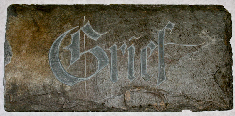
Week #24
This work was done in the Boston class this year by Karin Sprague for the first month class "Modernizing a Traditional Calligraphic Hand: Blackletter".
In her own words:
A 200 year old piece of roof slate clipped to 9" X 4 1/2". Lettering drawn on paper using a C-O nib. Transferred to the slate using Saral.
Hand carved using a mallet and chisel. Grief is a human experience that I have been called to minister to. Compassionately designing and hand carving gravestones for families across the United States is how I spend my days when not taking bliss filled classes with Reggie Ezell. www.karinsprague.com Karin Sprague Stone Carvers, LLC 904 Tourtellot Hill Rd. N. Scituate, R 02857 USA ph: 401-934-3105 fax: 401-934-3106
The answers to most of your questions regarding PRIMITIVE TO MODERN can be found through the main page at the web www.reggieezell.com Reservations are now being taken for next years classes. You can also contact me directly at contactreggie@comcast.net or 773-202-8321 . There are now three slots left for cities for 2012. Thanks, Reggie
* * * * * * * *
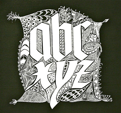
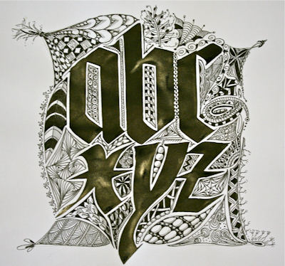
Week #25
This work was done this year in the Boston class by Jan Boyd for the first month class "Modernizing a Traditional Calligraphic Hand: Blackletter". In her own words:
These two pieces were produced as homework after the first Primitive to Modern class. With an automatic pen and Moon Palace Sumi I did the letters in two variations of Gothic font. Then I added Zentangle design work all around with a Micron .01, shading with pencil, to frame the letters. I find that the "one stroke at a time" relaxation/meditation of zentangle is a wonderful way to illuminate pieces and yields unexpected results every time. I then scanned in the finished piece and inverted it in Photoshop. Voila! Two finished pieces!!
The answers to most of your questions regarding PRIMITIVE TO MODERN can be found through the main page at the web www.reggieezell.com Reservations are now being taken for next years classes. You can also contact me directly at contactreggie@comcast.net or 773-202-8321 . There are now three slots left for cities for 2012. Thanks, Reggie
* * * * * * * * *
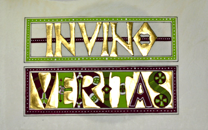
Week #26
This work was done by Sue Kinsey in Tulsa in 2010 for the third month's class "Illumination on Vellum". In her own words:
For #2974, In Vino Veritas: This piece is about 5 x 8 inches and done in the style of the codex aureus. I used the letter designs from the manuscript pictures but wanted more updated colors. I thought the purple and green colors worked well for the quote: In Wine there is Truth. I first did the letter design on grid paper, then I photocopied it and played with the color scheme using colored pencils. The work was tedious but fun to do! This is done in gouache and 24k gold on vellum.
The answers to most of your questions regarding PRIMITIVE TO MODERN can be found through the main page at the web www.reggieezell.com Reservations are now being taken for next years classes. You can also contact me directly at contactreggie@comcast.net or 773-202-8321 . There are now three slots left for cities for 2012. Thanks, Reggie
* * * * * * * * * *
Week #27
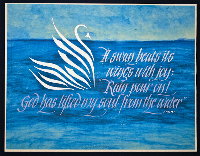
This work was done in the Boston class this year by Nita Padamsee for the first month class "Modernizing a Traditional Calligraphic Hand: Blackletter".
In her own words:
This piece was done for the 'Primitive to Modern' workshop, 2011 in Massachusetts. It was one of three pieces for Month 1 Homework: Black letter Variations. This one being for the modernized variation for Black letter. I have always been terrified of using watercolor with a brush, so I thought I'd do it with a twist! For the back ground I used the Neocolor water color crayons on hot press Strathmore water color paper. I used baby wipes to spread the color across the page, not a brush! (thanks to YouTube). It was like going back to kindergarten all over again, lots of fun!! As Reggie suggested, I copied the background on Arches text wove on my home ink jet printer. I then sprayed it with spray fixative. For the letters I used a combination of P H Martin's bleed proof white, W & N white gouache & a dash of W & N ultramarine & cadmium red. The letters are done with a speedball C3 nib. The swan is done in Schmincke silver gouache.
The answers to most of your questions regarding PRIMITIVE TO MODERN can be found through the main page at the web www.reggieezell.com Reservations are now being taken for next years classes. You can also contact me directly at contactreggie@comcast.net or 773-202-8321 . There are now three slots left for cities for 2012. Thanks, Reggie
* * * * * * * * * *
Week #28
This work was done by Lois Rossiter this year in the Boston class for the frost month class "Modernizing a Traditional Calligraphic Hand: Blackletter".
In her own words:
Black letter with ProWhite on black Canson MiTientes; center counters and surrounding spaces cut away Paste paper in background, lettering with gel marker
Prismacolor pencil Among other influences, Sr Corita Kent, artist and teacher, guides my own seeing, making and teaching. In this quote she says, "We are accustomed to looking at objects. We need to become accustomed to seeing spaces between and around objects as if they too were solid." 12" x 12"
The answers to most of your questions regarding PRIMITIVE TO MODERN can be found through the main page at the web www.reggieezell.com Reservations are now being taken for next years classes. You can also contact me directly at contactreggie@comcast.net or 773-202-8321 .
There are now two slots left for cities for 2012. Thanks, Reggie

* * * * * * * * * * * * *
Week #29
This work was done by Dave Flattery this year in Boston for the first month class "Modernizing a Traditional Calligraphic Hand: Blackletter".
In his own words:
This work is cut from gray Fabriano paper. It is 16" x 17" . I started out with a Coit 3/8 inch pen. I then traced over those letters adding swells and waists. Next I tried to arrange the words in lines. The problem area was "another" above "till" because of the ascenders. I tried many times but each time came up with a bad spot. When I would start over I always started from the top again. When I got to the problem spot and tried to fix it the dominoe affect would mess up everything I did above it. It took me a bunch of tries before thinking of starting with "the problem area" and working outward.
The answers to most of your questions regarding PRIMITIVE TO MODERN can be found through the main page at the web www.reggieezell.com Reservations are now being taken for next years classes. You can also contact me directly at contactreggie@comcast.net or 773-202-8321 . There is now ONE slot left for cities for 2012. Thanks, Reggie
* * * * * * * * * *
Week #30
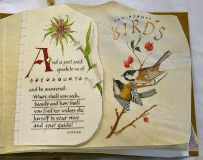
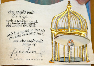
This work was done by Jan Boyd in Boston this year for the second session, "Writing on Vellum". In her own words:
These pages are part of a little book (approx 6.5"x8") I created for homework in Class 3, Primitive to Modern. Working on vellum off cuts, I used gouache, Moon Palace sumi, gold leaf and Spectralite gold. The finished book has 7 pages, all poems or quotations about different types of birds. The first page is actually two pieces of vellum hand-sewn together to give the title page some depth and to use a small off-cut that otherwise would have been too small for the book. I painted the edge of the small piece very lightly with gouache, to give it further dimension. The second page shown here is actually two as well. The vellum off cut I used for the Maya Angelou quote had a natural oval hole in it, around which I created a gilded cage, with a bird inside. On the following page, the bird is free, on a branch with another bird in a winter landscape.
The answers to most of your questions regarding PRIMITIVE TO MODERN can be found through the main page at the web www.reggieezell.com Reservations are now being taken for next years classes. You can also contact me directly at contactreggie@comcast.net or 773-202-8321 . There snow ONE slot left for cities for 2012. Thanks, Reggie
* * * * * * * * * *
Week #31
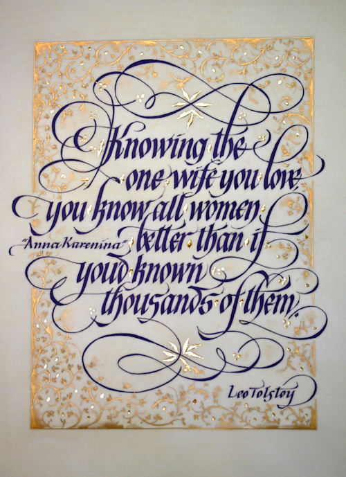
This work was done by Maria-Helena Hoksch in New Orleans in 2010 for the third month's class
"Illumination on Vellum". In her own words
Woman you Love
Approx 13"x10" gouache on calfskin vellum, speedball and pointed nibs,
gold leaf, Japanese watercolor.
This is my try at slanted Gothisized Italic, and working on vellum.
The quote is pulled from book I read at that time. I labored over this
layout like crazy!!! And wouldn't you know it, if you give so much,
you do not end up entirely happy. I ended up learning that simpler is
better, that I rather like simple layouts, and let the letterforms
speak. Not here. I added a lot of frills. And then some more. All the
letter-flourishes are carefully planned end drawn. I also learned that
purple and gold is not my favorite combination. I will end up giving
this piece to my first close friend or relative who wants it, heaven
knows, they have been asking me for some artwork for years, and I have
had nothing to give. All in all, I learned a lot with this piece, and
it may just end up someone's favorite...
The answers to most of your questions regarding PRIMITIVE TO MODERN can be found through the main page at the web www.reggieezell.com
Reservations are now being taken for next years classes.
You can also contact me directly at contactreggie@comcast.net or 773-202-8321 . There is now ONE slot left for cities for 2012. Thanks, Reggie
* * * * * * * * * * *
Week #32
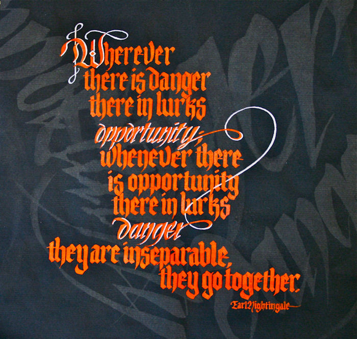
This work was done this year in the Boston class by Claire Griffin for the first month class "Modernizing a Traditional Calligraphic Hand: Blackletter".
In her own words:
The assignment was from the Boston 2011 Primitive to Modern class. The object was to use a classic gothic letter and a modernized version (I chose cursive gothic) for this project. I went home found a quote that seemed appropriate, "Wherever there is danger there in lurks opportunity; whenever there is opportunity there in lurks danger. They are inseparable, they go together."Earl Nightingale
Then I went a little crazy and pulled out a few pieces of black canson charcoal paper, used bleach and a large flat brush to write "danger" and "opportunity" in the cursive gothic. After rinsing the papers and letting them dry I found the pattern that most appealed to me and would work with the lettering. On tracing paper I played with layouts using the quote in different ways. When I found the layout I liked, I used W/N Cadmium Red gouache and a speedball C1 nib to do the quote. I highlighted the key words by using the cursive gothic and added an outline of white, which also acted as a ribbon of sorts that connected the 2 words, illustrating the message of the quote.
The answers to most of your questions regarding PRIMITIVE TO MODERN can be found through the main page at the web www.reggieezell.com Reservations are now being taken for next years classes. You can also contact me directly at contactreggie@comcast.net or 773-202-8321 . There is now ONE slot left for cities for 2012. Thanks, Reggie
* * * * * * * * * * * * *
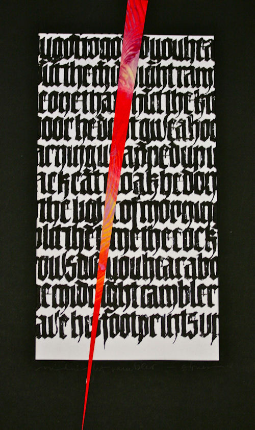
Week #33
This piece was done by Lois Rossiter in Boston from the first month's session "Blackletter: Modernizing a Traditional Calligraphic Hand". In her own words:
Black letter with Moon Palace Sumi on a cotton paper. Paste paper 'dagger'. I was listening to the Rolling Stones while on the treadmill and "Midnight Rambler" provided the incentive to keep moving and the inspiration to get lettering. The rambling lyrics represent the beat and the paste paper " knife right down your throat" is the counterpoint. 18" x 24"
The answers to most of your questions regarding PRIMITIVE TO MODERN can be found through the main page at the web www.reggieezell.com Reservations are now being taken for next years classes. You can also contact me directly at contactreggie@comcast.net or 773-202-8321 . There is now ONE slot left for cities for 2012. Thanks, Reggie
* * * * * * * * * * * *
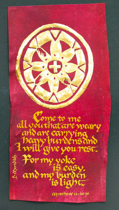
Week #34
This work was done by Louise Meredith in Birmingham for the fourth month's session "Primitive to Modern". In her own words:
Brazilwood Dyed Vellum Project
Reggie gave us a prize by handing out already prepared and dyed vellum. At least three processes were eliminated in preparing the calligraphic project. But then, the instructions, "find a symbol to transfer on the skin and gild it." That step took several sittings. A symbol, object or letter needs to be fine-tuned so much in order for the gilding to be successful. In planning you can ink in the symbol on a piece of paper to determine what problems you will be encountering on the skin, considering being able to keep interior areas "clean". This symbol has been one of my most successful gilding experiences. The fish symbols and cross are of course strong Christian images. The wine-colored vellum and a biblical quote seemed to fit. I found the quote after I decided on the symbol. I used a quote that was too long for the space (4x7) but crowded it all in (good texture-right?). I was surprised that a yellow stick ink did not work (too light, faded into the wine color) I used Saiboku stick ink, ochre. I used a gothic style and a Mitchell #4 nib, 23k patent gold leaf. Quote is Matthew 11: 28-30. Louise Meredith
The answers to most of your questions regarding PRIMITIVE TO MODERN can be found through the main page at the web www.reggieezell.com Reservations are now being taken for next years classes. You can also contact me directly at contactreggie@comcast.net or 773-202-8321 . There is now ONE slot left for cities for 2012. Thanks, Reggie
* * * * * * * * * *
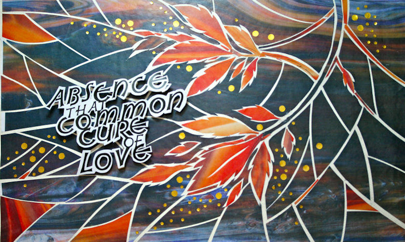
Week #35
This work was done by Maria-Helena Hoksch in New Orleans in 2010 in the
fifth month's class, "DESIGN: Deconstructing the Grid". In her own words:
Leaves of Absence
Approx 11"x18"
This piece was entirely done in the second to last class, during two
day weekend. Cutting paper to pieces and putting it back together is
not what I normally would do, so it was a mental challenge first. I
was surprised how much of a push it was for me visually and color-wise
as I normally do not use such strong colors. It was also interesting
to create a piece of which lettering is not a focal point, not a
center of design. It was the most fascinating to look around in the
class at other's work as everyone was creating such strong, different
pieces! I will personally not do a piece like that again, as I am a
big fan of traditional calligraphy work, but thanks, Reggie, for
pushing me for something so out of my character. Amazing experience
with calligraphy, crafting skills and color!!!
The answers to most of your questions regarding PRIMITIVE TO MODERN can be found through the main page at the web www.reggieezell.com Reservations are now being taken for next years classes. You can also contact me directly at contactreggie@comcast.net or 773-202-8321 . There is now ONE slot left for cities for 2012. Thanks, Reggie
* * * * * * * * * *
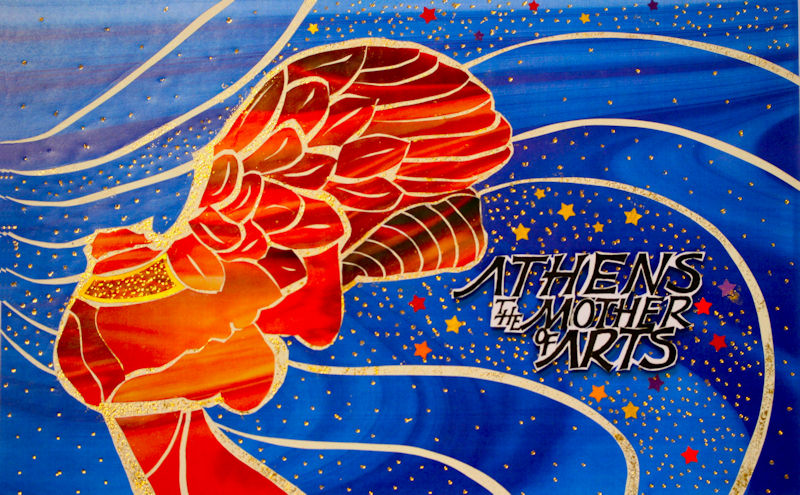
Week #36
This work was done by Caroline Benedictson in Tulsa in 2010 in the fifth month's class of the year. In her own words:
Month 5: Design: Abstraction/Fragmentation; Lines; Simple Images
Before the weekend, I checked out the examples on the website. I focused on the
fabulous geometric" designs" created with the white lines and was unable to come up
with any ideas for a design. I decided to look at Greek images for an idea. The Winged
Nike of Samothrace is a very interesting and elegant symbol. The quote was easy:
Athens the Mother of Arts.
Reggie was staying with us, so I showed him my plan the evening before our first class.
He rolled his eyes and told me it was too much detail. I ignored him and the "simple
images" instruction and took the challenge.
The lettering was a breeze.
Then I fragmented the wings and the rest of the image. I had little pieces of "wing" all
over the table and no idea how to put them back together. Reggie patiently worked me
through it. Gold dots were mandatory and the stars and breezy swashes had the
Winged Nike flying. While "dotting" the sky I accidentally placed a piece of used up
gold paper on a white swash. The gold flakes looked different so I continued to press
gold flakes on the white areas.
Thank you for your patience Reggie.
Materials: collage from color prints manipulated in computer, sumi ink, metal nibs,
watercolor paper, gold foil, color confetti. 12" x 18"
* * * * * * *
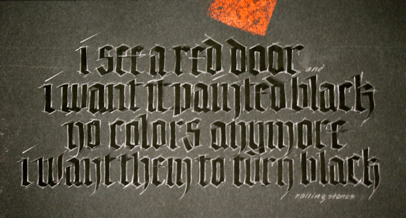
Week #37
This work was done by Lois Rossiter in Boston this year for the first month's session, "Blackletter: Modernizing a Traditional Calligraphic Hand".
Black letter with black gouache on black Canson MiTientes, graphite pencil, red Prismacolor Art Stix. What color is black letter? The Rolling Stones think it's "Painted Black". 14" x 20"
* * * * * * * * * *
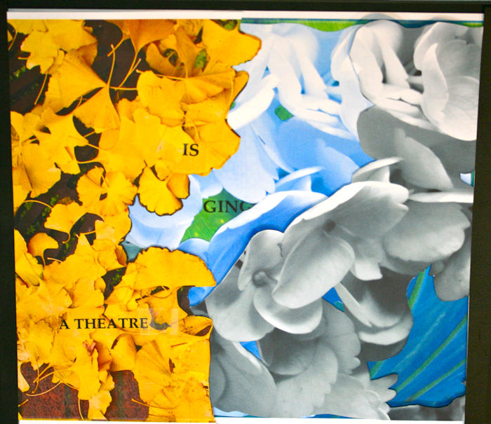
Week #38
This work was done by Eugenia Uhl from New Orleans in 2010 in the final session of the year, "Experiencing the Book as a New Structure".
In her own words:
I'm a photographer, so I took some close up photographs of flowers and plants and things that reflected
light around my house and in my garden. I printed them out with my printer on to vellum, mohawk and photo paper. Some I also xeroxed in
color and B&W for variety. I let that imagery and the colors of it guide me through creating my book. My intent was to reveal a garden,
much like when you walk through one and little flowers surprise you here and there and the textures of the garden are revealed slowly and
there's something new everywhere you look. Images presented approx. 11 x12. Materials: collage with transparencies, papers, and three dimensional covers.
* * * * * * * * * * *
Week #39
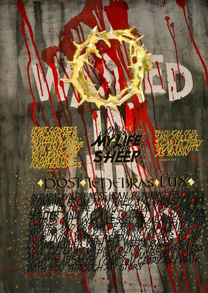
This work was done this year by Barbara Mitchell in the Course in Atlanta. In her own words:
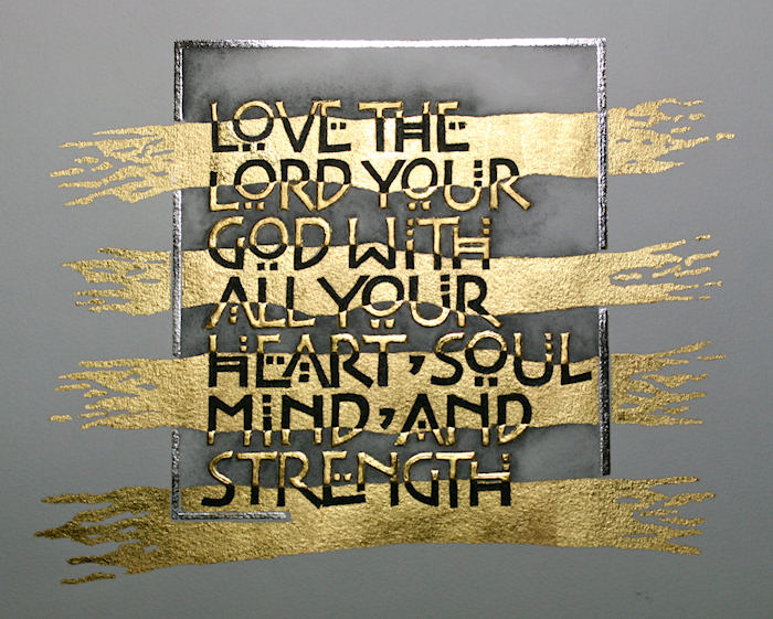
When charged by Reggie to do homework for someone I love, I decided to do the piece I had bouncing around in my head for quite some time. I wanted it to speak-and tell of my gratitude for what Christ did for me.
I first wrote the words Washed in His Blood with a large coit pen. I cut the words out and masked them onto a full sheet of arches 140 lb. hot press watercolor paper. Next came the diminishing contrast background watercolor wash with W/N ivory black. Then using 3 colors of red W/N watercolor I drizzled and splattered. Then the crown, drawn and built up for dimension with many layers of instacol--letting each layer dry completely before applying another. I then gilded it with 23 patent gold. W/N gold gouache was used to write the scriptures, using the Racous lettering. Using the uncial lettering, I wrote Post Tenebras Lux (Latin for After Darkness Light) with a broad edge nib in black gouache. This is the name of the poem I wrote below it. I love the layering procedure taught by Reggie, enabling one to convey multiple thoughts on a single sheet of paper.. Thank You Reggie!
* * * * * * * * * * *
Week #40
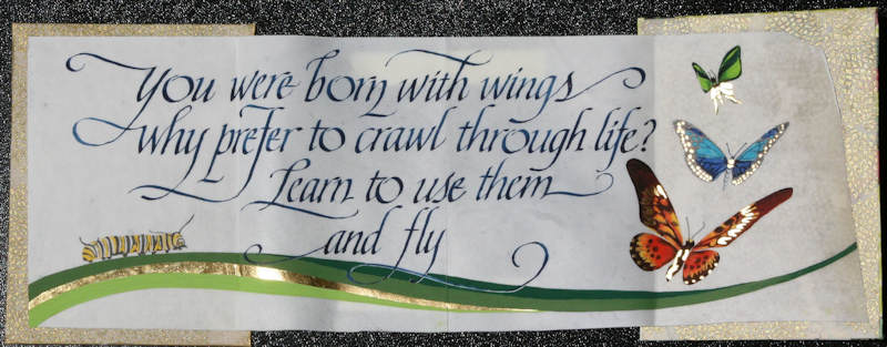
This work was done by Nita Padamsee in Boston for the third month's class "Illumination on Vellum". In her own words:
"I love this class as it pushes me to try new things. In this assignment we needed to use word & image to get our message across.
This was my first accordion book I made with vellum. A little scary, as the folding was done after the calligraphy & drawing.
Yes, please spray your work with fixative before you decide to fold vellum that has gouache or watercolor.
On YouTube, I learnt how to cover a book board by using a combination of PVA glue & methylcellulose!
I used W&N gouache for the calligraphy & the butterflies. The gold is done with 23K patent gold."
* * * * * * * * * *
Week #41
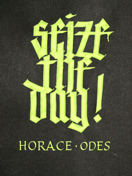
This work was done by Lydia Batten this year in Boston for the first month's session, "Modernizing a Traditional Calligraphic Hand: Blackletter". In her own words:
Let’s start with my thoughts behind the piece… prior to this I had spent at least two weeks making pretty intricate bookmarks to give to my upper level Latin students as departing gifts with the ‘carpe diem’ words from the original poem by Horace hand lettered on them (as well as the last two lines from the ode in which these key words appear, AND a translation!). I have been doing this for the past three years. After all the time I spent on making each individual book mark—each was done by hand, no prints—I needed to ‘de-stress’, let’s say, or just break away from the ‘close’ layout I had been dealing with. Whereas all the work on the bookmark had been very small, I felt the need to GO BIG! And I had all this interesting bright groovin’ green color left over, which had such a yummy texture... (I think it was a mix of Twink H2O Key Lime green, Turner fluorescent green gouache, Dr. Martin’s Bleed Proof White, and probably a yellow of some kind, though, honestly I can’t really remember… I love playing with color mixing and this was just another concoction, a ‘melange’ that came out really great—they don’t always! I will probably never get that same exact green ever again…)
So I grabbed the 5/16” Horizon brass nib I’d bought at Odyssey last year, calling to me from my pen container, and began! And that bright green color I had mixed sang its siren song too. I had used up all the dark blue paper for the bookmarks, so I took out a sheet of the Strathmore Artagain black paper (9 x 12 pad) and after drawing the spacing lines with the Fons & Porter White pencil, just started lettering. I had done some other smaller variations of the words (both Latin and English) on other pieces of scrap and this was the ‘advanced attempt’ to get the gothic really compressed and tight on a large scale, and still retain some legibility! The green was so lush and it just pooled, especially at the bottom of the down strokes (my writing table is at a slight slant), and I just left it to see what it would like once dry, and then if necessary I’d go back and go over them again. But honestly, I liked the effect the pooling of the color had on the overall presentation so I left it. The attribution to Horace at the bottom in Roman caps I did with a Tape 1 (or was it a Mitchell 4??? I didn’t write it down).
In the past, I had not particularly liked doing black letter/gothic—but this time around, with the emphasis on pushing the limits in this class, I am having a really great time with it! So, this was a way to ‘enjoy’ the gothic lettering, use the large nib (again, something I don’t normally use), and that groovin’ green.
* * * * * * * * *
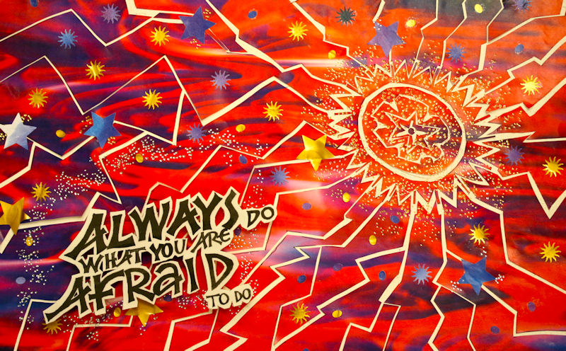
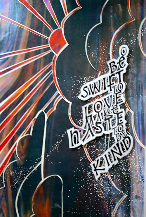
Week #42
This work was done in 2010 by Petrea Tomko in New Orleans for the fifth month's class "Deconstructing the Grid". In her own words:
Immediately I knew which quote would be my choice in the “Deconstructing the Grid” class in Reggie’s P2M 5thmonth. “Kindness” permeated themes of quotes grabbing my heart and my life that entire year. Immediately I also knew I would do a flush right layout of the words, a layout to which I am frequently drawn. How the flush right ended up on a gentle curve is anybody’s guess, but I believe the letters themselves dictated it once I cut them out.
Marrying image to text remains one of the most challenging aspects of this art form that I continually face. I fight stating the obvious, fearful of falling into the pit of being trite. Here is a really good of example of this weakness of mine. They – a bold sunset as image and a quote on kindness as word - really have nothing to do with one another. I give myself a little grace and chalk it up to “workshop”. (That only carries one so far when you look around and see the masterpieces others are so magnificently creating!)
I seem to recall my color choice being driven by my love of red, but I knew I didn’t want it all warm tones, so to balance it the dark purples and blues seemed an obvious solution. Silly as this sounds, a spectacular sunset through disturbing dark thunderheads while driving into New Orleans the night before was an image I couldn’t shake all the next morning, so that is the only explanation I have for the choice of sunset. To me, the text and the image compete way too much.
What I do love about it is the orientation of the image and the text. If you rotate the piece 90 degrees clockwise, you’ll see the way it was originally with the text in the bottom left corner. It fit well there, but just seemed boring. I just said what the heck and turned it. Voila. I had what I wanted. The new orientation was disturbing to a lot of folks in the class, and several suggested I turn it back. What can I say? I just couldn’t! Ultimately, I think Reggie and I were the only ones who really liked it that way.
The foil pen which at first I thought would be extraneous I now find to be essential. Kudos, Reggie. You SO know how to gently lead us. Thanks for your kindness all year long. What a gift.
* * * * * * * * * *
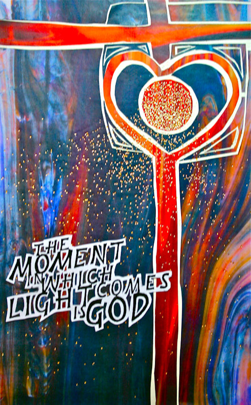
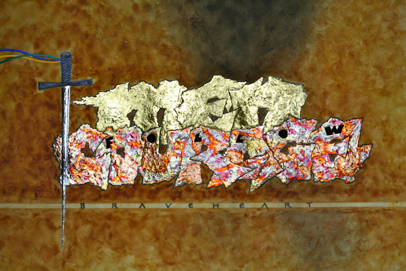
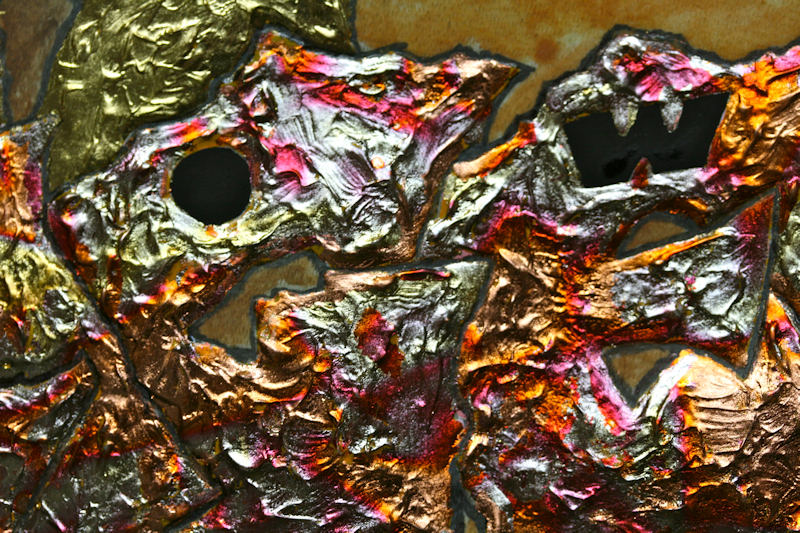
Week #43
This is a work I did for my son Garrett this year. In a brief quote from the film Braveheart; William Wallace's response to Robert the Bruce (1305 A.D.): "Men don't follow titles. Men follow courage."
Watercolors, sumi ink, acrylics, 24 kt. gold leaf, pure pallidium leaf, variegated leaf, on deerskin parchment, 12" X 18". This piece exemplifies some of the modern design/techniques presented in the third month of the course, "Illumination on Vellum".
* * * * * * * * * *
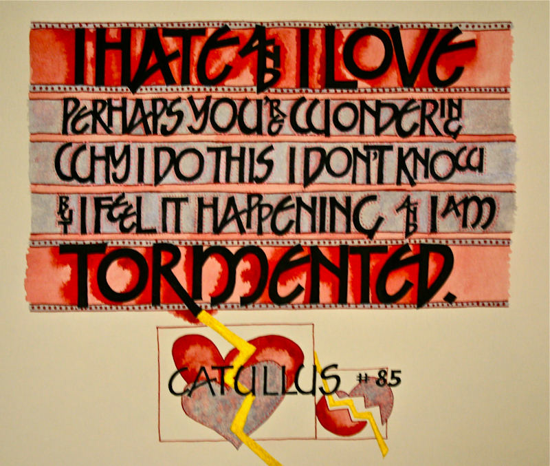
Week #44
These works were done by Lydia Batten this year in the Boston class, for the fourth month's "Primitive to Modern". In her own words:
I thought this poem was short enough text to tackle with these great built up B-bomb letters! J (Rude awakening there!) I had never really enjoyed the B-nib much before, even though a calli-pal of mine has such fun with it. So, this new exposure in class was a means to try them out again. I have a collection of all sizes of the nibs and took out the big one and began to play… I liked the boldness of the big thick strokes and thought it evoked the message of the really important words at the beginning and end of the poem.
The sequence of things: (pretty much…)
Keeping the concept of the GRID in mind, this is what evolved:
· The B-1 nib, randomly chose 1” x-height for the large letters. I used a mixture of Moon Palace Sumi ink and WN Jet Black + Glair blend ( a tip for a good strong black I got from Suzanne Moore, former teacher and mentor), and even then I went over the letters with a second coat to really get them BLACK.
· I had some diploma parchment lying around and decided that would be the paper to use (I am determined to use up all that unused paper). I did not alter the size… I went with what I found.
· I did preliminary layouts on bond paper, created a model of the whole thing on a piece of Strathmore charcoal, and tried out everything there first before I did it on the final piece. And had a piece of the parchment lying around also for quick tests…
· The smaller text in between the first and last lines I did with a B-5 nib. Again, double-inked and then built up,
· To go with the ‘grid’ assignment, I had to add color to the negative spaces… chose RED, since it evokes the earlier works we looked at, and was the right color for this poem—the passion of love, especially those powerhouse words at beginning and end… The red was a combo of WN Cad Red + the WN Red Ochre gouaches (what was recommended to buy to get close to the Cad Red Deep no longer available). I decided to water down the red considerably after seeing its intensity on the model.
o And that’s where the inspiration came in… As I was painting in the negative space with the watered down red, I wondered what would happen if I dropped in some of the thicker red in a wet-on-wet technique to create the ‘shadow’ lines (I have been studying watercolor here and there recently, and I love that technique, and on my model all the shadow lines I tried out with white, gold, etc. just didn’t seem to add to the letters. So, I had two small brushes going at the same time, one with the watered red and then another to drop in the darker red while still wet and letting it ‘bleed’. I have to say, that was REALLY fun to see what happened (and time consuming). And the black never really moved because of the combo mix. (I did not spray a fixative as I should have… oops).
· The gray color was a mixture of Dr. Martin’s Ph White, some white iridescent gouache and Sumi/Gou. Mix (it was hard to see the iridescence in the Latin piece, but it showed up more in the English version, because I did not take the time, as I should have, to match the colors up better). As I applied the gray color, again, while wet, this time I dropped in the watered down red to create ‘shadow’ texture.
· After I did all the coloring in, I added the grid lines with the Ball nib that you gave us, and then put the red dots around the smaller writing to ‘fill’ them out a bit (I used the Schminke Red Perle Gouache that is ancient…)
· The hearts actually came from one of those religious books you recommended with the copyright free Christian images (it’s almost blasphemous, since this poem is so NOT Christian!) which I adapted slightly. I wanted to use gold in the piece and since I had only used the diploma parchment didn’t want to use real gold on that ‘cheap’ paper, so I used the Schminke Gold Perle (again, I’ve had it forever—most of the glycerin is gone and I’ve had to cut open the tube to get the gouache out of it). It felt like a lightning bolt slashing through the two hearts (representing his two very different feelings, and the torment created) was appropriate, especially coming off the R which broke the grid and descended below the x-height…
· When I put his name at the bottom, even though I’d done it on the model, for some reason it came out a little off center, so I decided to add the poem number in Roman numerals (that’s how they are grouped—no names given to them), and add a smaller version of the hearts to balance it all out.
Once I finished the Latin one, it was 4th of July, and an ensuing month filled with so much activity! I walked away from it, and never got back to do the English version until August… I wanted to keep the format the same, and try to write the English in the same order as the words appear in Latin so those who are not familiar can follow along easily enough and make connections between the words—even the conjunctions were written in the same way (small and vertically). The problem was there was much more to the English than the Latin so I had to be much more creative about getting all the text on each line. I have to admit that was fun working through those ‘sticky’ places on the model and then seeing it all come together on the final piece.
The diploma parchment I used for the English piece did not cooperate nearly as much as the first one had… I don’t know if it was from a different batch, or if I used the other side, or if it was more humid ( I try to keep the dehumidifier going non-stop to prevent that, since my studio is in my basement on the sunny side with lots of windows, but even so, it’s the basement and we had an extremely wet summer). Whatever the reason, the bleeds did not occur as nicely, and the gray was much darker. Other than that, the layout went well (though if you look closely, I did goof on the interlinear spacing on the second one, and didn’t realize it until I was too far into it to want to start over). And I flipped the lightning bolt to come off a different letter on the bottom line (which also broke the grid) and go in the other direction…
* * * * * * *
Week #45
This work was done by Carolyn Lueders in Boston this year for the fourth month's class "Primitive to Modern". In her own words:
Initially, I was searching for a mandala image to copy for this assignment.
After looking at hundreds of examples - none satisfactory - I struck out on my own and this is what ended up appearing at the end of my pen. Transferred the image and text with Saral, then a layer of gesso and a few layers of instacoll. Next time I gild something, I will adjust the amount of instacoll up a notch, as this project showed me that thin coats is not the way to go. I wanted the image to be puffier and smoother, but was afraid it would pucker, so I was more conservative than I needed to be. Gilding the two halves was a major pain. I had to mask off the side that was not being gilded with a piece of glassine cut to the exact shape. Then repeat for the other half. It did not help that it was about 3am the morning of a Reggie class! Still need to clean up some of the edges and outlines.
I LOVE THESE NEUGEBAUER LETTERS! Most of the time spent on this project was devoted to determining size and layout. Many, many renderings considered and tossed, all of it completely enjoyable. Some of the spontaneity I adore about this hand was sacrificed in order to ensure the text was centered.
Gold Leaf, Palladium Leaf, gold and silver Schmincke gouaches, ball-pointed nib.
Approximately 3" x 8”.
* * * * * * * * * * *
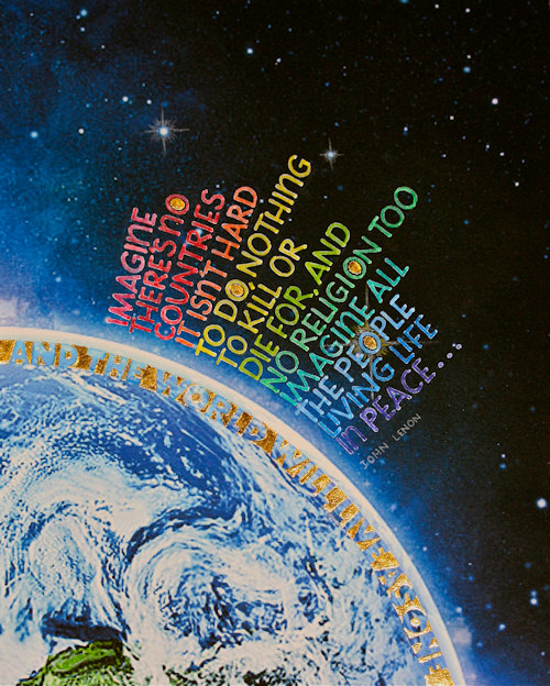
Week #46
This work was done by Nita Padamsee in Boston this year for the fourth month's class "Primitive to Modern". In her own words:
As global headlines become macabre on a daily basis, it is refreshing to revisit John Lennon's vision that he held
for the world in the 1970s. This was the inspiration for my 4th week's assignment.
The background is a copyright free image from Google images, which I didn't further enhance.
I printed the image on my home inkjet printer on Arches Text Wove and sprayed it with workable fixative before writing on it. The calligraphy is done with a speedball B-nib with a combination of
Dr. Martin's bleed proof white and white W & N gouache. This combination seems to be more opaque than using the two by themselves. Purposefully, I didn't 'square off the edges' of the letters to implement the rounded type styles of the seventies. Also in the 70s, use of the rainbow was very common. In order to touch upon that, I used colored pencils to go over the white letters ever so lightly.
Since the use of gold or any other metal was a requirement for this piece, I designed the arch using gold for the negative space of the lyrics,
"THE WORLD WILL LIVE AS ONE," in hopes that this embedded truth will one day manifest as reality.
* * * * * * * * * * *
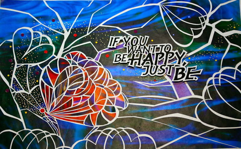
Week #47
This work was done by Claire Griffin in Boston for the fifth month's class "DESIGN: Deconstructing the Grid" In her own words:
When I first saw the samples for this project that were created by Reggie and past students I have to admit I was very intimidated. The prospect of using an exacto knife and glue more than a calligraphy nib for this piece was daunting. Even more so was the thought that the finished product was actually going to be a computer enhanced photographic image. But as I have learned in past classes, expect the unexpected and trust the process.
Reggie brought in beautiful stained glass images from which to choose the tones we were going to use. I picked the deep blue/green and the intense red for a highlight. He also brought in large sheets of arches 140lb. that were waxed. I was intrigued. Then I chose a quote, “If you want to be happy, just be.” I used the speedball B3 to do the lettering, then fine tuned the letters with a micron and EF66 nib. At the copier supplied, I copied the image at different sizes and then played with the layout to create what I felt was the right look, copied it again on arches 90 lb. and trimmed the edges around the letters, keeping @ 1/16th white all over. Using pieces of styrofoam coffee cups (very creative recycling!) I added space under the copy to create a shadow when photographed.
The next step was the design. I knew I wanted to play with the heart image and overlap it to create an art deco floral effect, then I saw the image of the butterfly that appeared with even more overlap and was inspired. I chose the bulk of the design to be in the blue/green, then added the red for the butterfly. Using the back of the stained glass “image” sheet, I drew the design I chose, then put it on a light table over the large waxed sheet. Little did I know the amount of cutting that I was in for. It was like doing an elaborate puzzle. The stained glass images went on the waxed sheet and by process of cutting away and leaving white (lead) in between the pieces left, “exploding the image” as Reggie put it. As the cutting continued the design took on a new life and started to really have a stained glass effect.
When finally finished, numb thumbs and all from using the foil pen for accents, the time came for Reggie to photograph. He loaded the digital image into IPhoto and manipulated the color, sharpness and depth to create the final image. WOW!
Now, if I can do this process again at home, that will be quite an adventure!
I’m looking forward to it.
* * * * * * * *
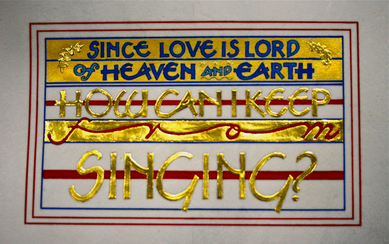
Week #48
This work was done by Eileen McAllister this year in Boston for the third month's class "Illumination on Vellum". In her own words:
How Can I Keep From Singing
I did this piece in response to the P2M Month 3 homework instruction to use the design techniques of the Codex Aureas on vellum and "make it our own." This was also the month we were to try to use an ink jet background, so I was looking at Hubble telescope photographs while scouring some favorite books for a special passage.
In this case, however, the words found me! As I was skimming through those heavenly pictures, I discovered that the melody and refrain from a old hymn, "How Can I Keep From Singing" were floating around in my head. It is a song that reminds me of my parents, and the lyrics talk about love beyond measure even in the midst of uncertainty and turmoil--they seemed to be just the words I was looking for!
I tried a few thumbnails, but quickly settled on this one and worked out a tight layout, using different Speedball B nibs to vary the size of the letters. I chose red and blue because I liked how the immediacy and brightness of the primary colors worked with the exuberance of the words. I traced the design onto the vellum, ruled in all the lines and rectangles with gouache and ruling pen and soon discovered that I had a very patriotic design in progress--not my intention. At about the same time, I realized that the tight spacing top and bottom for lines 1 and 2 was going to make the intended gold gilded background next to impossible for me to execute. Stifling a groan, I decided that the best direction was forward--this was homework, after all, and meant to be a learning experience!
Fortunately, I had just seen a layout a friend and classmate had done using Schmincke gold, and thought that might be a solution. I added flanking graphic elements to lines 1 and 2 that I gilded along with other planned gilding areas. I noticed that as the gold went into place, the color looked vibrant rather than patriotic, so I felt like I was back on track.
I enjoyed doing this piece and especially appreciated being able to turn my "uh-oh" moments into "ah-ha" moments.
Materials: 5" x7" calfskin vellum, W-N gouache, Micron marker, 23 Karat patent gold, Schmincke gold
* * * * * * * * * *
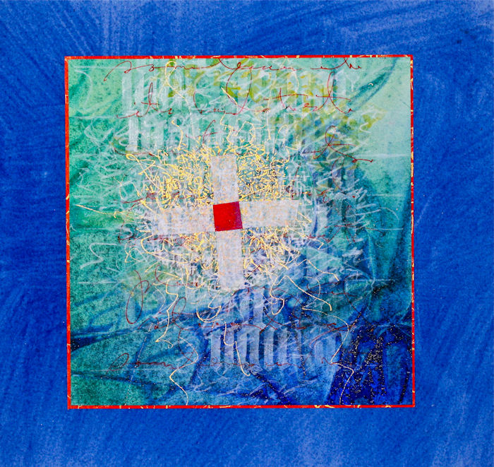
Week #49
This works was done by Lois Rossiter in Boston this year for the fourth month's class "Primitive to Modern". In her own words:
I am still exploring what could make a grid: I used blackletter forms and my own handwriting. The remainder of the composition contrasts with the linear grid via letter parts, marks and scribbles. The center cross establishes a focal point and anchors the marks behind.
Diluted Bleed Proof white, Prismacolor pencils, red roller ball pen, Schmincke gold pan watercolor, Saran wrap-treated watercolor on Arches HP, paste papers.
* * * * * * * * *
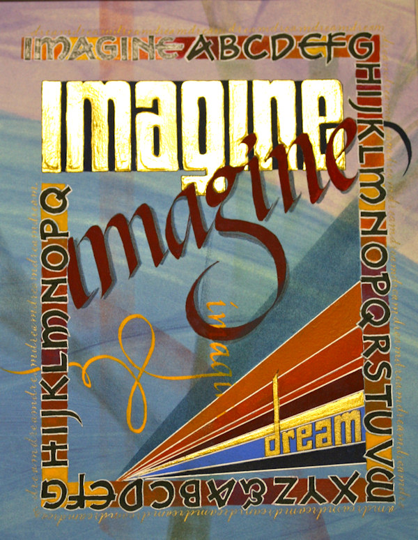
Week #50
This work was done by Jan Boyd in Boston this yearn the fourth month's class "Primitive to Modern. In her own words:
This piece was completed as homework for Primitive to Modern after studying work done by Thomas Ingmire and Dick Beasley and after creating a work in class using many of the techniques they employed.
With several attempts at a design concept, I finally completed a sketch to work from. Using Beasley as inspiration, I started my finished piece with a scanned image of paste paper printed onto Arches Text wove. I then added some pastel dust shapes after cutting masks for trees and shadows. I then transferred the border design with Saral. Inadvertently skipping the step where the letters should have been under laid with white gesso, I lettered the alphabet, bordered it in white and added the interstitial color. Realizing my error, I did underlay the word "imagine" in the border so it's a bit highlighted which turned out to be a pleasant surprise.
With the border masked, I transferred the rest of the design, laid gesso and instacoll in the large word "imagine" (leaving the spaces where the words would overlap) and the one gold ray at the bottom and then gilded them. Using the same palette as the border, I painted in the rays, the other two versions of "imagine", the spaces and shadows and then painted the word "dream" with Spectralite gold. I broke the grid with some of the rays and pastel swashes to create depth. The script lettering around the border in Spectralite gold was added to soften the edge. Still feeling that the piece needed darkening, I added a deep blue matte which pulled everything together.
This piece is so different than anything I've done, I had a hard time knowing when I was "done". I'm still not sure - but it's "done enough" for now and will be looked at later for more refinements.
* * * * * * * * * *
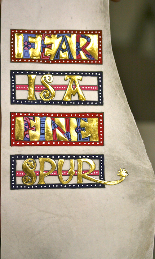
Week #51
This work is by Sheila Dalahanty in Boston this year for the third month's class "Illumination on Vellum". In her own words:
This is my attempt to do a "modern" take in the style of the Codex Aureus (although the most contemporary thing about it may be the fact that I did it). I started with a small, odd-shaped, but quite beautiful piece of vellum and thought about - how can I use that form in my design? I found the quote, which I think is quite funny, and it suggested to me a way I could echo the curve of the vellum by exaggerating the tail on the “R.” Although my head hates the Optivsor, my eyes and hand now find it essential when doing such tiny work. I laid the gesso, then 1 layer of Instacol, the gold leaf, and mixed up my colors. I find doing the painting can be relaxing. I placed the white dots using the Kemper Fluid Writer after gum sandarac, and it worked great.
* * * * * * * *
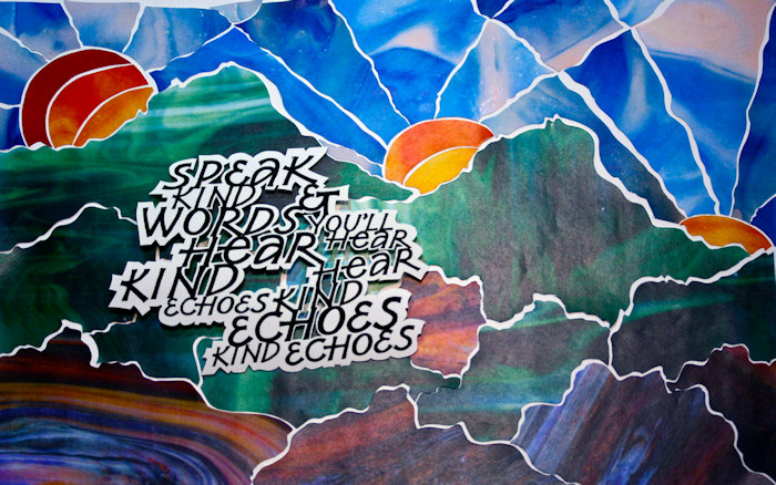
Week #52
This work was done by Lydia Batten in Boston this year for the fifth month's class "DESIGN: Deconstructing the Grid". In her own words:
Because the quotation included the work ‘echo’, it reminded me of the myth about Echo—and how her punishment for her talkativeness was to forever hear only her own words repeated back to her as she sat alone in the forest/mountain tops. So, that’s where the mountain image came from. At first it was just the one set of mountains with the sun, and then to keep with the repeating idea of the ‘echo’ I decided to repeat the image and make it smaller and less distinct, like an echo, as it progressed across the page. You had suggested using very straightforward geometric shapes, so that’s when the sun was added more prominently. And then as the project progressed and you revealed more and more about the cutting strategies, using different colored papers, etc, this all started to take its final form. Nita suggested cutting the sun up further into smaller shapes, so she gets the credit for that idea! The base of the mountains needed more detail so I cut shapes from the paper to resemble rocks and boulders. As I wrote out the quotation and you had us do copies at different sizes, that’s really what gave me the idea to repeat the last part of the quotation, since I had all the copies right there to cut out and put together for the final print. Probably what I would like to do, if I have the time, is to print another copy of the quotation and re-cut the negative spaces a little differently. I think I went to close to the black of the letters and did not leave enough white in some places.
Never in a million years would I have seen myself doing a project like this on my own! Thanks for pushing me way beyond my comfort zone so that I could see that yes, indeed, I can do this kind of detailed project!
* * * * * * * * * *