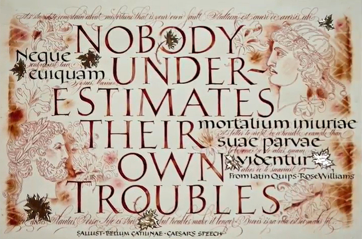
TROUBLES
This pic of the week
“describe” request from Reggie reached me while I was
traveling in Egypt. So I try and tie this fact in, even
though I had created Troubles several months prior.
While visiting the ancient
temples in Luxor, my guide told me how the temples were
built from inside towards outside, so the first and
oldest part was in the middle, and every next ruler had
to go around, further out, to add to the temple complex.
No ruler had an idea what the next one would do, add or
eliminate. So that is where I found out that I thought
like Egyptian, which is of course a joke!
When exhibiting Troubles
at IAMPETH this summer, someone asked me - where do you
even start a “complicated” piece like this. My answer
was: in the middle, with no real idea what I was going
to add later, when I had time to come back to it, if
ever. All I relied on was my intuition, knowledge of
some basic layout rules, and no real care of what was
going to turn out, if anything. It was not to be a
serious piece. (This really is not what I said, I just
mumbled something perhaps much smarter that I cannot
recall.)
The first things I did were naturally the large drawn
and painted-in Roman caps. I did plan the layout of
these a bit, which means I had a really rough draft. A
month later I added the foundational hand. Then weeks
after that, the delicate leaf design and the faces that
appear to be on the background. Some of the leaves I
later gilded. |
The last script to add was the lace-like flourished
copperplate. I added it with a light touch but with
abandon. To complement, not to compete, with other
hands.
At the beginning of the year Reggie had stressed to the
class: bring to the homework what is unique to you
personally. I had always realized - being part of the
wider calligraphic society, divided mostly into two
somewhat opposing schools - that one of the rather rare
qualities I possess, is feeling equally comfortable with
pointed OR broad edge pen. Not at all the same for every
calligrapher, I had found long ago. Most prefer one OR
the other.
Starting the year long class, I set as my personal goal
and mission to bring these two different tools (and
schools of thought) together as often as possible in the
very same pieces of work. To reconcile them in my
creations in unexpected ways. I can now say I kept to my
goal. I created rather several pieces that way. One of
them, rendered on silk, was pic of the week couple
months back.
Materials and tools used: pencil, Mitchell nibs, fine
brushes, pointed pen, loose leaf moon gold, watercolors,
gouache, pastels. |
 Video
Video