* * * * * * * * * *
Week #18
This work was done by Stephanie Chao in 2017 in
San Diego for the session “Modernizing a Traditional Calligraphic Hand:
Blackletter” in PRIMITIVE TO MODERN. In her own words:
One of our homework assignments in the first class of Reggie's
Primitive to Modern was to write something in Textura and have
it "reversed" at our local copy store.
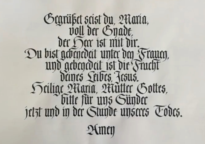
I chose the German version of the Hail Mary prayer, first
writing on graph paper to determine line lengths for centering
purposes, |
then onto John Neal Bookseller's 11 x 17 practice paper, using a
Speedball C-4 nib and Chinese stick ink.
For the Italicized variation, I wrote the prayer on Arches 90lb
hot press paper, using the same nib and ink. |
Click for
 Video Video
* * * * * * * * * * *
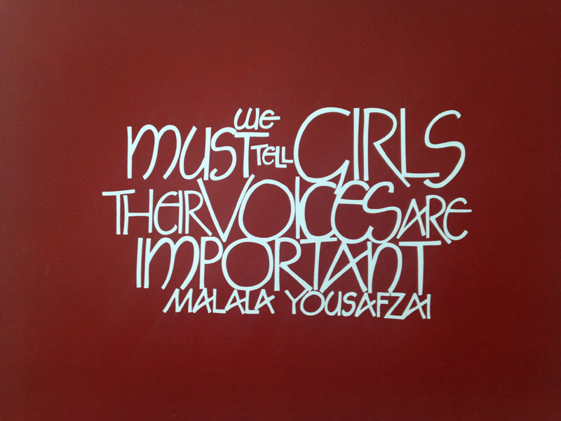
Week #19
This work was done by Amy Lear in Austin in 2016 for the
session “Variations on Romans” in 26 Seeds: a Year to Grow. In her own
words:
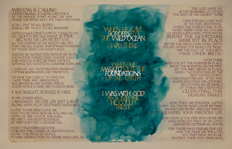
Voices
This piece was done on deep red paper with Dr. Ph. Martins
bleedproof white. Inspired by the wisdom and courage of Malala
Yousafzai and wanting to inspire my two daughters, I created
this piece with large letters and a bold layout. I sketched the
design on grid paper, with several revisions, before scanning it
into the computer for resizing. I was happy with the design of
each word, but their placement wasn’t quite right. On the
screen, I was able to move the words around to get a final
draft. From there, I printed the sketch to use to transfer
guidelines to the red paper.
As I worked on the letters, I noticed that the white wasn’t as
opaque as I wanted, so I went back and added a second coat of
paint with a small watercolor brush. And then… I managed to drop
my brush onto the table! It fell in the middle of the word
“tell” and rolled through the G in girls, and the C below it. |
I tried all of the traditional ways of correcting mistakes, but
the paper just wasn’t having it. So, I dug through all my red
paint and managed to make an acrylic one that matched (using a
scrap of red paper to test). I carefully painted over the white
smears of ink and repaired it.
During class, Reggie commented on the design and suggested that
I scan the piece and shrink it to a smaller size. In doing that,
I realized that the texture of the paper looked unclean after
scanning. So, I traced the whole text to a vector in Adobe
Illustrator and replaced the background with a solid red color.
After printing these in 8x10 and 5x7, I was really encouraged by
how successfully the design translated to the smaller size. And,
now that I have it in a vector format, I am able to experiment
with different colors of letters and backgrounds very easily. |
* * * * * * * * * * * * *
Week #20
This work was done by C.J. Kennedy in Boston this year
for the session “Basic Romans” in 26 Seeds: a Year to Grow. In her own
words:
|
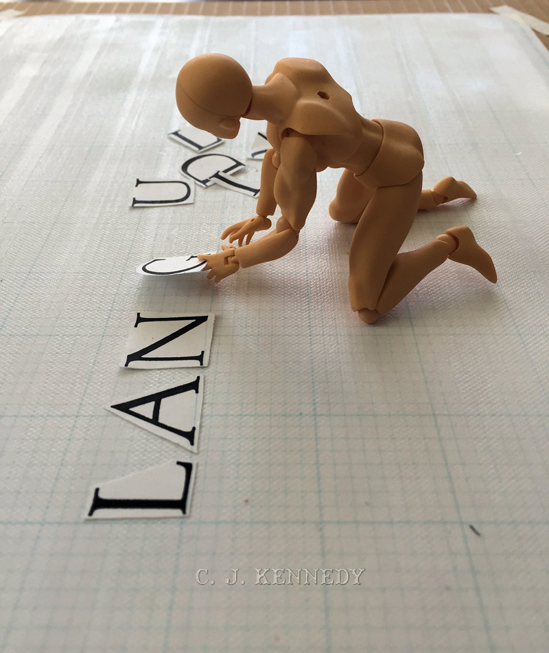
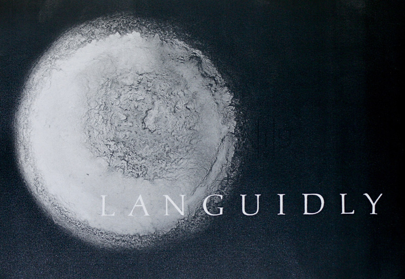
Homework is more fun less of a drudge with someone else to help.
My buddy, Ben Dover, helped with spacing the word “languidly”
using the sour pickle method. |
Ben Dover’s eyesight is better than mine and working directly on
the waxed grid, he was able to bring a unique perspective to the
assignment. |
* * * * * * * * * * * *
Week #21
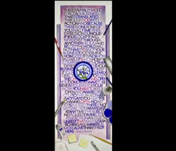
This
work was done by Patti Adams in New Orleans this year for the session “Basic
Romans” in 26 Seeds: a Year to Grow. In her own words:
In trying to decide what sort of quote to do for our
monoline romans exercise (with the dreaded B2 nib),
I found myself looking to this: a wonderful piece of
advice from famed choreographer Agnes DeMille to
modern dance legend Martha Graham. It speaks to the
importance of artists being able to find a way
through self doubt; to let go of judgement and allow
the work to speak for itself. Great words of wisdom
for us all.
In finding my way through this
project, I decided I could have a little fun with it
by adding whimsical tromp l'œil effects as I worked,
painting the things that were scattered about my
drafting table, including the yellow "post-it"
notes. |
One of the hardest things to capture was my John
Neal gridded practice pad! Yikes!The piece is done on a leftover
portion of elephant-sized Arches hot press watercolor paper in a
variety of values of blue, blue-violet and violet. The wine stain is
painted in watercolor and, yes, for authenticity I was forced to try
the full spectrum of reds: a glass of pinot noir, a glass of
zinfandel, a glass of cabernet…(oh, the sacrifices we make for our
art! 😉) But, most importantly, I ended up enjoying using the B-2 nib!
A first for me! Thank you, Reggie. |
Click for
Video
* * * * * * * * * *
Week #22
These works were done by individuals in New Orleans this year for the
session “Basic Romans” in 26 Seeds: a Year to Grow. In their own words:
#1 & 2 Lisa Devlin
As a graphic designer, I
use a variety of tools (including the computer) and
appreciate many periods of art and design. I also
enjoy generating ideas for make-believe products,
creating ads and labels for them and putting them on
greeting cards. So it seemed natural to turn
Reggie’s letter-spacing exercise into ads. I thought
that bubble bath and a wine vineyard would be great
for expressing the word “LANGUIDLY,” followed by the
registered trademark symbol for that touch of
authenticity. Both ads were intended to amuse the
viewer while expressing my enjoyment and exhaustion
after a full day learning calligraphy.
I
began by using the waxed grid paper and letters
Reggie supplied, manually spacing the letters on the
paper and then photocopying the finished work.
Although the letters seemed spaced adequately well
on the grid, the photocopied versions showed me this
wasn’t entirely the case. So when I brought the
letters into Adobe InDesign, I kerned them slightly.
Concerned that reliance on a computer might not be
within the exercise’s scope, I confess that I held
back and didn’t do a complete job. I then copied the
text and pasted them into the Adobe Illustrator
files where the illustrations were created. The
final piece was printed on my desktop printer.
This was a helpful exercise. Because of the
deadline realities of my work and the frequent
last-minute changes that typically arise, I’d
developed some bad habits and rusty letter-spacing
skills. So this exercise reminded me of the need to
apply more care in that area.
#3 Patti Adams
This spacing exercise took a lot longer than I
imagined! As Reggie suggested, after I laid out the
word calligraphy on my waxed grid, I left it on a
stand in my studio so I could casually glance at it
as I worked on other things.
After a few
days, I finally decided that there was obviously a
Roman Rebellion taking place while I slept; letters
were surreptitiously huddling up in my studio
overnight! |
I
finally arrived at the version you see here. I printed it onto a
sepia-toned 11x17" copy of a very large piece I did in graphite
several years ago as part of an exhibition at the New Orleans Academy
of Fine Arts. It is a drawing of one of our oldest and grandest live
oak trees in Audubon Park, aptly named "The Tree of Life”. Displaying
some of the most splendid examples of nature's calligraphy, these
majestic trees are for me a constant source of inspiration!
#4 Carmel Cucinotta-Harmon
I chose this 'ghost' picture
from a Time-Life Book Series I have on the "Enchanted World'. Since
all of us were so fearful of diving into the ROMANS, I thought this
picture of "fear" was very appropriate. Class mates exchanged many
emails saying how frustrated and fearful they were to attempt this
very important exercise; myself included.
I used the Palatino
Type Face that Reggie gave out in class. I took my picture and my
layout to Kinkos (now Fed Ex) and had a transparency made of my
spacing. It took some time for the sales person to figure out how to
apply the letters to the photo. I was a bit worried because the black
letters were so close to the darkest part of the photo. But, I liked
the picture and decided to go for it.
I have since learned,
through trial and error, that "I can do the transparency and
photocopy" at home.
My little ghost still says it all about
those lovely ROMANS |
Click for
Video Here
* * * * * * * *
Week #23
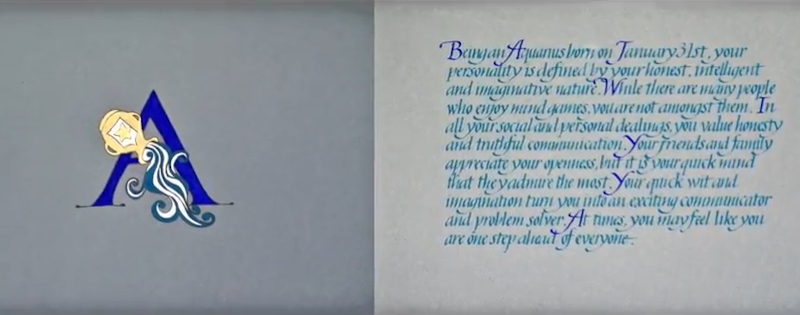
This work was done by Tomoko Zunino in Seattle in 2015 for the session
“Brush Lettering” in 26 Seeds: a Year to Grow. In her own words:
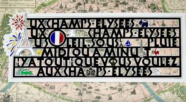
In between classes, my husband and I went to Paris
on vacation and I wanted to create something always
to reminds us of the trip.
The letterform is
Neuland written in black gouache with a Hiro #8 nib
on Arches Watercolor HP paper.
I also wanted
you to feel like you were walking in Paris. I
decided to use the map of Paris as a background
paper and drew some famous sightseeing spots as
decorated letters; “A” for La tour Eiffel, “O” for
Tricolore, “I” for Obélisque de Louxor at Place de
la Concorde, “O” for Catacombes de Paris and “M” for
Basilique du Sacré-Cœur.
Before cutting out
the counter spaces with a x-acto knife, I placed the
calligraphy piece on the map to see how it would
look. It was not as dramatic as I was hoping for. I
realized they needed some colors, and added 7 French
logos which you might see on Les Champs-Élysées. |
Paper size approximately 10”×25”.
Translation:
At the Champs- Élysées
At the Champs-
Élysées
In the sun, under the rain
At noon or at
midnight
There is everything you want
At the Champs-
Élysées |
Click for
Video Here
* * * * * * * *
Week #24
This work was done by Sharon Allende in San Diego this year for the session
“Modernizing a Traditional Calligraphic Hand: Blackletter” in PRIMITIVE TO
MODERN. In her own words:
|
I love circles, as you can see. This piece was done
at Letters California Style 2017 in Lordana Zega’s
“Calligraphy on The Walls” Class. In this class
Lordana taught us how to use a dry flat brush to
letter in Black Letter or any lettering style of our
choice. She taught us how to use 1⁄2-inch up to
4-inch flat brushes to letter and create amazing
images. I used a 3⁄4 inch flat brush on Canson
Mi-Teintes Pastel paper. |
The
gouache is Winsor & Newton Lamp Black and Permanent White. The
Permanent White gouache is mixed with a little Schminke Bronze to give
a hint of shimmer. The red contrasting writing is Prismacolor Scarlet
Lake colored pencil, and a 2B Graphite pencil was also used. Although
it is difficult to read, the words are taken from the Mumford and Sons
song “Awake My Soul”, which is how I felt learning this technique. It
is very freeing to letter with a brush and paint. |
* * * * * * *
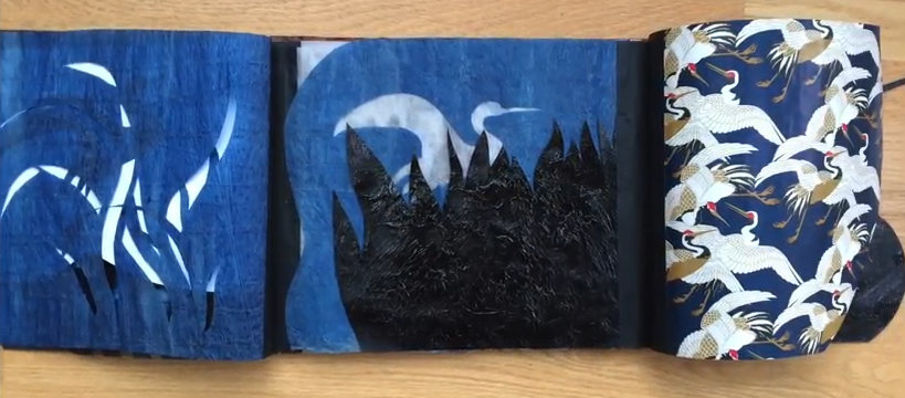
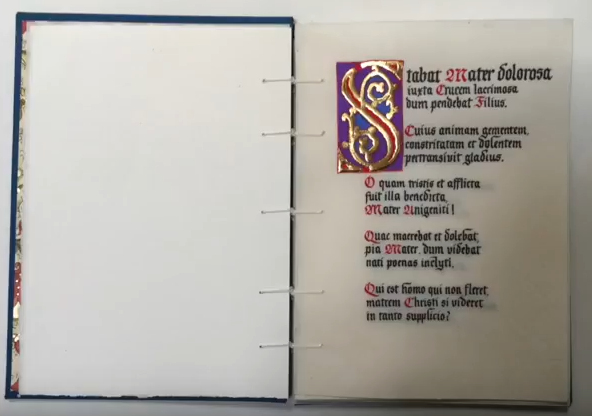
Week #25
This work was done by Stephanie Chao in San Diego this year for the session
“Writing on Vellum” in PRIMITIVE TO MODERN. In her own words:
Stabat Mater
One of our homework assignments
from Reggie’s second session was to make a small
book incorporating vellum pages.
The vellum
offcuts I purchased from Reggie were each about 5 X
7 inches. I wanted to write a moderately lengthy
text and chose the Stabat Mater, a 13th C. Latin
hymn attributed to a Franciscan friar, that I first
became familiar with many years ago through the
music composed by Giovanni Battista Pergolesi
(1710-1736) at the end of his short life.
Scored for soprano and alto
soloists, violin, viola, cello, and organ, the duets
are some of the most touchingly beautiful music I’ve
listened to. |
The hymn comprises 20 three-line stanzas. My
first attempt was to write it in 1.5 mm x-height with a Mitchell 6
nib, but even with my trusty Optivisor, I found it too difficult; so I
increased the guidelines to 3 mm and wrote with a Mitchell 5 without a
reservoir.
Although challenging, I found the entire process to
be meditative: I listened to Pergolesi’s music repeatedly while
writing, gilding, preparing the book covers, and assembling the book
using a single sheet coptic binding technique. |
Click for
Video
* * * * * * * * *
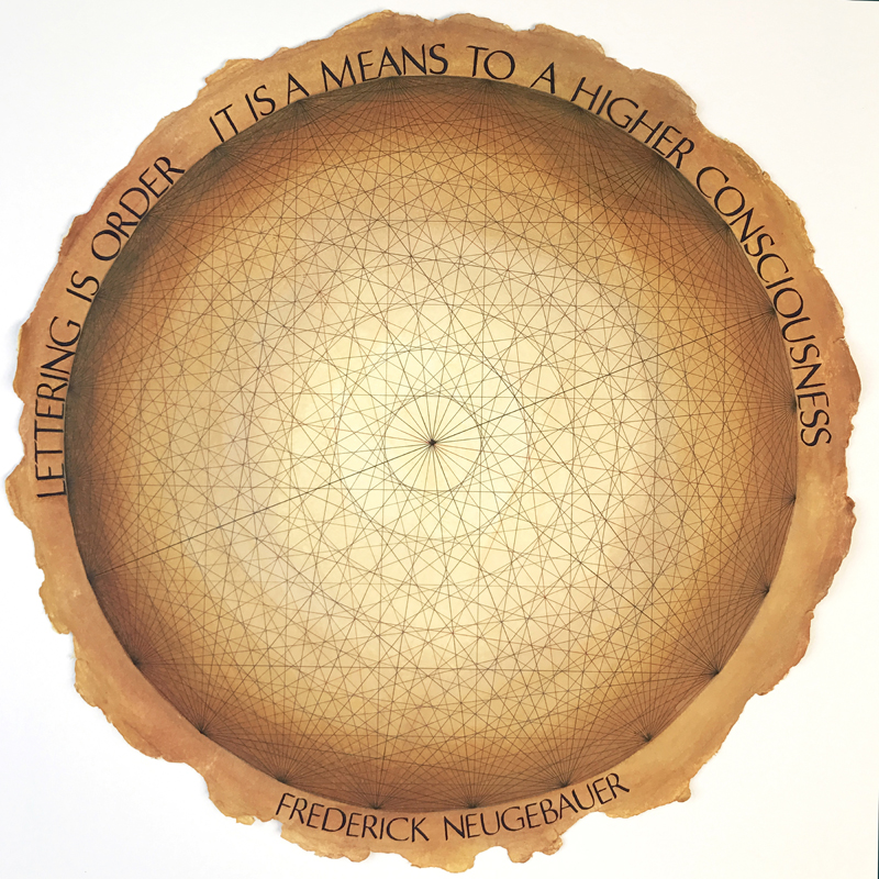
Week #26
This work was done by Patti Adams in New
Orleans this year for the session “Beginning Romans” in 26 Seeds: a Year
to Grow. In her own words:
Writing this wonderful quotation of Frederick
Neugebauer in plain Romans was another big challenge
from Reggie!
I decided to feature a DaVinci Circle as the setting
of the quote. There are twenty-four equally spaced
points around the perimeter of this circle, each
connecting to every point. Interestingly, there are
48 letters in this quote, which would be the next
numerical size of a larger circle! (then 96 points,
etc) This geometric exercise, which Leonardo had his
students do, teaches that the sacred shape of the
circle is contained in everything in nature and
illustrates that circles can be created with
straight lines. The more line intersections there
are, the more circles emerge: in the center, and
within the concentric layers there are ovals and
then more circles. With a larger number of points on
the outer perimeter, more circles and ovals...ad
infinitum...like our universe. |
I thought this DaVinci Circle the perfect
setting for a discussion of Roman capitals. For me, there is an
element of allusion to their construction, all based on measurements
and movements of the pen that completely defy ones natural
inclinations and expectations.
I used a 20” round, deckled paper, handmade by Twinrocker and brown
and sepia 1.0 Micron pens for all the lines. It is glazed with
multiple light layers of watercolors (all Daniel Smith) in
quinacridone gold, burnt sienna, indigo and yellow iron oxide. The
calligraphy is done with Speedball C nibs using indigo gouache.
Learning to try and control Romans has been one of the great
challenges of my long calligraphic life. Reggie captures it perfectly
in his Romans video: “Welcome to Romans, where nothing is natural. A
world of contrivances, demanding the utmost from you in skills of eye,
hand and mind."
I’ll keep working on it! |
* * * * * * * * *
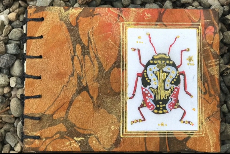
Week #27
This work was done by Sabrina Hill in San Diego this year for the session
“Writing on Vellum” in PRIMITIVE TO MODERN. In her own words:
May was Month Three in Reggie Ezell’s Primitive to
Modern Class 2017 San Diego. Our homework assignment
from Month 2 (March) was a book using vellum and
some of our newly acquire gilding techniques.
When putting together homework for the previous
month, I had looked up ladybugs and found the
universe of beetles. The bugs look like show girls
or drag queens. I thought they would be the perfect
subjects for gilding on vellum.
I started by
planning a 3-page vellum book with 3 beetles, but
which ones? With so many beautiful choices, I
decided to expand it and do a Top Ten Beetles book.
Well now I was in a mess. There was not enough
vellum for this. I had fig bark paper, and I liked
how it looked with the mottled vellum—crisis
averted. But now I had too many pages. Add more
beetles.
And that’s how I ended up with Beetles:
A to Z.
Execution does not always go as
planned. The fig paper and a broad nib pen were not
the best of friends since the uncoated unsealed
paper acted like a wick for the loaded nib. I used a
Micron pen for much of the writing. The lyrics to
All You Need is Love were written with a Leonardt
ball-tipped pointed pen—my new favorite nib. |
Winsor Newton watercolors and gouache were
used to paint the bugs and many bugs were brushed with pearlescent
pigment for a super-shimmery bug effect. I used the paints with very
little water on both the fig bark paper and the vellum. All bugs were
outlined with the micron pen and shaded with soft graphite. My first
car was a very used VW Bug that I shared with my sister, so homage is
paid to that beetle as well. I added the words to a Beatles song to
use the remaining extra pages, and finished with a little beetle
humor.
This is my first effort in bookbinding. I will most
certainly make more; it was such fun! I used book board covered with
marbled mulberry bark paper (which is almost impossible to tear) and
assembled it using a Coptic binding. The vellum pages were singles, so
I used a folded strip of cream mulberry bark to provide a fold to
stitch then glued the strip on either side of the vellum after the
book was sewn together. I see all the mistakes, but I like my
primitive little book. Doing this book did not make me like bugs any
better. Beetles are well-styled but still creepy!
NOTE: In the
May class, Reggie taught us that the fig bark paper can be sealed with
methyl cellulose gel or Knox gelatin (in a special mixture). I love
the paper, so I will try sealing it in the next project! |
Click for
Video
* * * * * * * *
Week #28
This work was done by Maria Helena Hoksch in New Orleans this year in for
the session “Basic Romans” in 26 Seeds: a Year to Grow. In her own
words:
This piece of various capital letters does not make
any sense as to legibility, so do not try to read
it, as it is only pure experimentation in contrast
and color. Materials used: twin rocker paper, moon
palace Sumi ink, gray gouache, various pastels and
colored pencils, speedball B nib, Mitchell nib,
pointed pen.
Since I started my studies in art and calligraphy
more than three decades ago, I was always taught
that certain colors "go together", in other words,
make a pleasant match. In this piece I decided to
challenge that idea and prove that all colors go
together if you make them. It is your (the viewer's)
decision whether the result is pleasant to the eye,
or loud senseless cacophony. I am fine and even
salute the possibility of it being somewhat
offensive to the senses. |
I also took the idea that I learned from one
of my mentors, that a piece of art can be too "hot", as consisting of
only warm tones. You need something "cold" to cool it down. Here I
tried to tie in the hot tones with the cold tones equally, as an
almost chemical experience in "temperature in art". Many of my
treasured calligraphic friends told me that the colors were way off
here, and I only enjoyed the controversy. Why, after all, are we
experimenting, if not for making mistakes. Make no mistake and learn
nothing!!!!!
The contrast does not end here with color, but is made further
"obnoxious" by rudely ending thin lines and starting thick ones right
in the middle of a letter. The hole piece is presented as a solid
block of lettering on a simply laid out page, just to have the all the
various contrasts speak the loudest, and all for themselves. |
* * * * * * * * *
Week #29
This work was done by Amy Lear in Austin in 2016 for the session “Variations
on Romans” in 26 Seeds: a Year to Grow. In her own words:
Languidly
This was done for the spacing homework assignment for Month 1.
For the background image, I used a photograph that I had taken
and then edited it in photoshop to make it black and white and
to add black to the rest of the image. The photograph is of the
dried paint left at the bottom of a paintbrush-washing bowl
after the water had evaporated. It is a mid-century, pottery
ashtray that I found as my in-laws were cleaning out and
restoring an old farm. Using an ashtray sounds odd, I admit, but
it has a nice depth and the slots originally for cigarettes now
keep my paintbrushes from rolling away. I took the photo on a
nice, sunny day to increase the contrast of that old paint. The
original color was yellow paint in a green bowl. As a black and
white, though, it reminds me of an abstract, lunar landscape. |
After I edited the photograph, I extended the
image size to fit the paper I’d print it on, and scanned in my
properly spaced letters. However, they didn’t quite fit the way I
wanted it to. Instead of correcting the letter cut-outs and
rescanning, I edited the word in photoshop directly. I can’t recommend
photoshop for projects like this enough. To fit the word to the image,
I separated each letter into a different layer, and used the
“hide/show” feature to only show the three letters I was working on at
a time. Then, I nudged the letters right or left using the arrow keys
(rather than my mouse) for greater precision. Photoshop does have an
auto-arrange feature, which would distribute the space between each
letter. But, that only accounts for the total width of the letter, not
the white space within the letter itself. The letter L is a good
example of where that feature doesn’t work for lettering spacing. |
* * * * * * * * * *
Week #30
This work was done by Tomoko Zunino in Seattle in 2015 for the session
“Italic and Variations” in 26 Seeds: a Year to Grow. In her own words:
|
I want to thank everyone
for making this book possible. Thank you, Reggie,
for being such an inspiration. Thank you, Keiko, for
your kirigami flowers. Thank you, Italic, for being
beautiful and versatile. Thank you, Cortana, for
finding the quotes in between “Sorry, I didn’t catch
that.” Thank you, Mitchell nib #3, for your crisp
edges and flexibility. Thank you, Blick, for having
a BOGO on Canson Mi-Teintes. |
Thank you, X-acto, for providing such a
precise, sharp yet safe knife. Thank you, Winsor and Newton, for your
wonderful and perfect flowing gouache. And, thank you, Otto, for being
there. Happy Birthday! Tomoko, Winter 2016.
This accordion book
is 13” X 9 1⁄4” and has 18 pages. |
Click for
Video
* * * * * * *
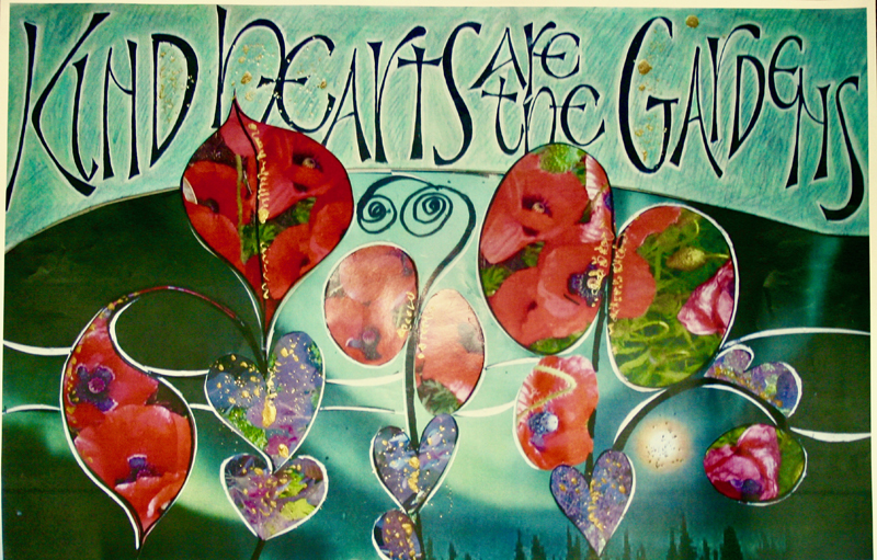
Week #31
This work was done by Carmel Cucinotta-Harmon
this year in New Orleans
for the session “Pressurized and Drawn Romans” in 26 Seeds: a Year to Grow.
In her own words:
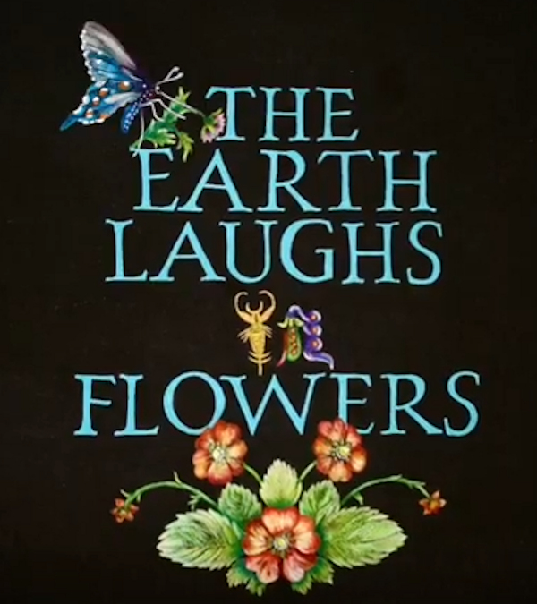
The inspiration for this
piece was our garden. It was in full bloom, and as I
took in the beauty I knew I had to do a piece on
flowers and nature. The quote is from Ralph W.
Emerson.
For this piece I had a difficult
time deciding on a layout. Actually, I did not like
anything I came up with. The only thing I knew was
that I wanted flowers at the bottom of the piece.
So, this is where I began. I worked from the bottom
up; something I have never done before.
After
spray fixing the black paper, I began using colored
pencils to draw in the flowers (which took
forever!). I made a transparency of my pencil drawn
letters from my exemplar and began tracing the words
on the black paper. My first word was “flowers”. I
did not trace the word ‘in’, as I did not like the
way it looked (using the transparency). I left space
for the word “in”. I continued up the line. When all
words were traced in, I under painted them with
Acrylic paint mixed with a Matte Medium. I chose the
color blue green because I love this color. |
I had to lighten it from the pure hue because
it was too dark to show upon the black paper. Painting the letters was
very slow and tedious. I could only paint two letters at a time before
taking a much needed break.
I still had to figure out what to
do about the word “in”. Since it was in between “laughs and flowers” I
needed something about “earth” to tie everything together. I decided
to draw a little bug for the “i” and a bean plant turned upside down
for the “n”. This is what I wanted.
Now I had to figure out
what to put at the top of the piece. Originally I wanted more flowers.
I decided that would be overkill. I needed something. I chose a little
butterfly and a single tiny flower looking down over the piece. They
are also done in colored pencils.
One thing I have learned is
this... it is a good idea to take a photo of the layout prior to
actually painting etc. The photo, for some reason, emphasizes mistakes
that the human eye can miss.
I had fun working on this
homework. It was very arduous and time consuming. I had such
inspiration from my husband’s garden that it turned out to be very
rewarding in the end. |
Click for
Video
* * * * * *
Week #32
This work was done by Maria Helena Hoksch in New Orleans this year for the
session “Pressurized and Drawn Romans ” in 26 Seeds: a Year to Grow. In her
own words:
I started this piece for a
previous Reggie session earlier this year, but was
too embarrassed to take it out and show to others,
as it looked ugly and unfinished to me. And, I did
not know then, it was only one third there.... A
total throw- away, I thought. I have high standards
for myself, after all, I reminded myself. As soon as
I had decided that it was garbage, a stray misbreed,
I decided to "adopt" it, to rescue it, as there was
nothing to loose, but only to gain.
That is
when I started layering. It was an adventure, a
journey, which I did not know where it would lead.
First the Mitchell nib in gray gouache on top of
watercolor romans. Then lines painted blue and
white, drawn with ruling pen and filled in, right
between, and even on top, of the romans. Then italic
on top of the painted lines. Between every layer I
sprayed fixative like a maniac to be able to letter
on top of the previous layer. |
Towards the end, I had sprayed so many times
that the ink was almost repelling, and skipping. As if I was now
lettering on top of plastic. Gum Sandrac did no longer work at that
point.
Let's be honest, I ended up with a hot mess. But again,
it was too late to throw it away. It had "turned" too busy, too
colorful, too much movement, too.... I need something to calm it down,
I thought, to give the eye finally some rest and peace. To thank the
eye for even looking at it! That is when I added the simple stripes in
gilding. Most artwork uses gilding as a main decoration, or precious
accent, I used it as the most unadorned part of my work.
Materials used: Arches watercolor hot press paper, Ken Oliver's
watercolor bursts, various colors of gouache, Dr. Martin's white,
watercolors, WN drawing ink, various sizes of speedball C and Mitchell
nibs, pointed brush, ruling pen, 23K gold leaf laid on Instacoll.
Overall measurements of the piece: 22"x15 |
Click for
Video
* * * * * * * * *
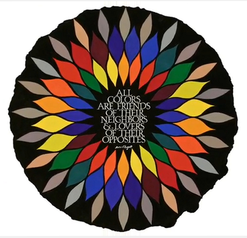
Week #33
This work was done by Patti Adams this year in New Orleans for the
session “Pressurized and Drawn Romans” in 26 Seeds: a Year to Grow. In
her own words
In my lifelong obsession with the study of color, I
have collected a number of wonderful quotes from
creative artists I admire. From Mr. Monet: "Color is
my daylong obsession, joy, and torment". From Mr.
Gibran: “Let me, O let me bathe my soul in colours;
let me swallow the sunset and drink the rainbow.”
But this one from Mr. Chagall is my favorite.
My main challenge was finding the appropriate
setting for his wonderful words. In the midst of
working to complete a huge stack of Twenty-Six Seeds
homework (!), I visited a friend in the hospital.
While waiting for the arrival of the elevator to get
to her floor, I looked down and found the
inspiration I needed! A wonderful star shaped
pattern on the tile floor that would feature my
color wheel perfectly!
My goal was to lay out the
colors precisely as the quote prescribes: adjacents
and opposites. The first layer are adjacents; colors
which live in harmony with their neighbors. |
The second layer are the lovers; opposites
above and to the right of each complimentary color of the first layer.
The third layer of the wheel is a mixture of those two opposites,
mixed with white to illustrate the beauty of their neutrals.
The piece is done on a white, round piece of 24" handmade,
deckle-edged Twinrocker paper. The next challenge was setting off the
colors and the quote with a color that would magnify their
differences, particularly the neutrals. So, I arrived at ivory black.
This color was painted around each color and painstakingly
(neurotically!?) painted around the hand drawn Romans caps. The white
of the words is the white of the paper. They are the negative shapes
of the piece. I loved the idea of the quotation having absolutely NO
COLOR AT ALL! :)
Thus is the life of the calligrapher: you get
a crazy idea and then can't lay down the brush until you find an end.
I could title this piece "Four 00 Brushes Die For A Good Cause!" |
Click for
Video
* * * * * * * * * * *
Week #34
This work was done by Jean Ferrier in 2016 in Seattle for the session
“Illumination on Vellum” in Primitive to Modern. In her own words:
|
I used the computer paper for the lower half of the
piece with the plant forms. The upper part with the
writing is gouache. I was thinking of my garden,
which had a difficult winter with several killing
windstorms, but has now recovered and being enjoyed
by hummingbirds, and a deer family. |
They are the intended recipients. The actual
assignment was barely in mind, and I just fooled around without
benefit of the thought process. |
* * * * * * * * *
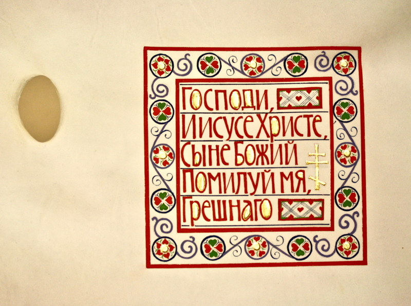
Week #35
This work was done by Stephanie Chao in San Diego this year for the
session “Illumination on Vellum” in PRIMITIVE TO MODERN. In her own
words:
In our fourth class with Reggie, one of our
assignments was to do a gilded piece on vellum,
inspired by the Codex Aureus.
I have been studying Russian Byzantine iconography
for a few years and wanted to writethe Eastern
Orthodox Jesus Prayer or Prayer of the Heart, in
Church Slavonic. I don't speak or write Russian, so
a day was spent researching and verifying the
correct letterforms.
I worked out the drawn letters in pencil on graph
paper, printed the 6- inch square design on a
transparency, and then traced my design onto both
Arches 90 lb. hot press paper and vellum, with the
idea of working each step first on paper and then on
vellum, as we had done in class for various
techniques. |
After the counters were gilded by building up
two layers of gesso and clear Instacoll, I drew the letters using a
Mitchell 5 nib and WN Venetian Red gouache. Borders were drawn with a
ruling pen and filled in with a small pointed brush. I used a circle
and scroll template and freehand filled in the smaller designs with a
pointed nib.
I like working to music; in this case, the Church Slavonic chant of
the Jesus Prayer on YouTube provided hours of inspiration and
spiritual support in creating this piece.
https://youtu.be/C7-VLJxLEV4 |
* * * * * * * *
Week #36
This work was done by Maria Helena this year in New Orleans for the session
“Pressurized and Drawn Romans” in 26 Seeds: a Year to Grow. In her own
words:
A year ago I was celebrating my 50th Birthday in
China by climbing the Great Wall. I ended almost
"dead" of exhaustion from my 10 mile climb. Yet a
few days later i went to the main art market in
Beijing looking for all things calligraphy. I had
seen, and even bought, some great Chinese watercolor
art on fabric, so amongst interesting oriental
papers, I was also looking to buy some real silk
"canvas". I was surprised to discover how rare it
was even in China. Silk for artwork does not come
cheap nor is it easy to find.
At home it took
me almost another year to cut into and try out this
scary, curious, precious material. What you see here
is my first, and so far, my only try with silk. (No
worries, I made an investment, and have yards of it
left). The homework assignment from Reggie was drawn
roman caps, and I decided to combine them with
pointed pen. Yes, believe it or not, I took the
needle-like nib straight to the delicate fabric, and
it worked almost like writing on butter would.
Sensitive and smooth. No spreading, no catching
threads on this sharpest of tools! Then I filled in
my romans and the green leafy decoration with tiny
brush and watercolors, all the while taking
advantage of what watercolors can do. As the matter
of fact, the only medium used for this piece is
watercolor. Including copperplate lettering. |
As I "finished" the piece, it started to
seriously rebuke me. I want more, it said. You can see through me, so
show something through. Use me! So I cut another piece of silk, marked
the area I wanted to show, and covered it entirely with broad edge pen
romans, still in watercolor. As my tool was full of ink this time, it
bled a little, and letterforms came out somewhat distorted, but after
all, it was to be a just a background.
So what you now see is
two layers of silk placed on top of each other, playing with each
other. Not much planning. After completing, I just ironed the two
pieces of fabric to an absolute smooth surface. All crumpling just
disappeared. The Chinese stamp with my name in Latin and Mandarin
alphabet was custom made for me in Beijing, and gave the final touch.
Some weeks ago, while teaching a pointed pen class called
Seastones at IAMPETH conference in Louisville, I donated this piece to
the organization.
Exactly on my 51st birthday this July, a
fellow calligrapher Jennifer Calvert Cathey from College Station,
Texas generously purchased it at their auction.
This story is
over, but not my adventures with silk, nor with Reggie's homework
assignments. |
Click for
Video
* * * * * * * * *
Week #37
This work was done by B J Grant in
SanAntonio in 2016 for the session “DESIGN: Deconstructing the Grid” in
PRIMITIVE TO MODERN. In her own words:
The pictures of "quilt quotes" was done by BJ Grant
in 2016 during Reggie Ezell's Primitive to Modern
class in San Antonio.
When we were first given the assignment I was not
too clear on how to go about using the 11x17 prints,
but since my quotes were focused on quilts I started
to cut the print into quilt shapes.
It was like a jigsaw puzzle but the sticky board
Reggie provided made it a lot easier. That is one of
the great things about taking classes from Reggie --
he supplies more "stuff" than you ever could
incorporate!
The quote was calligraphed and
xeroxed in different sizes on transparencies to
determine which size looked best. |
The
correct sized transparency was then selected and copied on to a heavy
weight paper and then cut out and arranged on top of the cut out print
using mounting tape to produce a shadow effect. The first picture
shows the quote on top of the cut out print.
On the second and third photo below I decided to take a white glossy
paper to cut all the quilt shapes out with an Xacto knife to allow the
prints to be slipped behind the cut out design. That way I could see
which print looked best without having to cut the prints up. I could
also xerox it larger or smaller. These made great postcards.
The process was fun to do and allowed me to learn about the printing
aspects of producing multiple products from original art. Other class
members did some extraordinary pieces that I hope will be shown to
allow people a better understanding of how unique this process is. |
* * * * * * * *
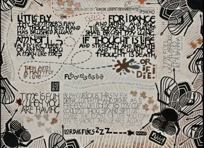
Week #38
This work was done by Lisa Devlin in New Orleans this year for the session
“Variations on Romans” in 26 Seeds: a Year to Grow. In her own words:
“Flies” was inspired by the work of Joke Boudens. I
enjoy the graphic boldness and humor of her work
which she achieves by butting up images and
different text blocks of various shapes, sizes and
styles. Although she seems particularly intrigued
with beetles and other insects, the subject matter
for my piece actually was inspired by a swarm of
flies that had infested my house. I found this
disturbing as I recalled a passage in the Bible
(Exodus 8:21). Perhaps I, too, was being punished.
Or maybe I’m just sloppy.
Artistic expression
helped me cope with these feelings. I started by
exploring the subject through online research and
sketching. I sketched and played with many ideas
and, because of limited space, many of them wound up
on the “cutting room floor.” It’s interesting how
such profound insights can be made and expressed by
comparisons to something humble or overlooked. Flies
can be playful, a nuisance, evidence of dirt or
incarnations of evil (i.e. Beelzebub). I liked the
idea of portraying the humble fly with references
from poetry (e.g. William Blake), comedy (Groucho
Marx), movies (Psycho) and everyday expressions. I
thought it would be fun to explore the word “FLIES”
itself by writing the first two letters and then
repeating the letter “i” or “e” and even drawing
eyes to create the word.
I chose a process
that, although time consuming, was familiar and
forgiving. I first hand-lettered the Neugebauer text
blocks on grid paper, drawing the letters so the
lines of text touched each other. |
I particularly enjoyed how the ascender of one
letter could merge with the descender of another with the dot in the
letter “i” adding another contrasting and playful element. I extended
some of these lines into adjacent letters and added “fly hairs” to
various letters in the William Blake text block (thus echoing the legs
of a fly). I created a carbon by tracing each text block with tracing
paper, turned the paper over and traced it again with a soft lead
pencil, taped the paper to a sheet of Canson paper and traced each
letter yet again (phew!). Then I drew over each letter with Micron and
Sharpie markers. It was a laborious process, but one that gave me a
feeling of control and allowed me to make adjustments where necessary.
Using a similar process, I drew graphic flies of various sizes,
traced, transferred and redrew onto the Canson sheet.
Design
decisions were made by considering contrasts in size, weight and
balance within the layout. But as the work progressed, I noticed that
it really didn’t have the wonderful feeling of Joke Boudens’s piece
because the text blocks and images were placed too far apart. A
patterned background would help create unity. Thick lines were drawn
in Prismacolor pencils and then erased in areas to create subtle
texture. These lines echoed the design of the larger flies and
generated a sense of movement. Conceptually, my goal was for the
viewer’s attention to move here and there around the page—much like
the movement of a fly.
“Am not I a fly like thee?” |
Click for
Video
* * * * * * * * *
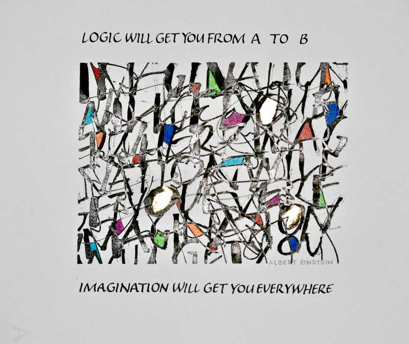
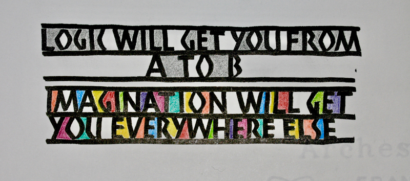
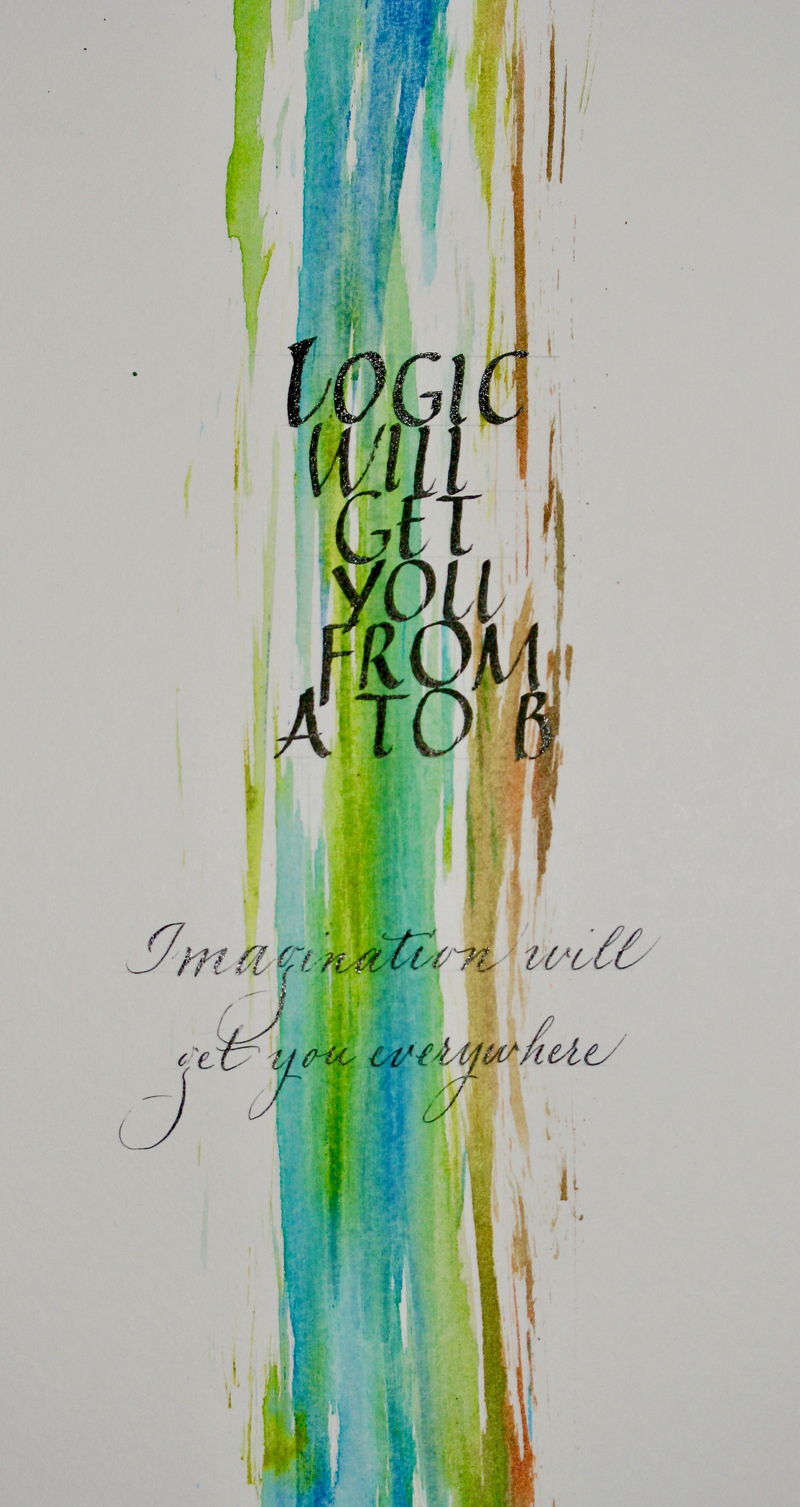
Week #39
This work was done by Gail Robichaud in Boston this year for the session
“Variations on Romans” in 26 Seeds: a Year to Grow. In her own words:
In doing the same quote by Albert Einstein in three
different Roman lettering styles, my objective was
to make "Logic" appear solid and "Imagination"
appear fluid and colorful.
The first piece that appears to be fragments is done
in sumi with a half-ruling pen. My objective was to
use the entire quote but to make the quote
illegible. In this way the reader may use their
imagination as to the meaning. The color is colored
pencil and there are three gilded circles. |
In the Neuland rendition, the lettering and
lines are done in sumi ink with the logic part colored in graphite.
The imagination portion is done in colored pencil to suggest
liveliness.
The third piece is done in watercolor and sumi. Different watercolors
were applied to one brush and then dragged across the page. Sumi was
then used to write the logic portion so that it appears more solid and
the imagination section more free flowing. |
* * * * * *
Week #40
This work was done by Nancy Kloos in Seattle
in 2016 for the session “DESIGN: Deconstructing the Grid” in PRIMITIVE
TO MODERN. In her own words:
This piece came about as a result of Reggie’s
“Deconstructing The Grid” Primitive to Modern class.
It measures 21” x 26”. It was a collaborative effort
with my friend, Lisa Tsang. The inspiration for this
piece was the picture of a stunning quilt we’d seen
on one of Lisa’s postcards.
We selected three sheets of coordinating paper and
stacked them together making the initial two cuts.
Then, one sheet was taken for the top, another for
the middle, and the last for the bottom.
From these pieces random cuts
were made and each piece was glued in place on black
paper with a pebbly texture. |
It felt almost as if we were assembling a
jigsaw puzzle and it became more exciting as each piece was laid.
The lettering was done on Arches watercolor paper with a Speedball B2
nib and the corners were sharpened with a micron marker. It was then
cut out with an X-Acto knife to play around with the positioning and
glued in place with raised double sided tape.
This was one of the few pieces I did in class. Our year had one class
left to go and had I realized how much fun this could be, I probably
would have waded into the water much sooner! |
* * * * * * * * * * * *
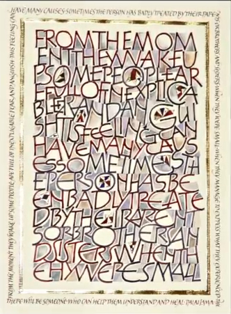
Week #41
This work was done by Maria Helena Hoksch in New Orleans this year for the
session “Variations on Romans” in 26 Seeds: a Year to Grow. In her own
words:
This is my third time to take Reggie's year-long
class, but my first time to submit to what has
become to be known as his signature homework
assignment - mono-line, somewhat rustic caps, very
recognizable. Some know them as Neugebauer caps,
others as a play on Tom Perkins take, either way
they are just one of hundreds of variations on Roman
caps. Why are they so good for beginners, I'm not
sure, but everyone always loves them and tries them
out. Everyone in class brings some homework! Goal
achieved !!!
From the beginning of my limited
time and planning on this assignment, I knew I had
to make these caps my own, somehow. I used the
speedball B series mono-line, clumsy, nib yes, but
that was about it. I squared the ends with pointed
pen. I decided to play with spacing between letters,
different line heights, "weird" letter forms
(literally making them almost mutilated), and adding
color. After adding varying degrees of color to
letters, I also added it to the background, making
it all look one twisted texture, as one mess of a
memory. Instead of painting the insides of seriously
exaggerated round letters, I left them empty to
symbolize the holes in our remembrance. Dalai Lama's
quote about childhood relationships following us as
inexplicable fears into adulthood made perfect sense
as my text, and I used it by abandoning any word
spacing into illegible whole rectangular center. |
Now, I had picked a special paper for this
piece. That gave a certain quality to everything I did on it. If I'm
not mistaken, it is no longer made fabulous Fabriano Italia. It has
heavy textured laid surface lines. It makes the letters, gilding, and
even delicate brush painting look like traces left by a tractor tires
in wet mud. I very much chose, enjoyed, and used that effect to add
another dimension to this piece. Something my human hand could not
have created on its own. The decorations amidst the letters are like
little kites of hope floating around, with no care paid to their exact
placement. Randomness is their message.
As I by now know about
myself, I am an accidental artist, not a careful planner. Ideas,
colors, and solutions come to me as I work and create. I have to
decide when to stop. And I don't always know when to stop. After the
gilding, I decided the piece lacked some finer, more delicate quality.
To take away some of the childishness of it all. That is when I added
the same quote once more in more refined and sensitive "small caps"
going around the "messy center", in much
more skilled, smaller,
and delicate version, this time totally legible. The uniform color of
these small caps is to calm down the eye before it finally leaves the
piece.
Size 18.5"x14" . Tools and materials used: speedball B
nib, Mitchell nib, pointed pen, ruling pen, fine brush, various
watercolors, gold leaf over Instacoll base. |
Click for
Video
* * * * * *
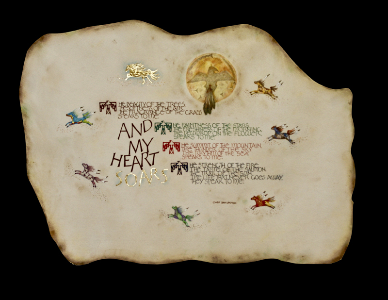
Week #42
This work was done by Carmel Cucinotta-Harmon in New Orleans this year
for the session “Variations on Romans” in 26 Seeds: a Year to Grow. In
her own words:
I had this piece of vellum for a few years. I never
had an inspiration to use it. However my husband,
Butch, is always reading about Native American
Indians; and Reggie recommended a book called “Many
Winters”, by Nancy Wood. This was all the
inspiration I needed.
My quote is one of many by Chief Dan George. I used
a Thunderbird to indicate the “T” at the beginning
of each phrase. I used gouache in Red Ochre, Oxide
of Chromium, Cadmium Red and Indigo to write the
quote.
The Indian Shield is done in Colored pencil; I
layered many colors to achieve the slight variation
in color. The ‘ring’ around the shield is soft
pastels. My attempt was to mimic the old writings
and ‘winter counts’ made by Native American Indians
to record their history. I became fascinated with
the designs the Native American Indians painted on
their horses. I used colored pencils to create the
designs on the horses running across the page. A B-6
nib was used to write the Neugebauer Caps. I used
the Monoline practice sheet to write the Tom Perkins
letters. I then traced them onto the Vellum. At
first I tried to write directly on the vellum with
my nib, which kept pulling. |
I think the vellum was not prepared enough.
After tracing the letters on the vellum, I filled in with Red Ochre –
using a 10/0 spotter brush. I like this brush for its size, but more
importantly for its firmness.
I used Extra Heavy Gel Gloss to build up “Soars” and then gilded with
gold leaf. For the gold horse at top I built up several layers of the
Extra Heavy Gel Gloss; and then gilded with gold leaf. I had to use
“activator” to fill in the crevices where the gold leaf did not
adhere. I used a pale blue colored pencil to delicately outline the
gold letters and gold horse.
The bottom section of the vellum was straight cut. I cut the bottom to
match the top curves. Using a soft cloth I smudged soft pastels around
the edged to give the look of age. As usual, I do not do well planning
a layout. I never follow the many ‘thumbnails’ I work up. For this
piece I began with the shied and worked down. Everything just fell
into place according to my whim.
I thoroughly enjoyed working on this piece and want to thank Reggie
for ‘pushing’ me to do more with ALL of these homework assignments! |
* * * * * * * *
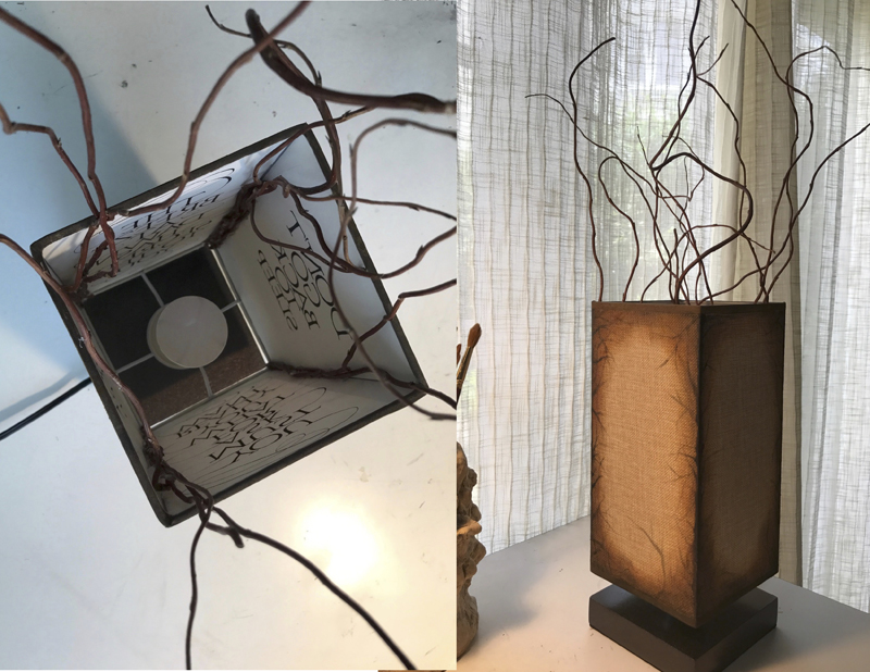
Week #43
This work was done by Patti Adams in New Orleans this year for the
session “Pressurized and Drawn Romans” in 26 Seeds: a Year to Grow. In
her own words:
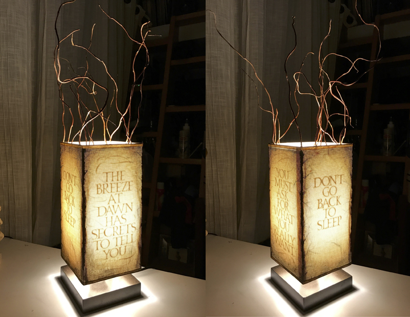
“Don't Go Back To Sleep”
Every calligrapher prays for the moment when the
proverbial light comes on; that moment when you can
finally see the piece. For me, those moments are
illuminating, in every sense of the word. So, when
trying to find a way to capture the essence of one
of my favorite Rumi quotations, I decided I had to
do pressurized Roman caps on a lamp!
The first order of business was to find the right
lamp. It had to have a shade of equal sides, at
least 5" wide and a height of at least 10" or more
and a narrow, square, dark wooden base. To my
amazement, I found one online! I also went to my
local florist and bought some dried willow branches
with the idea of attaching them to the four corners
of the shade. (Don’t you love a good glue gun?!) I
thought this would be a way to draw the light out of
the lamp.
Now, how to write on the fabric!? I quickly had to
rule that out since the shade was made out of linen.
The obvious solution was to attach the calligraphy
on the inside liner of the shade. Now came the
really tricky part: In order to be able to read the
lettering on the outside, it had to be
written backwards on the inside: the ultimate Reggie
spacing exercise! So, I did pressurized Roman caps
(Mitchell nib) on 140 lb Arches HP WC paper, using
van dyke brown qouache, adding flourishes (Hunt 101)
to echo the movement of the branches, backwards. Now
that was fun! :/
The
poem’s title and main message that is repeated three
times in the brief poem is repeated on two of the
four sides (and no, I didn’t just run it through the
copier, although I was tempted!), with the two other
most important lines of the poem lettered on the
other sides. |
These lines
are only visible when the lamp is switched on. After the lettering and
flourishing was all done came the scariest part: attaching the paper
to the lampshade. I sprayed adhesive mounting glue onto the back of
the artwork and oh, so gently guided it down into the lampshade,
praying that it didn’t attach itself to anything on the way down or
worst yet, get attached at a crooked angle. OCD calligrapher that I
am, I breathed a huge sigh of relief when that was done!
So, now to work on the outside.
I wanted the lamp to be equally attractive when in the off position so
I needed to create some drama. The lampshade, which was a dull cream
colored linen, needed some depth of color and textural interest when
unilluminated, so I took my van dyke brown (acrylic paint this time)
and glazed color at the corners, along the
bottom and top and painted “branches” coming out of the sides, again,
to mimic the willow branches bursting out of the top.
The parallel message here for me is the way I can feel when practicing
Roman caps or italics or copperplate or fill-in-the-blank hands. While
still concentrating on the task, it can sometimes feel very
uninspired. (As a professional musician, I do understand the
importance of practicing my scales but seriously, there are days,
right!?) But then, often after these long practice sessions, I can
pull out a delicious piece of Roma or Arches or Fabriano or BFK Rives
paper out of my file and the “lamp” comes on. It seems as if the
artwork has simply been hiding out in the drawer all along. I just had
to bring enough energy to the work and then, in turn, enough power was
generated for me to be able to see the piece. Don’t go back to
sleep...the breeze at dawn has secrets to tell you...you must ask for
what you really want...don’t go back to sleep...
This lamp now sits in my art studio overlooking my calligraphy table,
reminding me always about the work, the process, and, hopefully, the
illumination. |
* * * * * * * * * *
Week #44
This work was done by Ann Rabinovitz in Memphis this year for the session
“Variations on Romans” in 26 Seeds: a Year to Grow. In her own words:
I was not going to take Reggie’s last year long
class this year but somehow found myself doing just
that. Looking through my old papers and possible
designs never finished, I found this outlined
alphabet that was flush right. I decided to make a
mirror image of the alphabet and that left a top
round empty space and a bottom round empty space,
which I thought was really cool. Little did I know
how hard it would be to come up with a design for
those spaces.
Once I got the letters properly
drawn and fitted into gridded lines, I began to fill
in the back ground around the letters, mostly going
from a light tint in the middle of the piece to the
actual color and then having the darkest color on
the outsides. |
I wasn’t sure that I liked the W/N primary
gouache series of colors, but when I painted them in the order that I
arrived at, I was amazed at how well they all blended together and the
color just sang.
But the piece did not look finished so I added
lettering in the top empty space using a B2 nib. On a separate piece
of paper, I then made several different designs for the bottom area
but was not happy with them, so I moved onto creating the side
borders. I wanted them in grays, but after several test tries of
various colors and shapes and sizes of the shapes, realized they
dulled the colors in the original middle part. So, I went back to
using some of the original colors and that seemed to work. Then I went
back and made several more designs for the bottom area, combining some
lettering and the color design. My vow to do simple smaller works this
year had gone by the wayside. Though this piece is only 9” X 7” it got
more involved than when I first started it. I rarely name my pieces,
but this one I am calling “More than Rainbow Colors”. |
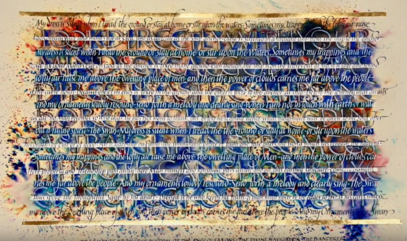
* * * * * * * *
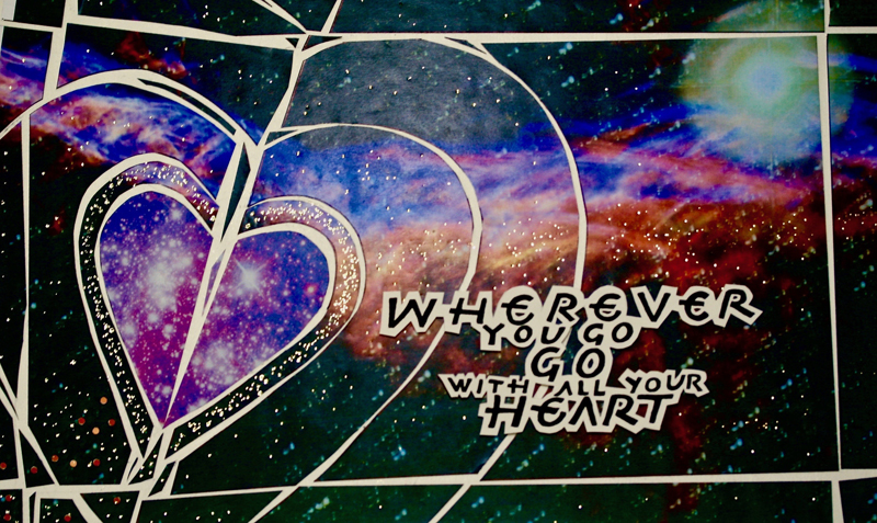
Week #45
This work was done by Sandy Hanower in 2016 in Seattle for the session
“DESIGN: Deconstructing the Grid”
in PRIMITIVE TO MODERN. In her own words:
The easiest part for this design assignment was
finding a quote that I wanted to use:
"Wherever you go, go with all your heart." Confucius
When I found a celestial background it seemed to tie
in with 'wherever you go," and a heart was just the
perfect symbol for the quote.
BACKGROUND: I started with an 11 x 17 inkjet print
with a celestial background.
LETTERING: I wrote the quote out on a grid sheet
with a Speedball B-3 nib and sumi ink in a RAUCOUS
alphabet format. Then I reduced and enlarged the
words in various sizes --- +75%, +80%, +150%. I cut
up my words and repositioned them on a waxed grid
sheet for a desirable layout. After arranging my
words, I further experimented with the size of the
text by reducing my words by 85% and enlarging 120%. |
Then I cut around the final quote with a Xacto
#11 blade, leaving space around the letters -- approximately 1/8."
With the lettering copied onto a transparency, I determined the ideal
placement of my quote.
IMAGE - DESIGN ELEMENT: On tracing paper I sketched out a heart and
added some abstract lines to expand my heart. Then I traced the final
design on the back side of my color xerox background. The lines and
heart shapes were cut with my Xacto. On my waxed grid sheet, I laid
out my design and separated some space between each of the lines.
I then attached the text to my piece.
With a hot foil pen, gold dots were randomly added and more heavily in
the middle of the heart.
Now my image was ready to be photocopied.
I particularly enjoyed working on this design project. |
* * * * * * * *
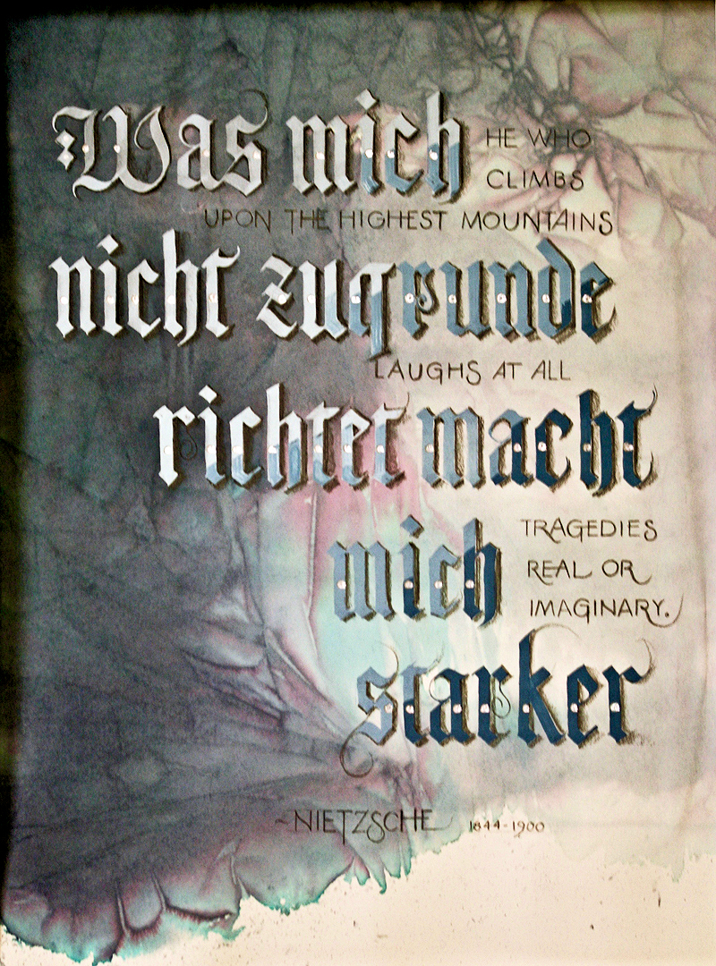
Week #46
This work was done by Rose Smutko in San Diego this year for the session
“Blackletter: How to Modernize a Traditional Calligraphic Hand” in
PRIMITIVE TO MODERN. In her own words:
I was intrigued by discovering Nietzsche's
quotation, not only in English language, but in
German. I loved the challenge of using two languages
in one calligraphic piece.
I initially began the project by spritzing water
onto Arches 140 Lb. Hot Pressed paper. While the
paper was still quite damp, I dropped in grey and
blue-greencalligraphy ink onto the paper. Moving
quickly I placed plastic wrapinto the ink & pulled
tightly in two different directions. I
uncharacteristically was patient and left the
plastic wrap in place until the following morning. |
After peeling the plastic wrap from the paper,
the right side of the paper was exactly the lightness of color that
I'd hoped for; the left seemed too dark.
However, I decided to use this contrast to my advantage. I used Black
Letter for the German translation. I started with a very light value
on the left, graduating to dark on the right. I also added metallic
silver foil in the middle of each letter. Finally, I used graphite
pencil for both the shadows on the Black Letters and for the English
translation. |
* * * * * * *
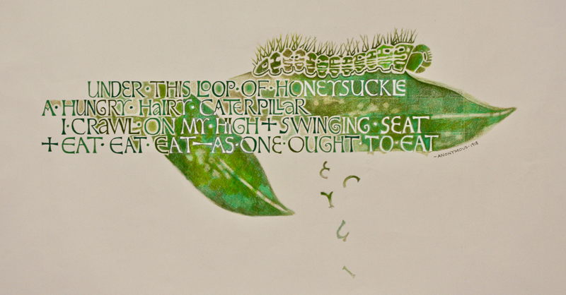
Week #47
This work was done by Lisa Devlin in New Orleans this year for the session
“Variations on Romans” in 26 Seeds: a Year to Grow. In her own words:
The idea for “Hungry Caterpillar” began with an
illustration I had drawn of a caterpillar in an old
sketchbook. I found a playful poem online and
thought this stanza would be perfect for an image of
a caterpillar munching on some leaves.
The calligraphy designs of Marina Soria inspired me
for this project. I particularly like the way she
emphasizes abstract shapes between letters and
thought it would give the impression of the
caterpillar chewing on leaves, creating holes that
become letters or the white spaces between them. For
the lettering, I thought David Jones’s variation on
Romans would give the piece a wonderfully quirky,
organic feeling. To create a sense of unity and
prevent needless distraction, I thought it was
important to make the piece monochromatic. Various
shades of green—from brightly saturated shades to
duller tones —would also, I believed, give my
drawing a subtle, organic quality.
I started by drawing the letters in graphite
on grid paper and arranging the lines of text. I
then transferred the letters to Arches text paper by
creating a carbon with transfer paper. I created
four shades of green with gouache and drew the
letters using a Mitchell 3 nib. A different shade of
green was selected randomly every few letters to
enhance the organic feel. |
I then penciled in an outline of the leaves
and transferred the caterpillar design. As I colored in the leaves
with Prismacolor pencils, I changed my mind about the color of some of
the letters—deciding it would be more interesting to have those
letters appear as negative shapes inside the leaves. So I painted over
the green with Dr. Martin’s bleedproof white directly on top. Having
pieces of letters oating down as if partially eaten by the caterpillar
also was a last minute decision.
This was an important project for me because it introduced me to the
calligraphy of David Jones. I’m new to calligraphy and working with
nibs. His letterforms seemed more forgiving and accessible to me.
Although the piece was a stretch, I approached it with a level of con
dence (no doubt aided by the hours of practice on Romans). I really
fell in love with the David Jones variation on Romans during this
project and de nitely will use it in the future. |
* * * * * * * *
Week #48
This work was done by Lee Thurston in Boston this year for the session
“Carolingian snd Variations” in 26 Seeds: a Year to Grow. In her own words
With our manuscript book assignment coming during
the peak of summer, I couldn't help but take
inspiration from all around me: a wealth of sun,
lush plants, good times with family and friends, and
vibrant energy all around! Along with several quotes
about the season, you'll find my own list of
favorite summer blessings, which are unpacked along
the bottom of each page.
The result is a
book project titled “Summer.”
Bound with a
Japanese stab stitching technique, the cover is made
of paste paper and the end papers have real
wildflowers incorporated in them. |
The
manuscript pages are Arches Text Wove, which I cut and folded in half,
providing two clean writing surfaces. I then created each page
individually before binding the book.
As assigned, all the
summer words and quotes are in the Carolingian alphabet. I chose
Mitchell #2, #3 and #4 nibs and gouache, using Winsor & Newton indigo,
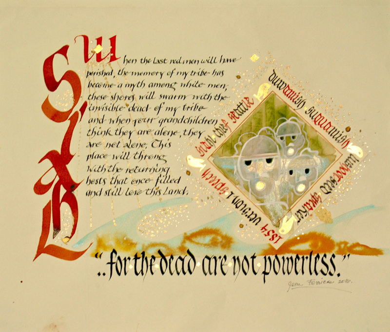
chromium oxide, red ochre, and ivory black--thank you, Reggie, for the
color recommendations!
Simple drawings in watercolor pencil
complement the words to finish off this personal summer sketchbook. |
Click for
Video
* * * * * * * * * *
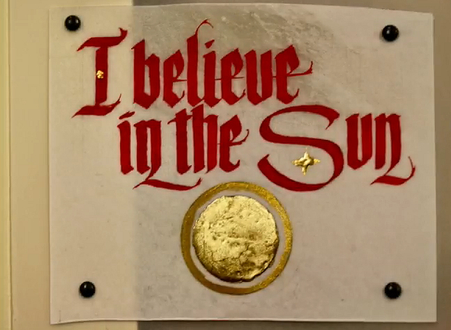
Week #49
This work was done by Rose Smutko in San Diego this year for the session
“Writing on Vellum” in PRIMITIVE TO MODERN. In her own words:
My initial inspiration for this assignment came from
a powerful
quotation by a Jewish prisoner
(anonymous) during the Holocaust. "I believe
in the Sun, even when it is not shining. I
believe in Love, even when I cannot feel it. I
believe in God, even when He is silent."
These juxtapositioned phrases seemed to lend
themselves perfectly to alternating between one page
of "light", followed by one page of "dark". I used
vellum with gilding on each page of "light"
alternating with eco-dyed paper for each page of
"dark".
Eco-dyed paper is created by placing
plant materials onto paper, bundling them over
rods and immersing the bundles into hot water. |
The string used to secure the bundle onto the
rod, created horizontal lines that seem to resemble barbed wire. In
order to enhance the feeling of barbed wire, I drew barbed wire with
black ink at the bottom of each "dark" page. I also shaded the Gothic
letters, as well as the barbed wire, with graphite pencil.
Creating the book itself presented a challenge, since I had never
actually made a book before. Enter DIY instruction of Bookbinding 101
on You Tube. After re-charging my iPhone's battery, I was able to
complete my project. I used black paper on both the front and back
cover to convey a somber feeling. And, I used twisted black twine to
complete this small book - again to resemble barbed wire. |
Click for
Video
* * * * * * * * *
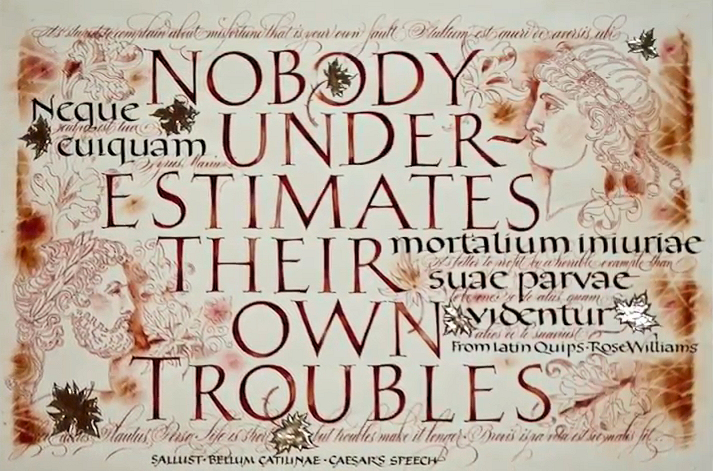
Week #50
This work was done by Maria Helena Hoksch in New Orleans this year for
the session “Variations on Romans” in 26 Seeds: a Year to Grow. In her
own words:
TROUBLES
This pic of the week “describe”
request from Reggie reached me while I was traveling
in Egypt. So I try and tie this fact in, even though
I had created Troubles several months prior.
While visiting the ancient temples in Luxor, my
guide told me how the temples were built from inside
towards outside, so the first and oldest part was in
the middle, and every next ruler had to go around,
further out, to add to the temple complex. No ruler
had an idea what the next one would do, add or
eliminate. So that is where I found out that I
thought like Egyptian, which is of course a joke!
When exhibiting Troubles at IAMPETH this summer,
someone asked me - where do you even start a
“complicated” piece like this. My answer was: in the
middle, with no real idea what I was going to add
later, when I had time to come back to it, if ever.
All I relied on was my intuition, knowledge of some
basic layout rules, and no real care of what was
going to turn out, if anything. It was not to be a
serious piece. (This really is not what I said, I
just mumbled something perhaps much smarter that I
cannot recall.)
The first things I did were naturally the
large drawn and painted-in Roman caps. I did plan
the layout of these a bit, which means I had a
really rough draft. A month later I added the
foundational hand. Then weeks after that, the
delicate leaf design and the faces that appear to be
on the background. Some of the leaves I later
gilded.
|
The last script to add was the lace-like
flourished copperplate. I added it with a light touch but with
abandon. To complement, not to compete, with other hands.
At
the beginning of the year Reggie had stressed to the class: bring to
the homework what is unique to you personally. I had always realized -
being part of the wider calligraphic society, divided mostly into two
somewhat opposing schools - that one of the rather rare qualities I
possess, is feeling equally comfortable with pointed OR broad edge
pen. Not at all the same for every calligrapher, I had found long ago.
Most prefer one OR the other.
Starting the year long class, I
set as my personal goal and mission to bring these two different tools
(and schools of thought) together as often as possible in the very
same pieces of work. To reconcile them in my creations in unexpected
ways. I can now say I kept to my goal. I created rather several pieces
that way. One of them, rendered on silk, was pic of the week couple
months back.
Materials and tools used: pencil, Mitchell nibs,
fine brushes, pointed pen, loose leaf moon gold, watercolors, gouache,
pastels. |
Click for
Video
* * * * * * *
Week #51
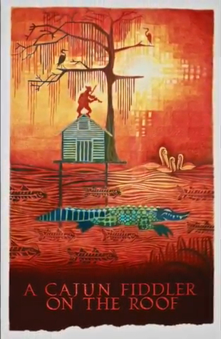
This work was done by Lisa Devlin in New Orleans this year for the
session “Variations on Romans” in 26 Seeds: a Year to Grow. In her own
words:
Like many Louisiana image makers, this state is my
muse and I’m driven in my own way to portray its
culture and tell its stories. Although born and
raised in New York City, I’ve lived most of my life
in southern Louisiana. Perhaps moving to a different
region with its own unique culture has inspired my
interest in how our environment shapes our
identities.
It occurred to me that the
experiences of Cajuns and the local Native Americans
are very similar to the Jews in the story of Fiddler
on the Roof. Because of coastal erosion brought on
by climate change, oil drilling and river levees,
many local people have been driven from Louisiana’s
southern-most areas. is has threatened their
livelihood, their sense of community, their culture
and way of life. In other words, their struggle to
hold on to tradition is as precarious as a ddler on
the roof. Whether driven from the land by cossacks
or by coastal erosion, the challenge is the same.
However, in my drawing, the ddler has been driven to
his roo op by the rising water—much like many New
Orleaneans during Hurricane Katrina.
I drew A
Cajun Fiddler on the Roof before starting Reggie’s
26 Seeds course. So it was originally drawn without
text at the bottom. My process begins with an idea,
followed by research and a little sketching.
Typically, I develop a composition by creating
individual drawings of different elements in
graphite and move them about the rectangular
background and re ne until I achieve the nal
composition. I then lay a large sheet of tracing
paper over the collage and trace it with pencil. e
tracing is turned into a carbon and transferred to
thick illustration board. Although it might seem
that the drawing is locked in at this point, there
is much opportunity for improvisation. While
coloring it with Prismacolor pencils, I see new
things emerge in the composition. ere’s a kind of
push and pull as some areas are emphasized over
others, new shapes evolve through color and texture
can be created by erasing and blending. |
The completed artwork was sent to an imaging
center where a high resolution scan was made and a le provided in pdf
form. A er opening the pdf in Photoshop, I extended the bottom to make
room for calligraphy, giving it a torn edge to echo the feel of
spanish moss (I think I probably went overboard on blurring the
bottom).
The pressurized Roman calligraphy was created with a #2
Mitchell and brause nibs for the serifs. A er hours of practicing how
to control the pressure and the pen strokes, I drew the letters on a
separate sheet of paper which I had scanned, brought into Photoshop
and added a reddish texture taken from the drawing. e attened
Photoshop image was returned to the imaging center and an inkjet print
was made.
A word about materials: Some people have asked if
using Prismacolor pencils on such a large image is time consuming and
expensive. I’ve found good prices online. Although I apply heavy
layers of pencil, a single pencil covers a lot of space. ey’re high
quality and interesting shades can be created by combining different
colors. It does, indeed, take some time to cover a lot of ground with
such a ne point, but I like the control it gives me and the ability to
do ne, detailed work. Heavy layering almost gives the appearance of
paint without having to spend time on paint set up and clean up. So if
I only have 15 minutes here and there to work on a project that day I
can quickly pull out my pencils. It eliminates the expense of paint
brushes. And nally, colored pencils are very portable, so I’m not con
ned to my studio. While I would like to include other materials such
as watercolor and collage in future projects, I think colored pencils
will remain a favorite.
I never intended for the original A
Cajun Fiddler on the Roof image to contain text. But the addition of
calligraphy has added another dimension to story telling which I hope
gives it, and future work, a deeper, more meaningful experience. |
Click for
Video
* * * * * * * * *
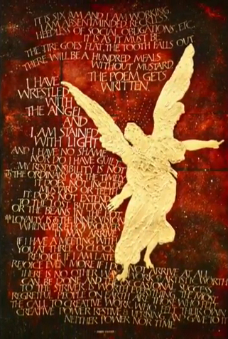
Week #52
This work was done by Patti Adams in New Orleans this year for the session
“Variations on Romans ” in 26 Seeds: a Year to Grow. In her own words:
One of my favorite poets, Mary Oliver, has written a
wonderful book of exquisite essays: “Upstream”.
These lines I share with you are from the chapter
entitled "Of Power and Time".
For me, it captures precisely what I feel when
struggling with a piece of artwork, be it
calligraphy, a drawing, or a painting; that
indefinable agitation that can be there as you
realize yet again that the laundry is not going to
get done, the groceries are not going to buy
themselves and all the dust bunnies in the house
have now multiplied. And it doesn’t matter. You have
done the work. You have gone through the struggle
and now you have a visitor in your studio. It is as
palpable a feeling for me as having had the idea in
the first place. Call it your muse, your angel, the
creative spirit...it is there! And I will do
anything to keep it there with me. Everything is
easier. The hand feels guided. But only after the
work has begun in serious earnest. Total commitment.
The piece was done on a piece of 16x20" BFK Rives
paper, using gold leaf, acrylics and gouache. I
covered the paper with a base of ultramarine blue
and then applied 23K patent gold leaf to the entire
surface. |
After lightly rubbing the gold leaf with
fine dental pumice, I then applied many light glazes of alizarin
crimson and indigo blue.
Next came drawing out the angel and
deciding where the text would go, planning everything on tracing paper
before making a mark on the gilded surface. The angel is by Raphael,
drawn from a huge street banner I have hanging in my house from a show
on that artist at the The Morgan Library. I created some contour on
the angel using molding paste and gesso, building up different planes
using a palette knife. The angel was then gilded in 24K gold leaf and
tooled in a variety of spots to create texture. (I told Reggie the
title of this piece could be "Two Books of Gold Leaf"!)
The
pressurized Roman cap variations were done with a Mitchell nib (taking
great liberties with the structure of a variety of words!), using
naples yellow gouache for the body of the text and Finetec silver for
the wrestling with the angel sentence. Finally, I took a deep breath,
put diluted naples yellow on a battered old toothbrush and flicked it
all over the piece. I like to think the angel was holding my hand the
whole time! |
Click for
Video
* * * * * * * * * *
The End: Happy 2018
|