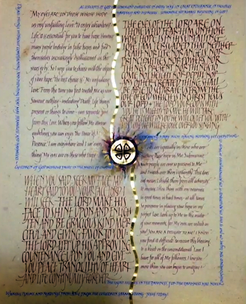
Children of God:
This was one of my previous,
unfinished pieces, pulled out and completed when
homework was due. It went well as it consisted
already of some variations on romans and italic.
Both were subjects at Reggie's yearlong class last
year. I added some more variety, plus the blue lines
of small caps. And finished it for good.
The
subject is clearly religious, more particularly
Jesus in Christian lives today. I chose the paper
first, which is extremely textured, coarse, non
bleached handmade Twinrocker whole sheet (18”x23”),
it almost looked and felt like cloth, perhaps
reminding me of Jesus’ robe. When creating more
contemporary pieces such as this, I usually turn to
religious texts as nobody cannot say the style does
not fit the subject. Anything somehow goes and fits
when it comes to religious texts.
My process
of creating a piece is more intuitive than planned,
such is my personal character. I count on my basic
knowledge of design, my decades of experience, and
let the inspiration and lettering flow. I often
reach for inks already at my table, that are custom
mixes, leftovers from previous jobs or projects, and
see what goes together. |
I hardly find a color combinations that feel entirely
wrong. Here, I counted more on the contrast of textures than the
“perfect choice” of colors. Literally, the paper is divided into four
equal parts, then into two halves.
So simple a child can do it. Then I pushed it slightly off balance by
making some quarters slightly smaller, and creating some variety
within the quarters. The blue lines of small caps further “disrupt”
the balance to add interest and complexity.
The line of
gilding feels somewhat unexpected on this rough paper, but the effect
that the paper creates by buckling up from layers of instacol, was a
real surprise bonus. Looks like a ribbon or a flowing river. I am not
sure the medallion in the center achieves anything, and looks like a
mistake I would not repeat in do-over, if there were one. But many
people who saw the piece at exhibition, told me the “jewel center” was
the main draw for them. So what do I know? I don’t get to decide, the
viewer does. I created my art, the viewer creates something out of it
for themselves by looking at it, with their personal eyes, and
reflecting on it through their point and soul.
After you
create a piece of art, you just have to let it go, flow out and live.
If you are brave...
Materials used not previously mentioned:
Mitchell nibs (small sizes), gouache, pastels, 24 K gold leaf. Note:
it was hard to create perfect letterforms with sharp nibs on this
extreme paper. The result is not my best lettering, but rather flawed.
No apologies. |
 Video
Video