* * * * * * * * * *
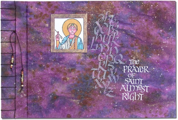
This work was done by Janell Wimberly in Dallas in 2007 for the session “Variations on Romans”, in 26 Seeds: a Year to Grow. In her own words:
|
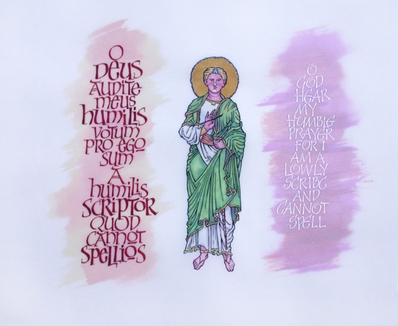
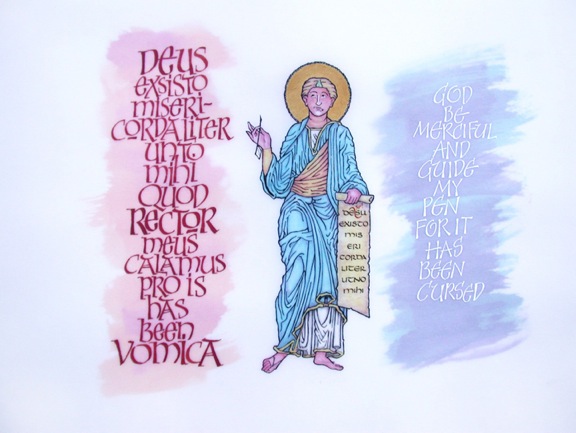
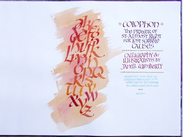
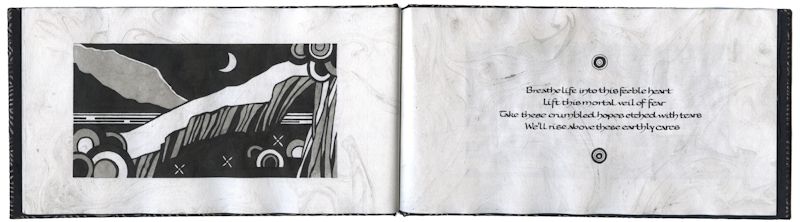
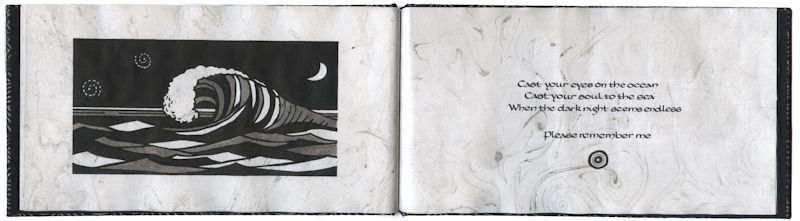
The story of “The Prayer of St. Almost Right” -- Janell Wimberly The idea for this piece started with an exercise in the first class I took at the 2005 Legacy Conference in Dallas in 2005 from Gwen Weaver -- “Romantic Romans”. I was trying to come up with some text to practice her fabulous letters and the idea of those times when we calligraphers “almost get it right” but look back on our writing and find a HUGE spelling error or text left out, or duplicated... so close! I wrote a brief narrative (St. Almost Right) to practice the hand Gwen was teaching and then later for one of Reggie’s classes from the “26 Seed of Calligraphy” decided to expand this same idea into book form (designing a simple manuscript book). I used a new "paper"/material for some of the pages to give the book some depth and interest; a transluscent paper called Chartham transluscent text. The 105# frosted paper is heavy yet translucent enough that it allowed me to draw on the front and put color on the back giving the figures depth and allowing, in some cases, white letters written on the transluscent paper to “float” over the page beneath. (Unfortunately, Chartham no longer makes the heavier 105#). |
I used a form of uncial and developed a letter form derived from
pressurized Roman and versal letters, what I call “Roman Versal”
for part of the text. The translucent paper was a good paper to
letter for gouache. The lettering and hairlines stayed crisp and
clean. The other pages were done on Arches Text Wove, one of my
favorite papers for lettering and book making. Arches loves
color and since it is a print paper, can be dampened and worked
with water color without having to be taped and stretched like
regular water color papers to keep it from cockleing and
buckeling. The "Latin" is a bastardized version using an on line Latin language generator, but I wasn't looking for literacy accuracy at this point! The covers were made from davy board and covered with a RIT dyed and “distressed” butcher paper. The book set up was part of Reggie’s class to learn how to construct a manuscript book. The drawings were done with black stick ink and the drawings were colored with gouache, gold inks, colored stick inks and water colors. The cording for the book was a leatherette cording decorated with various beads. The size of the manuscript book is 11.387"x16.75". |
This work was done by Chris Supina in Michigan in 1993 in 26 Seeds: a Year to Grow. In her own words:
|
This was a page done for a book that was a presentation to
Reggie from our 1993 Michigan class. I used Mitchell metal nibs, gouaches, and Micron Pigma markers on Arches watercolor cold press paper, size 10” x 10”. |
I still carry the stars and scars of that magic time together and am grateful for both. |
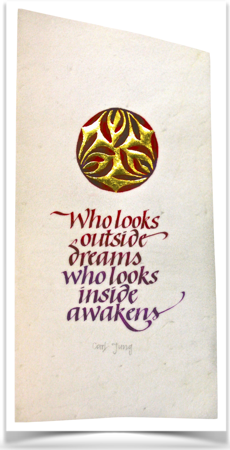
This work was done by Joanna Zdzienicka in Chicago in 2014 for the session “Italic and Italic Variations”, in 26 Seeds: a Year to Grow. In her own words:
|
This work is done on a vellum piece, prepared by Reggie. The
size of it is about 8x4". I really loved the irregular shape of
it and knew right away I wanted to embrace it. The vertical
orientation seemed to have potential for a more dramatic layout,
so I started my planing there. We were supposed to use an Italic hand. I decided to shorten the ascenders and descenders as much as possible, to keep the text compact, to create a visual texture rather than just lines of writing. The pressurized Italic variation seemed to have a natural, floral feel and harmonize with the image I chose. |
When deciding which part of the image to gild, I tried coloring on
a piece of paper on the inside in gold, and orchids in red: and
the opposite as well. The gold in the middle looked much more
interesting, drawing attention to its abstract shape; it was
also perfect for depicting the meaning of the quote. For lettering and painting the flowers I used WN Alizarin Crimson watercolor and a touch of WN Light Purple gouache. Gilding was done on Instacol base with 23K loose gold. It was a stressful experience to do it on the one and only piece of vellum I had, but I am quite happy I overcame the fear and tried this amazing material. Absurdly, the most profound experience was to line the vellum. The pencil graphite felt so nicely, "creamy" on the surface! |
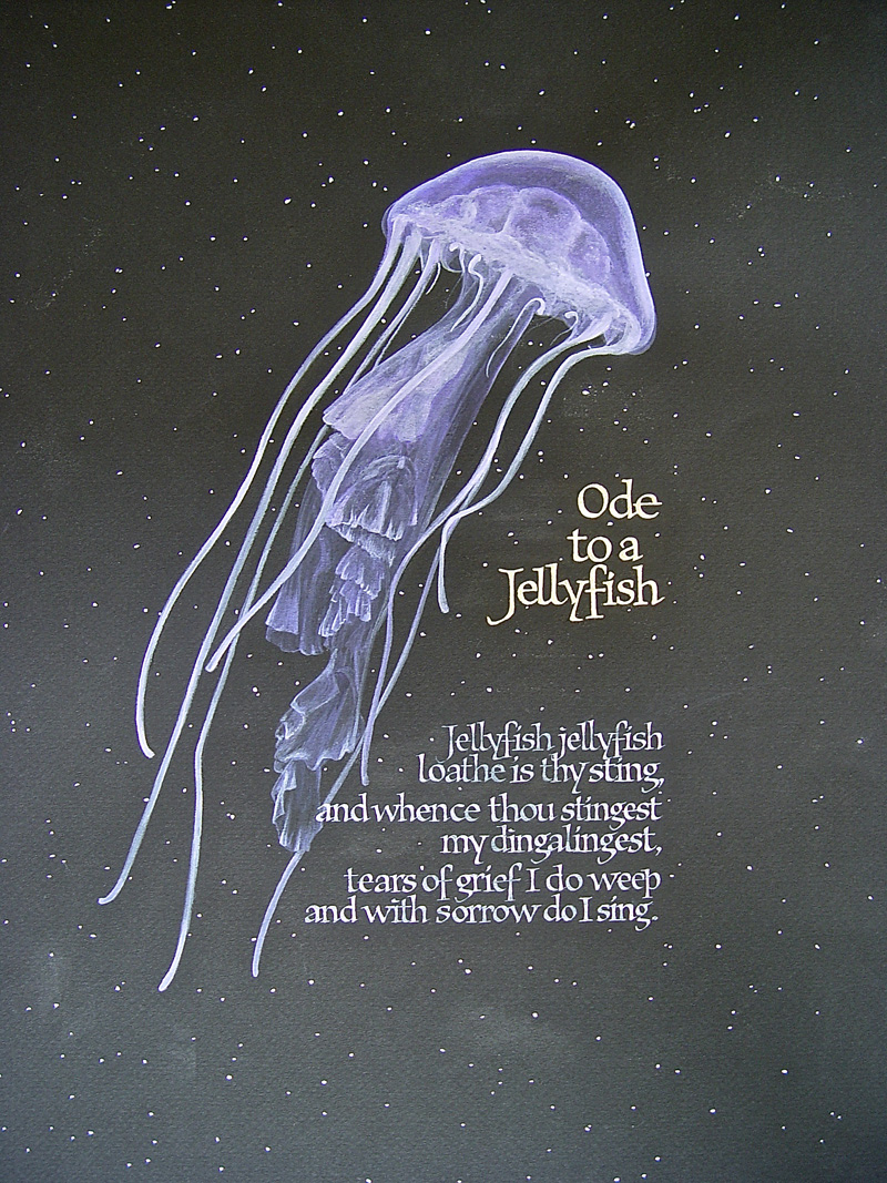
This work was done by Laurie Cook in 2002 in Portland for the session “Variations on Foundational”, in 26 Seeds: a Year to Grow. In her own words:
|
It appears that this assignment came after lessons on lettering
on black paper, using the Linex liner, gilding, and doing
bookhand, July 2002. 12 years later, I'm not sure of all of the
details, but I'll jot down what I do remember. I'd seen a photo of this jellyfish in a magazine (maybe 2" tall) and then searched for a quote to go with it. After time, I think I should have looked harder for another quote, but this is what I came across that month. The piece is 10.5" x 15.5" and I think I used Ingres black paper. I remember that it was pretty thin but the hard surface (vs. Arches) and minimal texture (vs. Canson) seemed good to lightly paint on. The jellyfish, background dots and the text of the quote were painted with gouache and the title is done in white gold. |
I think the base for the gold may have been gum ammoniac, but the
piece belongs to someone else so I can't inspect it to check for
sure. I used a flexible broad edge Mitchell nib for the
pressurized forms, and a Brause EF 66 nib to draw in the
delicate serifs. The jellyfish was painted first, and the lettering was worked out separately on white paper; then the paper was lined and I cut out each line, and lettered below them. If I had to do it over again, I would do the practice lettering on black paper and change some of the inter-line spacing. Some of it looks too tight to me, even though my lines were even and accurate. Isn't it amazing how I can remember doing this "wrong"!? Maybe that's an example of learning from one's mistakes - ? Always valuable, even if annoying... And in doing this piece, I had another realization: I like to paint, which I'm trying to do more of now. |
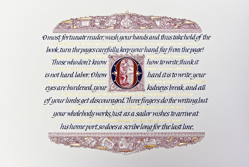
This work was done by Julia Silbermann in 2014 in Raleigh for the session “Carolingian and Carolingian Variations”, in 26 Seeds: a Year to Grow. In her own words:
|
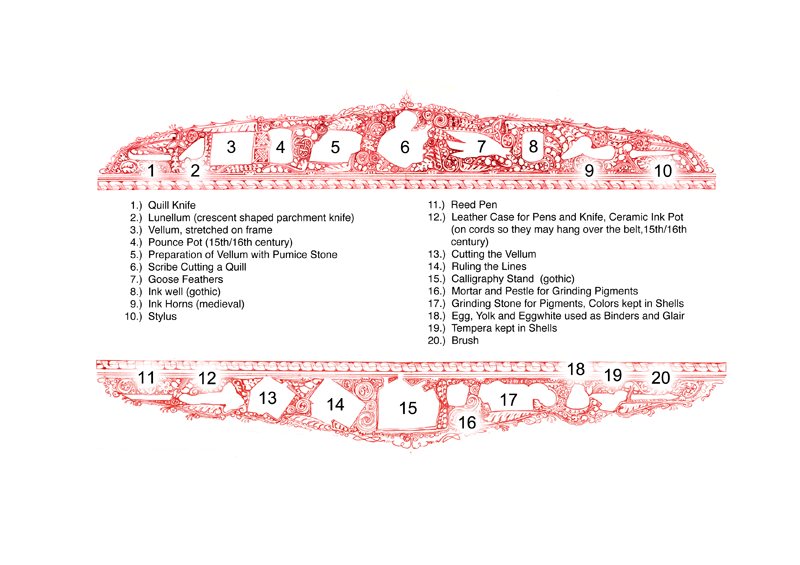
“The Scribe”: A quote by an 8th century scribe. Materials: 19”x25” Arches Watercolor Hot Press, Alizarin Crimson and Prussian Blue Gouache, Miniatum Ink, 23K Patent Gold, Instacoll, metal nibs. A scribe from the 8th century took the freedom to leave this quote in the margin of a book on Burgundian Law, which he had to copy. The words truly speak for themselves. They also made me take a closer look at all the techniques and materials that the ancient scribes had to know and use, apart from the actual writing: preparing the vellum, grinding the pigments, using binders and glair, knowledge about storing everything correctly, cutting quills and reed pens, ruling lines, etc. I wanted this work to be a kind of homage to the ancient scribes and depicted many of these techniques and materials in the flourished borders that surround the writing. There are 20 little illustrations hidden in them, which I created a little legend for, so they are easier to find. |
IThe flourishes in the borders are made up of the typical
variations of acanthus leaves, found in the Fleuronnée initials,
that started to be used in 12th century France. I also added a
few celtic knots, spirals, and key patterns as a referral to the
earlier insular decorations. The whole piece uses old design elements, but I also wanted it to have a more modern feel. I tried to achieve that, by detaching the Initial “O” from the beginning of the text and putting it into the middle of the layout, so it would become more of an illustration that balances the two heavy borders. Originally Fleuronnée was used to decorate initials and drag the flourishes along the text to create delicate vertical borders. Instead I used them in a horizontal position to create a rich framework for the writing. The original Latin quote is written in Carolingian with Miniatum ink on a flat writing surface with a Brause nib with reservoir, and gilded with 23K Patent gold. The English translation is written in pressurized Italic on a slant board with Gouache and a Mitchell nib without a reservoir. |
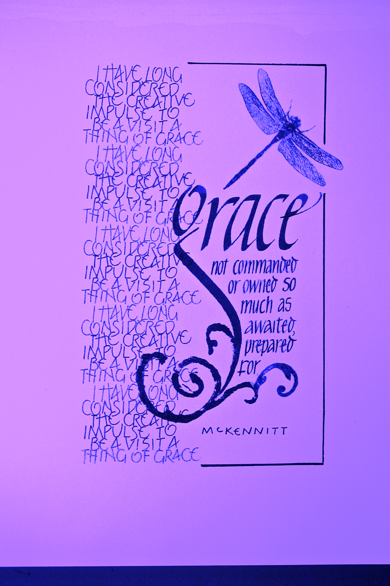
This work was done by Susan Burton in Chicago in 2014 for the session “Variations on Romans”, in 26 Seeds: a Year to Grow. In her own words:
|
Our assignment was in three stages: black-on-white, reversed,
and a finished piece using any variety of fine art materials.
This was the first stage, done in black and white as a draft so
I could experiment with styles and weights or both, and piece it
together. (Reggie has kindly enhanced it with color in
photoshop). I first wrote a block of text using a micron .05, repeating it, and printing it onto transparencies in two sizes so I could fiddle with placement and proportions. |
Using a C-1 nib and black gouache, I wrote out the word GRACE with a sweeping descender so I could align the remaining text up against it. For those letters, I used a Brause 1.5 mm nib but later darkened them with the micron. In my stash of this and that, I found a piece of deli paper with a broken swirl stamped on it; I tore it into pieces, using it as extension of the descender, and added the dragonfly as a way of extending the top of the g. Lastly, a partial border tied it together. |
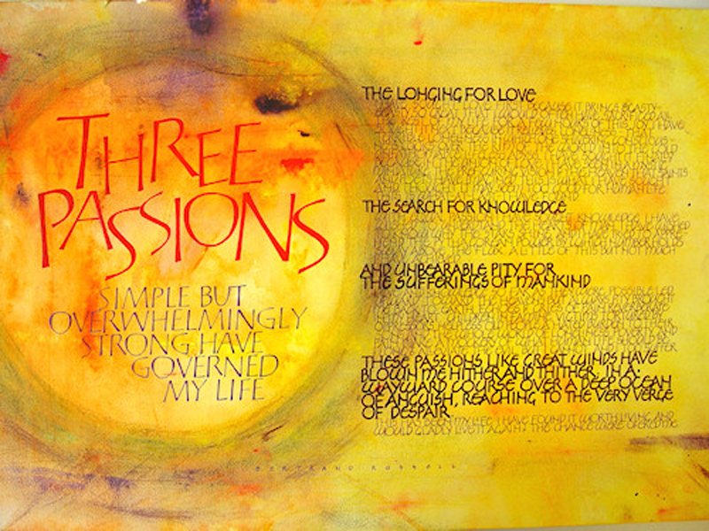
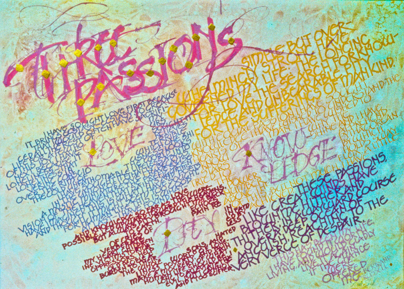
This work was done by Karen Nordstrom Roberts in Pittsburgh in 2002 for the session “Roman Variations” in 26 Seeds: a Year to Grow. In her own words:
|
To interpret the words of “Three Passions” by Bertrand Russell,
I wanted to give the piece a mystical feel because I found the
words to be profound and inspirational. I used Strathmore
watercolor paper (15" x 22") and a combination of gouache,
watercolor, and soft pastels. I created the background using a watercolor technique I learned from Leanna Fay. Full strength Winsor & Newton watercolor paint was squeezed out of the tube directly onto the watercolor paper. I used the edge of a credit card to spread the paint, then spritzed the paper with distilled water to allow the colors to bleed. Resulting in some areas with thick paint, and some with a pale wash. The areas of thicker paint are difficult to letter on so, I used Blair workable fixative spray to make the surface writable. The lettering was written in Winsor & Newton's designer gouache. Soft pastels were used to emphasize the title and unify the two major areas of lettering. |
I wanted to emphasize the title and important words by using
distinctive lettering. The title was written with the Tom
Perkins-style capitals which were drawn in outline with a bowl
nib then painted in with a brush. The text was written in an
uncial style inspired by Friedrich Neugebauer. The larger body
text is written with a Speedball B nib then finished by squaring
off the letters with a Brause EF 66 pointed nib. The body text
was written with a bowl nib. I tested many nibs and found the
bowl nib glided over the textured paper best to achieve a
monoline letter. Taking the year-long class with Reggie was a challenge but it opened me up to more layout and design possibilities and variations of calligraphic styles. I also enjoyed the recommended quotes, such as the Bertrand Russell one here, and the “optional homework" assignments to encourage students to take time to appreciate quality music, art, and film. |
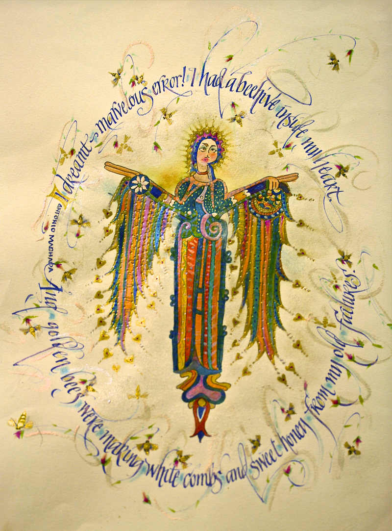
This work was done by Risa Gettler in Orange County in 2008 for the session “Italic and Italic Variations”, in 26 Seeds: a Year to Grow. In her own words:
|
Thank you for honoring my work and asking me to comment on the
project. The months assignment was Italic. But no matter what
the hand the challenge is for the verse and vision to compliment
each another so well that they melt into one vision. The angel
is Mozarabic from circa 8th century. Because the image is from
Spain I wanted the quote to be by a Spanish poet. I chose the
second stanza from Last Night As I Was Sleeping by one of my
favorite poets, Antonio Machado. Because it’s so beautiful I’ve
also included the last stanza). (Reggie, feel feel to eliminate
the last stanza, I included it because it resonates so
powerfully.) The work represents many materials and techniques learned in our earlier classes. Her dress and sleeve/wings were the ideal application of all the wonderful pigments we’d mixed in class. The lettering is done with a quill. The lettering is in gouache on Arches Text Wove and festooned with loads of gilding. I hadn’t written in a circle or oval before but class is all about experimenting so I went for it! I found writing in a circle is not so difficult if you apply the principal of always writing each letter directly in front of you. |
Homework assignments can have a life after the critique. This
image was featured on a cover of Angel Magazine and other
commercial applications. (Reggie you may want to eliminate this
last bit it was written as a way to endorse the worth of time
spent on task, i.e., your valid assignments.) Last night as I was sleeping, I dreamt—marvelous error!— that I had a beehive here inside my heart. And the golden bees were making white combs and sweet honey from my old failures. Last night as I slept, I dreamt—marvelous error!— that it was God I had here inside my heart. " -- Antonio Machado |
This work was done by Jane Doherty this year in Chicago for the session Italic and Italic Variations in 26 Seeds: a Year to Grow. In her own words:
|
This 12x20 inch image is on Fabriano Tiziano moss green paper.
The lettering and illustration are in gouache. I have a few more
details to add to the border decoration which I'll be taking out
my 00 brush to execute. |
If you look at the first S it has an odd flourish hanging off the top; what it really is, is an add on to camouflage a spacing issue. I think it worked pretty well. My 2014, 26 Seeds class is over, I plan on carefully tending my newly sprouting studio habits. |
Week #10
This work was done by Marijo Carney in1986 in Chicago for the session “Foundational Variations” in 26 Seeds: a Year to Grow. In her own words:
|
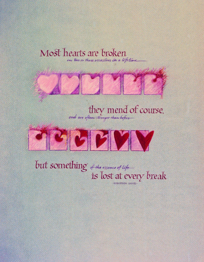
Most Hearts Are Broken |
The final art was done on a 25" x 19" piece of grey Canson Mi
Tientes paper, using oil crayons and colored pencils to draw the
soft round pink innocent heart that we are all born with. Then I
indicated the idea of pain being introduced by drawing a small
red spot on the pink heart that slowly grows until it takes over
and becomes the harder edged dark red heart shape you see at the
end. I broke the illustration into two sections and interspersed
the text between. I wrote the most important words of the quote with purple gouache using a Brause nib in a foundational variation that looked delicate and intricate to me, and the secondary words in a smaller script with a colored pencil. This way you only need to read the larger letters to understand the meaning. I did this piece so many years ago, but I still remember the thrill of having something I conceived of in my mind become tangible on the paper, and the enthusiastic support I received from my fabulous teacher...Reggie Ezell. |
* * * * * * * * * *
Week #11
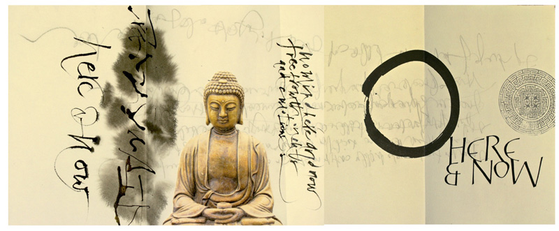
This work was done by Joanna Zdzienicka in Chicago in 2014 for the session “Variations on Romans”, in 26 Seeds: a Year to Grow. In her own words:
|
The assignment for this piece was to use a Roman Cap variation
in a short quote. Yes, ”here and now, my quote, is extremely
short, but written with the very challenging (in my opinion) Tom
Perkins caps. |
I added the Tom Perkins caps, which was the one and only
rehearsed element. It took many trials to compose and connect
the letters until they formed this ordinary looking detail. I
changed the shape of the letter "E" to make it work. Finally I completed the project with an image transfer of a Chinese labyrinth and a photograph of a Buddha statue, printed on Arches Text Wove paper. In the last stages of work I focused on designing each 'page' rather than the piece as a whole. The book has only 4 pages, folded in reversed order, so I glued additional black sheets of paper on both sides to create covers and make it visually richer. The size of my piece without covers is about 25”x10", made on Arches Text wove paper. The covers are made with black Arches Cover Paper. |
* * * * * * * * * *
Week #12
This work was done by Julia Silbermann in 2014 in Raleigh for the session “Carolingian and Carolingian Variations”, in 26 Seeds: a Year to Grow. In her own words:
|
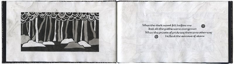
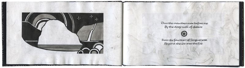
Manuscript Book: “Dante’s Prayer”, A song by Loreena McKennitt |
I used the marbling to create motion on the paper as a
counterpoint to the heavy woodcuts and to help transition the
eye from the illustrations to the small Carolingian writing.
Figuring out the Suminagashi technique turned out to be the
hardest part of the whole project. The ink did not want to float on top of the water at all, so I had to use vast amounts of distilled water. I needed to use fresh distilled water for every new marbling pattern and for each side of each single page. Otherwise the ink would just sink down immediately and no marbling could be seen on the paper. Later I read that surfactant chemicals like ox gall or photo flow can help with the water’s surface tension: thus the same water could be used for several marbling patterns. I would definitely try that next time. The book is closed by a long strip of Arches Cover Black paper, to which I adhered a metal button. I hand-wove the cord with a medieval weaving technique, similar to finger loops and sewed it to the paper strip, so it can be wrapped around the button. |
* * * * * * * * * *
Week #13
This work was done by Catherine Thrall in 2003 in Connecticut for the session Variations on Romans, in 26 Seeds: a Year to Grow. In her own words:
|
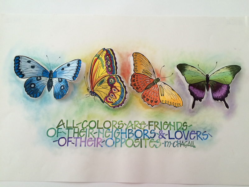
Butterflies by Catherine Filloramo Thrall |
II then painted with a brush, the butterflies using from the
left, mono, multi, analagous and opposite ( moving the green up
to a pale yellow) colors. After examing the final piece, I decided it lent itself to a bit more dimension so I cut the wings free from the paper and gently bent them up to look as if the butterflies were either just landing or getting ready to fly off. Sort of obvious, but I liked it. After our class critique, I decided, to tie the illustration, and the words more closely together by adding a soft backround of color, using pastels and leaving pops of white in the "O's" PS. It has been 12(!) years since that class with Reggie and it still seems like yesturday. My "bible" sits handy in my studio. I have taken so much from Reggie , including techniques and addages I have used for nine years teaching art to elementary / middle school students. |
* * * * * * * *
Week #14
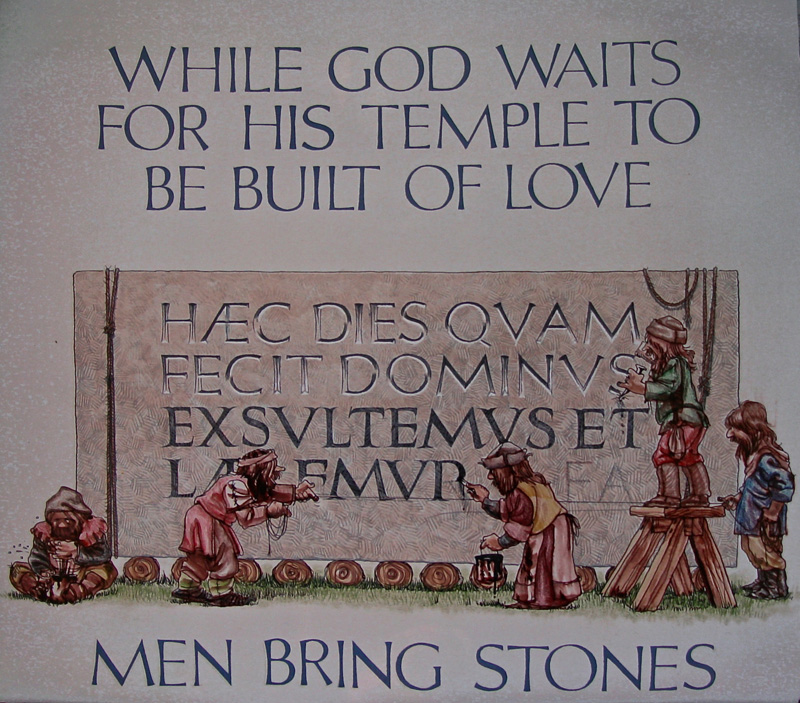
This work was done by Annie Barnhardt in 2002 in for the session “Variations on Romans”, in 26 Seeds: a Year to Grow. In her own words:
|
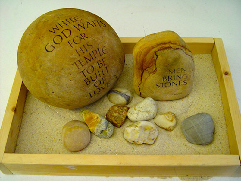
These words by Rabindranath Tagore have a potent meaning for me.
I knew I wanted to do something with stones, real ones, as
opposed to drawing or painting them. |
Using water color mixed to a hue deeper than the value of the
stone, I went over my blue lines with a Hiro #40 pointed nib. I
had previously tested the nib and writing fluid on the stone, to
see how the watercolor would mix with the blue Saral. I was
surprised that the surface of the stone didn't need any
preparation, other than cleaning. Whew! I painted the letters in with a Winsor Newton Series 7 brush, blending carefully into my outline, and touching up as needed. After a few days, I sprayed it with about a million coats of fixative! Not really, about ten. I worked on the small stone the same way. The hardest part was how to secure it while working. I used a bunch of towels to steady it. One thing I realize I love about calligraphy is not only the lettering, but the problem solving aspect of creating a finished piece. FYI, I still own this. It would be lovely if someone would like to add it to their collection! |
* * * * * * * * * * *
Week #15
This work was done by Pat Daley in Chicago in 2001 for the session “Pressurized and Drawn Romans”, in 26 Seeds: a Year to Grow. In her own words:
|
I used Copic marker for the grey stone, highlights on the letters are Dr Martin's, lowlighta and all in between greys are ( catch THIS-my own discovery ): Take a Parker Gel Retractible Refill, break, or work off the writing end, and the ink will start to drip slowly into the first well of a cheap plastic palette. STOP! when the drips begin to slow down--you don't want any of the gel in your black. Then I fill the rest of the wells with a few drops of distilled water, dip a #2 brush in the black, and get lighter greys as I progress to the 5th well and leave the 6th one clean. |
The paper was Arches Hot Press 300--which gave the Copic Marker
a nice grainy look on the stone face, but the Parker Gel lays
down extremely smoothly, better than sumi, and you just let the
palette dry out until you want to use it again by adding H2O to
wells 2-6. It'll be waterproof, and watercolor washes go nicely
and bleedlessly over it, making simple, but adequate shadows.
Oh, I did use some colored pencil in there, too; mostly on the little men--who are supposed to be "Little Medieval Men", not elves. |
* * * * * * * * * *
Week #16
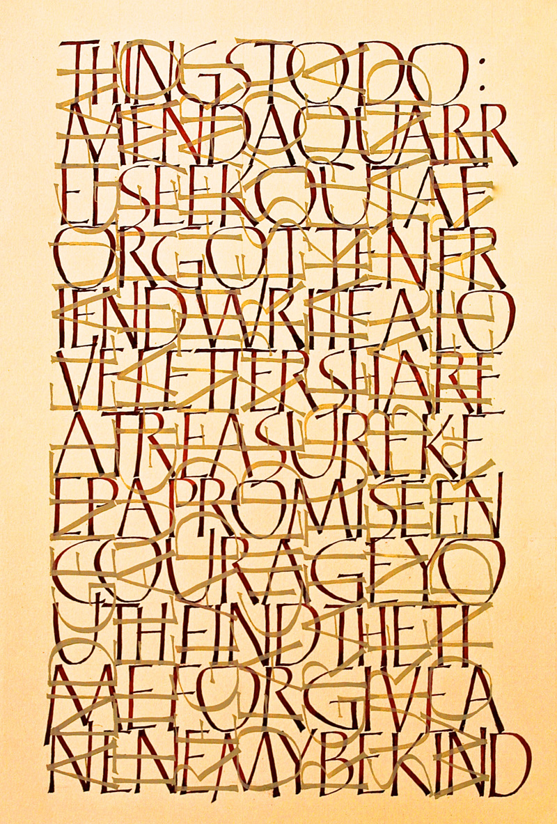
This work was done by Cheryl Lee Lawrence in Chicago in 2014 for the session “Roman Variations”, in 26 Seeds: a Year to Grow. In her own words:
|
This piece was based on a poem in a Christmas card I received many years ago. I’d always wanted to create a piece that started with the inspiring words, “Mend a quarrel….” Using the letter forms we were learning for Romans variations and a letter layering technique I’d learned in a calligraphy workshop, I set out on a piece of Ingres-Fabriano paper. I also attempted to follow, with questionable success, one of Reggie’s instructions to letter continuously with no spaces between the words. It’s a bit harder to read than I had hoped. |
The lettering was done with gouache and a #2 Mitchell nib. After
the dark red gouache dried, I sprayed the piece with spray-fix,
made a quarter turn of the paper, switched to a complimentary
tan colored gouache and continued lettering the words of the
poem. I’m hoping to utilize feedback I received from our great teacher and do this piece again. I have learned so much, been inspired so much and have experienced so much joy to have been one of Reggie’s students. One of the phrases in this piece is to “Share a treasure.” Reggie has shared a lifetime of treasures that I continue to discover every time I pick up a pen! |
* * * * *
Week #17
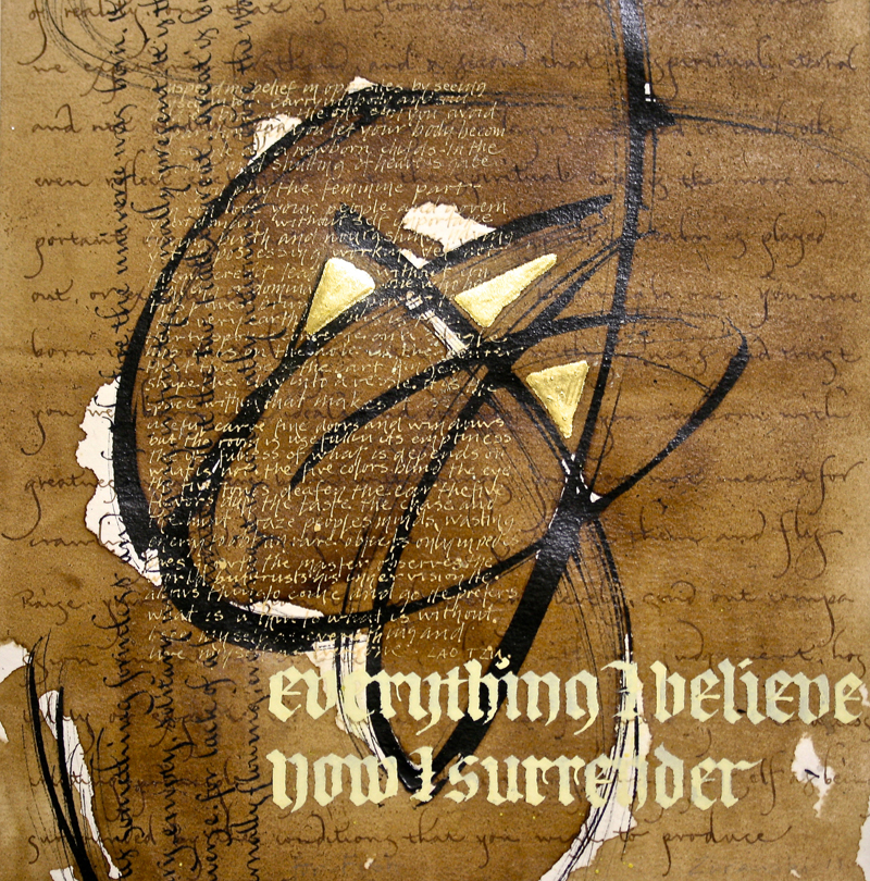
This work was done by Bob Zuranski in Chicago this year for the session “Modernizing a Traditional Calligraphic Hand: Blackletter”, in PRIMITIVE TO MODERN. In his own words:
|
“Everything I Believe” |
The underlying layers provide a structural foundation for the
abstract marks to contrast with; one is on the grid and
structured, one is off the grid and has lots of movement. The
major contrast is developed between the blackletter and the
abstract marks. My thought was to explore multiple triads playing off of the three guilded triangles. I tried to carry this thought to its logical conclusion with three focal points that keep your eyes moving from the trinity to the blackletter and back to God. If this triple focal point idea works it may be because they are close enough that the contrast keeps the viewers interest and it’s tight enough that it still works as a unified whole. The piece is executed on Arches Text Wove with a handmade bristle brush, ef66, crowquill and Speedball C nibs, Sumi ink, walnut ink, gouache, acrylic mat medium, and 23k gold on Instacol mordant. |
* * * * * * * * * * *
Week #18
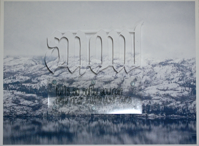
This work was done by Katie Garrod in Chicago this year for the session of “How to Modernize a Traditional Calligraphic Hand (Blackletter)” in PRIMITIVE TO MODERN. In her own words:
|
This piece grew out of a photo I took with my phone through the
car window when my husband and I were driving along the shore of
Okanagan Lake in January this year. Seeing it larger on the
tablet I was surprised and pleased to see what was captured; the
image had such a gentle ethereal look about it. |
Wording was required below "snow" that explained how I felt
about such scenes: that we are enriched by looking more closely
at the quiet, tranquil things around us. So I lettered the words
"falls so quietly you can only hear it with your eyes" in a very
fine marker and printed it onto a piece of transparent film. I
wanted to float this also above the paper but needed something
transparent as spacers, so after playing with beads and thread,
I finally settled on glueing beads between the card stock and
the film. By the time I had it all glued on I realized the print
of the lettering on the film needed more strength so had to go
over it; which is why it's shaky looking, but it seems to fit
somehow. It all sounds quite simple put like this but I often
fell asleep at night running the various choices through my
head. I am privileged to be able to turn my attention to some of the things in my life beyond the nuts and bolts of living and am grateful that with Reggie's guidance I am learning not just how to letter but how to really use the lettering to make an impact. |
* * * * * * * * *
Week #19
This work was done by Ginger Meidel in Miami in 1997 after completing 26 Seeds: a Year to Grow:
| Ginger was as vivacious. talented, and hard working a calligrapher as you’ll ever have the good fortune to meet. She was taken from us too soon in 2012. The piece below is a page she contributed to a book of appreciation for Reggie Ezell. For those who took “26 Seeds: a Year to Grow” the first quarter century it was given, they will recognize | (and hopefully laugh) at the ten earth tone gouaches used. The caps are based on a style by Friedrich Neugebauer using both Speedball B nibs and Brause EF66 nib on Arches watercolor hot pressed paper. The text is comprised of various “chestnuts” dropped by the instructor throughout the year. You are missed, Ginger. |
* * * * * *
Week #20
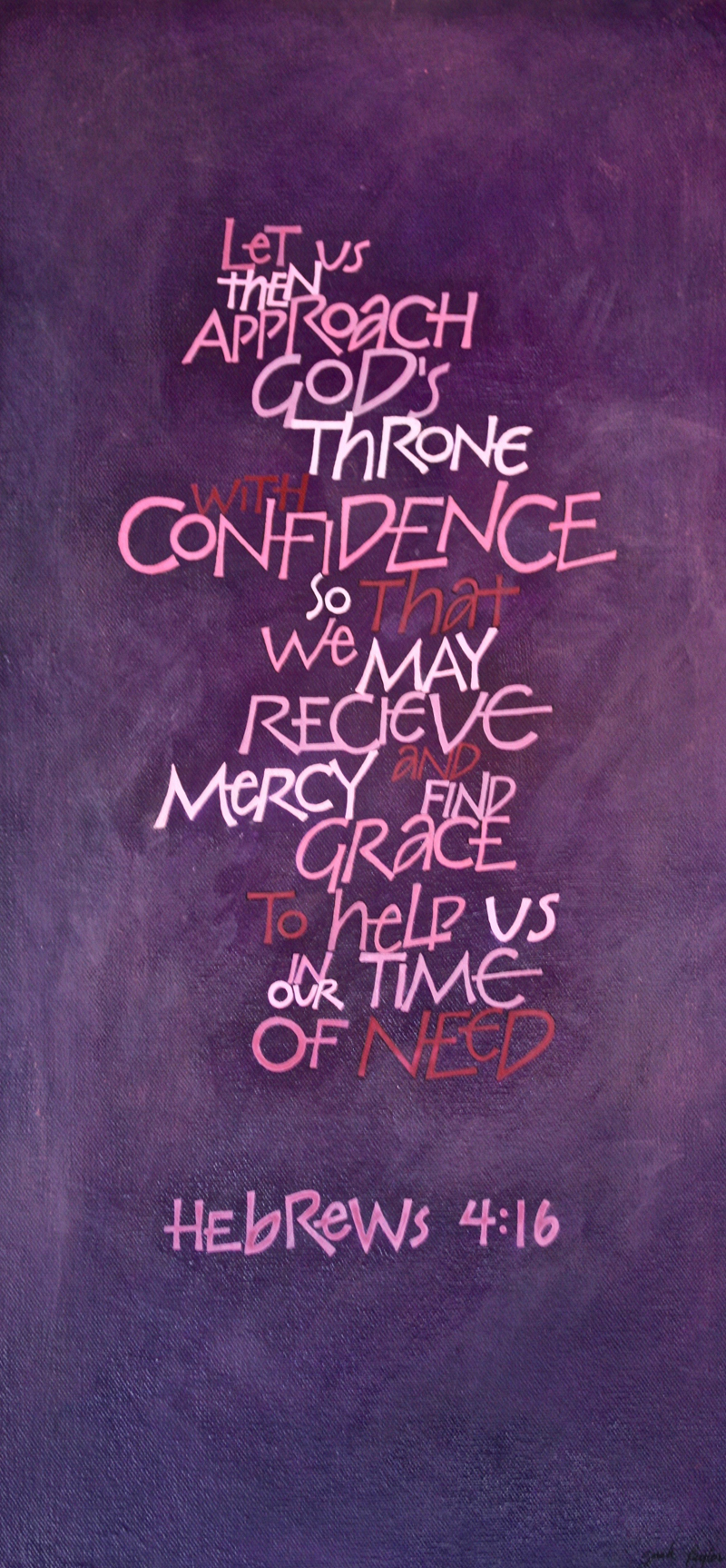
This work was done by Susan Burton in Chicago in 2014 for the session “Carolingian and Variations”, in 26 Seeds: a Year to Grow. In her own words:
|
These are three pages of a yet-to-be assembled book based on
excerpts from Neruda's “Poetry.” A couple of years ago I heard
the poem recited for the first time and instantly knew I wanted
to use it in calligraphy. Piecing together this book gives me a
relatively stress-free way to experiment with words and
techniques. |
The lettering has been done using either fine-point sepia
markers for the monoline letters or Brause nibs with walnut ink
for the uncial/carolingian. Torn strips of background paper and
stamped rice paper have been used for collaging. The cover (not
shown) echoes the stencil design on the inside pages, but I used
modeling paste instead of gesso and painted it with my favorite
earth tones. I hope this book will be my first expression of the poem since it does not yet capture the exhilaration I feel when hearing or reading these words—but it has been fun and there's a lot to be said for that! |
* * * * * * * * * *
Week #21
This work was done by Ann Sheill in Michigan in 1993 for the session “Variations on Foundational” in
26 Seeds: a Year to Grow. In her own words:
|
I looked through my huge ‘Reggie’ notebooks for the assignment
for this project. I couldn’t find it. I thought it would help me
remember specific details. I do know my goal was to have
something large, something medium and something small. The
title, the sub-titles and the text could be arranged so those
elements would create forms, small medium and large. I used various sizes of Speedball B nibs and squared off the ends with a EF66 pen, quite a tedious process, but effective. I used the Ruling Writer and most likely a folded pen for the title and subtitles. I wanted to create a contrast with the simple straight/curve lines of the alphabet of the text. The Ruling Writer and folded pen were so freeing to work with. The “Three Passions” letters were to be flowing, sweeping and moving with loose, wild extra lines mingling among the more structured letters. The sub-titles were done with the point of the folded pen. I wanted the sub-titles to be eloquent and more detailed than the text alphabet. They are a stylized Roman Versal, open and also relaxed. |
The back ground was first painted with a thin wash of pastel
colored gouache and then layered with the SaranWrap technique
for a soft textured background. The lettering was done with
gouache. I chose pinks, lavender and a golden ochre to suggest
subtle passion. Square dots of gold paint are used to tie the
titles and sub-titles together. Three Passions is done on a full
sheet of Arches 140 pound hot press. If you need to change anything about this, Reggie, go ahead. This was indeed a long time ago. I do remember that it seemed I would never be done with the writing. Your student pieces on your archives are so outstanding. I am humbled to have been a student in your class. So glad you are using our new technology to keep calligraphy alive and to keep on sharing what we all deem as beautiful writing. I have put calligraphy aside somewhat and have tried to take up oils. I regret that I never had the dance needed in my letters to be successful. I do have good memories of a good teacher and some fun classes. |
* * * * * * * * *
Week #22
This work was done by Alan Ariel in Chicago this year for the session “Modernizing a Traditional Calligraphic Hand: Blackletter”, in PRIMITIVE TO MODERM. In his own words:
|
This composition was an interesting step in my learning process
to letter with a broad edge nib. The letters had been lightly
sketched to mimic some of the letterforms I had seen on Reggie's
class exemplars. I scanned the sketch to make multiple inkjet
copies on parchment paper with the pencil lines printed at 20%
cyan. I lettered directly on parchment paper using the light
blue lines as a reference. I lettered the composition numerous times with diluted ink as the letters needed some texture. Many areas of the composition had been reworked for the sake of contrast and visual flow. Eventually the letters no longer resembled the original sketch. When I thought of the nib as a brush I had much better success with the letters filling in open areas of the composition. The original lettering was completed on a sheet of letter size paper, scanned at 1200 dpi with minimal retouching in Photoshop. |
The retouching effort was not different from a traditional
method of a 3 hair brush with white out and a magnifying glass.
When all was finished the image was inverted to appear as white
letters on a black background. The gray border is the texture of
the scanned paper surface which was selected and adjusted to
appear as a midrange tone. The composition was printed with an
Epson inkjet on a sheet of 13" x 19" watercolor paper. Since finishing the composition I began making broad edge nibs from thin pieces of folded brass. This new discovery of nib making has been one of the benefits of this lettering assignment. Reggie's Primitive to Modern workshop leads to many pleasant surprises and its all good! |
* * * * * * * * *
Week #23
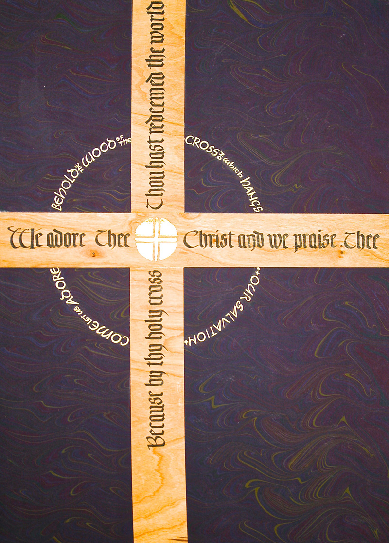
This work was done by Terry O’Connor in Chicago this year for the session “Modernizing a Traditional Calligraphic Hand: Blackletter”, in PRIMITIVE TO MODERN. In her own words:
| This piece was done in Reggie's Primitive to Modern class for the session on modernizing a traditional calligraphic hand. The assignment was to integrate two variations of blackletter in one work. This is obviously a Lenten themed piece and the text comes from the Catholic Good Friday service and from the Stations of the Cross. | The lettering on the crucifix is written in a traditional blackletter. It was done with Sumi ink on cherry veneer card stock. The "O" in the middle is gilded with 23K gold leaf on 2 layers of Instacall base. The contrasting Neugebauer letters around the cross were executed with a gold gel pen. The background is Jane Doherty's beautiful hand-marbled paper. |
* * * * * * * * *
Week #24
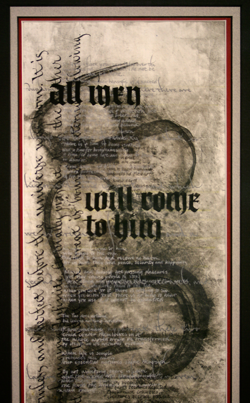
This work was done by Bob Zuranski in Chicago this year for the session “Modernizing a Traditional Calligraphic Hand: Blackletter”, in PRIMITIVE TO MODERN. In his own words:
|
“All Men Will Come to Him” The majority of the text comes from Dr. Wayne Dyer’s book, “Living the wisdom of the Tao”. The book is a collection of verses authored by Lao-Tzo in China 2500 years ago. The Dualistic Worldview is taken from “Making Sense of the Christian Faith” by David Lose. The study of the Tao presents one with the path of wisdom. The abstract, serpentine mark made with a handmade brush represents our varied paths through life. Those marks stand in contrast to the strong black letter on the top layer. This experimental piece has six layers which, taken together, form a study of simultaneous contrasts. |
The black letter, in fact, contrasts calligraphically with each
of the subservient layers. Each of the those layers consists of
various verses of the Tao, each of which would be a wonderful
piece on its own. Here they, while being mostly legible, are
relegated to the job of providing texture and contrast. Each layer is written directly atop the other, making major corrections impossible; find a mistake, win a cookie. Before writing the top layer the piece was spray fixed, sealed with acrylic mat medium and sanded. The piece is executed on Tyvek with a handmade bristle brush, EF66, speedball and crowquill nibs. The smallest lettering is 1/16th of an inch tall. I was cross-eyed for two days after writing that portion of the text. |
* * * * * * * *
Week #25
“This is the first time that two works are featured as a “Pic”. However, they represent well the delightful variety ofcreativity that people bring to this exercise using the now infamous “Sour Pickle Method of Spacing”. These works were done by Sharon Wolpert and Sarah Taylor in Louisville this year for the session “Monoline and Broad Edge Romans”, in 26 Seeds: a Year to Grow. In their own words:
|
I love that the true beauty of lettering is the interplay
between knowledge and passion, structure and dance, rules and
imagination. There is a lot of structure in letter forms but the
true beauty of them is when the pen uses that structural
knowledge and dances on the page like a dancer flows on stage.
Form and function interplay with creativity and playfulness.
I used Adobe Photoshop to scan the picture in. I did spacing by cutting out the Palatino caps and spacing them by hand on a piece of paper using Reggie’s “sour pickle” method (examining spacing between letters by squinting your eyes). Once I got them spaced right, I scanned my lettering in as a separate document and laid the lettering on top of the picture. I printed it out on 11X 17 poster stock paper. Thank you from the bottom of my heart, Reggie…you are a fantastic teacher!… Sharon |
We were tasked with this spacing exercise to use the Palatino
typeface and use the 'sour pickle method' to space out the word
calligraphy. This is the 'loose' version on 11x17 interesting
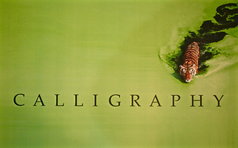
paper. While I started on the waxed grid we were given, I did most of my work using the program Paint.net, a free watered-down version of photoshop. I began by spacing out the tight word first. It took me a few days; I would open it up and look at my word each morning before work and move a couple letters around. After I was happy, I moved the letters equal distances apart to create the loose version. Then I scoured the internet and found this picture of a tiger moving through a lake of algae and loved how it looked like ink. I thought this exercise was excellent for making me focus on letter spacing. Since doing this, I have started looking closer as I create layouts and feel I have improved my spacing. …Sarah |
* * * * * * * * * * * *
Week #26
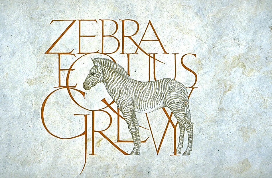
This work was done by Dee Segula in Detroit in 1993 for the session “Roman Variations”, in 26 Seeds: a Year to Grow:
|
Dee earned her livelihood as a working artist. She navigated
with equal ease through media as varied as metal, wood, exotic
papers, acrylics, pastels, watercolors, and beyond. She
maintained her own unique style and vision through her life. She
loved zebras, and the top work was just one such piece she
incarnated them into with her own style of Romans. Productivity and excellence were hallmarks of not only what she brought to class but brought to the lives of her calligraphy and larger artists’ communities. |
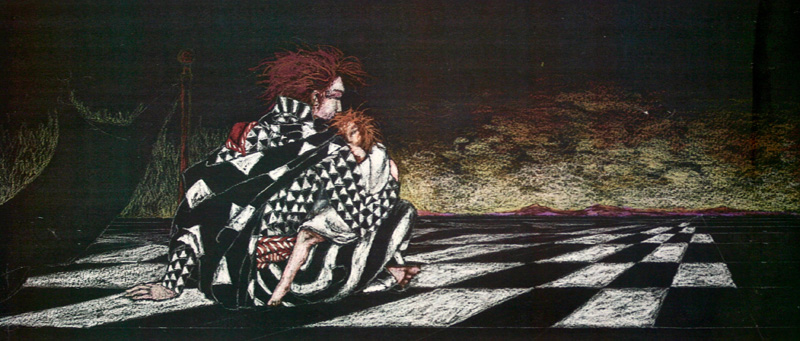
Throughout the Year Long Course everyone was inspired and awed
by her work, kindness, and modesty. No one knew until the final
month of class that Dee had needed a double lung transplant for
quite some time. She held on for several years after that,
surviving numerous major medical procedures without a trace of
self pity, relentlessly working at her art. I remember visiting
her the year after class. She was perched on her couch breathing
through an oxygen mask working with color pencils on black paper
on the (bottom) piece she titled “The Wait”. She had been
waiting almost a year, and time was running out for her failing
lungs. In 2011 we lost her. But her work and spirit survives. Thank you, Dee. Google search “Dee Segula artist” for more images of her works. |
* * * * * * *
Week #27
This work was done by Katie Garrod in Chicago this year for the session “Writing on Vellum”, in PRIMITIVE TO MODERN.
In her own words:
|
The assignment was a book, but I wanted a book that could stand
up by itself to be displayed containing some of my "go to"
quotations. In class we dubbed it a "scrollex"! The dowel and
wire hinges allowed for differences of size and shape of paper
and the wire was sturdy enough to support the vellum. If you
want to try this I used 24 gauge wire, it's a bit fiddly to make
the hinges but the vellum was tough enough to withstand being
scraped and poked at by the wire while I was fumbling my way
through the process. I used a very small drill on from my
grandfather's jewelry making tool box to make the holes in the
vellum. This was rather a poignant moment as I never met my
grandfather but my late father passed this little box of
treasures onto me. This was the first time I used anything from
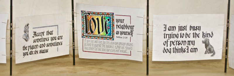
the box. (1) For the gentleman with a pigeon on his head I found the image online and traced the outline roughly onto the vellum; then went to work with various shades of watered down sumi ink, some dirtied up white gouache and a very fine brush. Dirtying the white gouache helps the image look right on the vellum, almost like a photograph on newsprint. And whoops! . . . the lettering left too much white space which I handily filled with one of Reggie's "lines" which was supposed to look like a carved stone border. |
(2) Reggie had suggested that as an exercise we copy “a master”.
In my innocence I chose a Sheila Waters style for the word
"love". The project started out as an "Homage" which rapidly
became a "Grovel" after closer examination of her highly
decorated words! Once I set out to copy the borders and images
with which she surrounds her letters I was dumbfounded at the
detail in her pieces. I would never have understood this
complexity without attempting to emulate it. Sheila's colors are
softened and muted in comparison with mine which were left
bright. Muting the colors would have meant adding black and
white (I think) in meticulous proportions . . . a lesson learned
for next time. To graduate the colors from dark red to blue in
just four inches I made up 16 shades. Then, feeling as though I
had narrowly escaped falling over a cliff edge I realized the
gradation of color would need planning out! So a little chart
had to be marked in pencil in 1/4" increments across the space
to indicate where the columns of each color should be placed. In
this way the somewhat dry gouache looked blended when brushed
into place. (3) My dog, pictured here, assumes I am an amazing human being - well we all need a little inspiration! |
* * * * * * * * * * * * *
Week #28
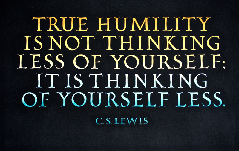
This work was done by Phil Hoagland in Louisville this year for the session “Pressurized and Drawn Romans”, in 26 Seeds: a Year to Grow. In his own words:
|
I chose this C.S. Lewis quotation for a poster to hang in my
high school classroom. The drawn Roman caps in the piece are
from the exemplar I created for a 26 Seeds homework project.
After completing the layout, I photocopied it onto plain white
paper and then used white Saral transfer paper to trace the
layout onto Arches black cover paper. The outlined letters were
then painted in with a white gouache base coat and allowed to
dry. The next step was to mix up four different values of yellow-orange gouache. Starting with the first line of text, the upper halves of the white letters were painted with the most intense of the four tints of yellow-orange, and their bottom halves were painted with the next lighter value. I then took a paintbrush dipped in clear water and used it to blend the two colors together at the waistline of the letters. The second line was completed using the same process. The lighter-value color (the same used for the lower half of the first line) was used for the upper halves of the letters in the second line, and the next lighter value was used to paint their lower halves. The third line of text continues the gradation with the lower halves of its letters painted with the fourth, lightest value. |
The entire process was repeated in the lower three lines of the
piece using four values of a complementary blue-green. Since
some areas of the letters ended up with as many as three or four
layers of gouache on them, it was a challenge to both cover the
white base layer and keep the paint inside the original
boundaries of the letterforms. Careful "trimming" with an X-acto
knife helped restore a few slightly overweight lines and serifs
to their original sizes. My original intention was to add some sort of texturing or border, but in the end I was persuaded by friends possessed of more common sense than I to let the letters alone to do their work. approx. 22.5" x 15”; letters 1.25" high; Winsor & Newton gouache on Arches black cover paper. |
* * * * * * * * * *
Week #29
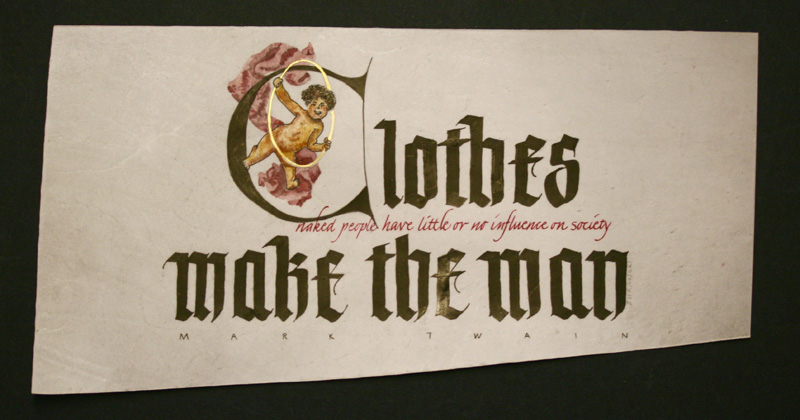
This work was done by Bob Zuranski in Chicago this year for the session “Writing on Vellum”, in PRIMITIVE TO MODERN.
In his own words:
|
“Clothes make the man” Twain created this humorous twist on the old Shakespearean quote, and the irony is a seedbed for the play on words. To push the irony as contrast, the original quote is in large black letter and Twains’ addition is tucked in the middle; in 1/16 inch high italic. |
The little cheruby guy floats in a versal ‘C’ of nakedness. The piece is executed on calf-skin vellum using Speedball C0, crow-quill, sumi and watercolor. 5” X 11” |
* * * * * * * * * *
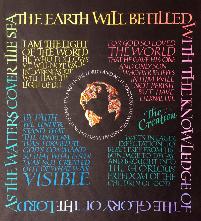
Week #30
This work was done by Roann Mathias in Memphis in 1998 for the session “Variations on Romans”, in 26 Seeds: a Year to Grow. In her own words:
|
The Earth Will Be Filled Gouache and raised gilding on black German Ingres paper, 19" x 25" This piece was done in the 5th month of 26 seeds, in 1998 in Memphis. It was my second time through and about 10 years after my first yearlong class with Reggie. During the intervening years, I worked for hours and hours practicing Romans in my studio! The lettering in this piece is a result of that study, featuring some of the variations I worked on and loved. Another aspect of this piece is that it is on a full sheet of black German Ingres paper. It was during the month of color theory, too, so I applied that information into this design as well. Finally, the gilding in the center is with heavy molding paste and variegated gold leaf. |
For me, this kind of work was a synthesis of all the techniques, color charts, layout ideas and slides of other students work that Reggie exposed me to in class. In addition, I spent time choosing the texts, and looking for just the right image of the earth (before the internet was as developed as it is today!) The whole process was like writing a final paper, or doing a final piano recital with all the intensity and nervousness and even joy that happen in that kind of performance when you are striving for excellence. |
* * * * * * * * * *
Week #31
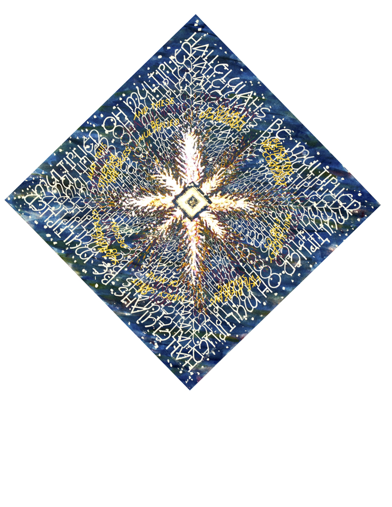
This work was done by Cynthia Stiles in Fort Worth this year for the session “Variations o for then Romans”, in 26 Seeds: a Year to Grow. In her own words:
|
My first encounter with the lyrics of this song, Multiplied by
Needtobreathe (lyrics by Rinehart & Rinehart), absolutely
delighted me on multiple levels. I started envisioning how this
could be expressed as visual art, the words and the images
feeding off each other, a visual musical expression of the words
for the eyes as well as the heart. The creation of this piece was done in five layers. I used Arches HP 140# Watercolor paper, the image size is 19" x 19". One - I watercolored the backdrop to obtain the look and feel of outer space, the stars were randomly dotted on first with masking fluid. I applied 4 or 5 layers of watercolor wash of various colors with a large round brush, allowing it to dry between washes to gain depth. I removed the masking and sprayed this layer with workable fixative. Two - I lettered the heart of the lyrics in a repeating, receding diamond shape using Neugebauer Caps. I began with the largest Speedball B nib and progressed to the smallest B and Mitchell nib toward the center, using the EF66 nib to square off the larger letters. The white gouache was watered down as the letters got smaller, receding in the distance. In preparation, I lettered those words one time and used the copier to enlarge and reduce them to the size needed to guide me and marked off guidelines for each line. I applied a second layer of fixative. |
Three - I lettered the lyrics in a circular shape, which was
appropriate as it repeats itself. The Raucous and Tom Perkins
letters were used, taking care to angle them to the center. The
gouache was mixed to the desired color. The B and EF66 nibs
applied the Raucous letters and the Mitchell nib the Perkins
letters. Also in preparation, I used a compass to draw several
circles in the heights needed for the letters on tracing paper
and divided the area into eight equal pie shapes, lettered on
this and used transfer paper to transfer this to the piece for
final lettering. I sprayed a third layer of fixative. Four - Time to lay on the gold and flames! I applied sculpted gilding base for the center diamond and the horizontal and vertical arms of the 'flame' to give it depth and texture. I used two layers of Instacol gilding base beginning with the center diamond and then the 'flames' going from small to large. The diamond has two layers of 23K patent gold leaf and the 'flames' have one layer of variegated leaf. Five - To extend the appearance and liveliness of the 'flames' I applied three different colors of gouache with a small brush shooting from the 'flames'. The finishing touch - a small heart shaped crystal placed at the center of the diamond. Thank you Reggie for this opportunity, it has been a true pleasure to begin my adventure into calligraphy with you, you have a real gift for teaching. |
* * * * * * * * *
Week #32
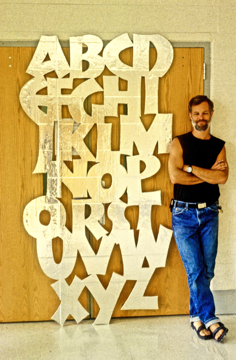
This work was done by Michael Noyes in Washington DC in 1996 for the session “Variations on Romans”, in 26 Seeds: a Year to Grow. In his own words:
| Well, obviously, this piece is a Neuland exemplar, done for homework I think. It measures about 4x8 feet and is cut out of a single sheet of polystyrene foam board insulation with an aluminum foil face. The letters were individually hand-drawn on paper, scanned and digitized in Adobe Illustrator, arranged on screen, printed full-size on multiple sheets of 8.5x11 inch paper, and attached together. | The outline on the multiple sheets was applied to the foam board using transfer paper, and then it was cut out with a razor. The photo was taken by you in class. The piece was later given to a fellow student to be placed on the ceiling over her bed (Ha!) in trade for a life-time place on her Christmas card list (which I haven't been on in many years now — and I can't now remember her name). |
* * * * * * *
Week #33
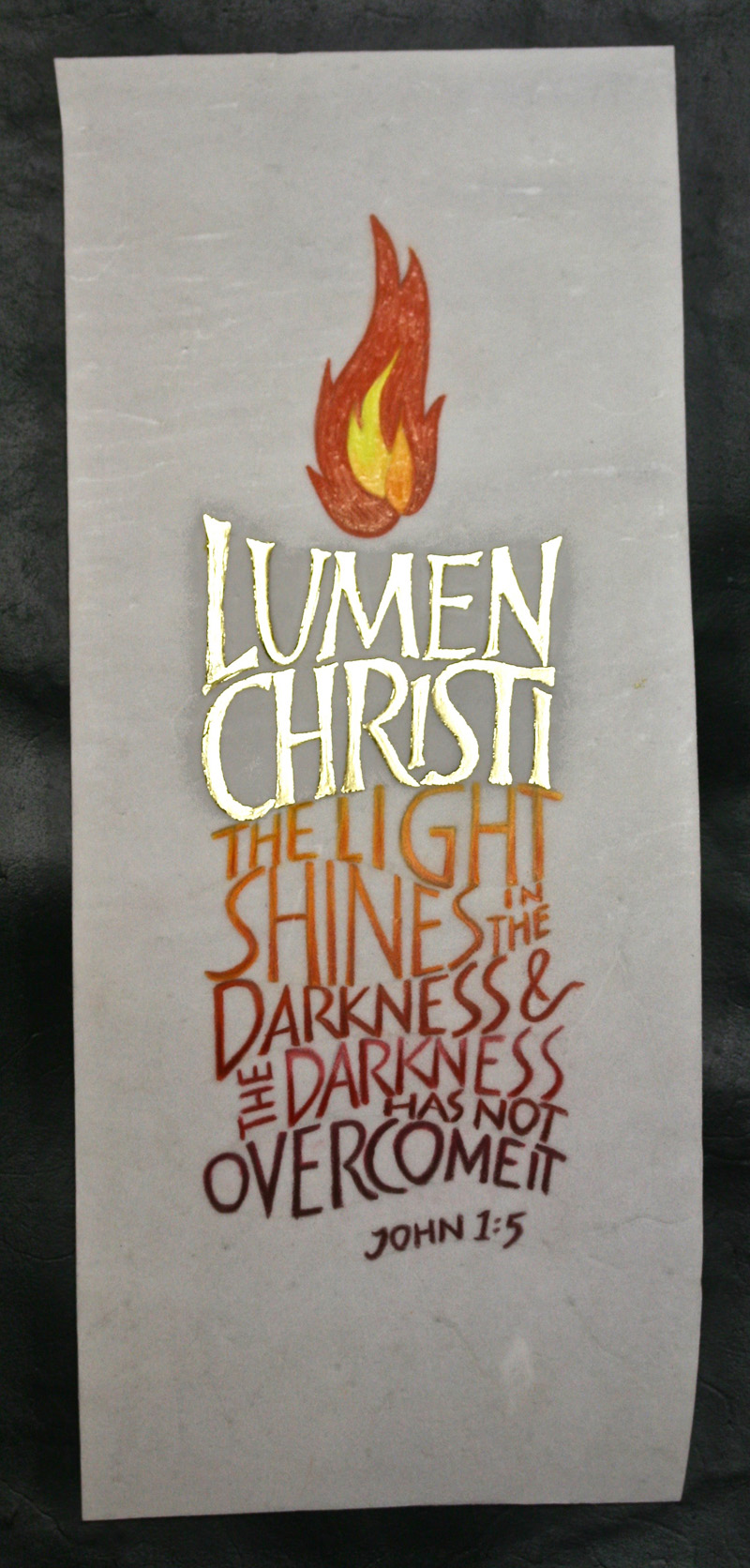
This work was done by Terry O’Connor in Chicago this year for the session “Writing on Vellum”, in PRIMITIVE TO MODERN. In her own words:
| This piece was executed on an off-cut piece of calfskin vellum: approximately: 3” x 8”. The gilding was done with 23 karat patent gold over 2 coats of Instacoll base. The rest of the design was accomplished with Prismacolor colored pencils. I wanted to achieve a gradation of color that I could not get with gouache on the vellum. | The inspiration for this piece comes from the Roman Catholic Easter Vigil service. "Lumen Christi", or "Light of Christ" is chanted as the paschal candle is lit in the dark church. I have always found this to be a very dramatic moment in the liturgy. |
* * * * * * * *
Week #34
This work was done by Mike Kecseg in Chicago in 1986 for the session “Brush Lettering”, in 26 Seeds: a Year to Grow. In his own words:
| This is one of my earliest attempts at pointed brush lettering. I decided to do a piece that had a more structured style with the blackletter and contrast it with the more unstructured script style. Even though I didn't understand completely how the pointed brush worked at the time I think it began my interest in how the pointed pen and pointed brush related as tools. | Out of that I developed some of the pointed pen variations styles that I do. The piece was done on Canson paper with gouache. The background roman letters were done with a flat brush and the rest of the lettering with a pointed brush. I picked the Alfred Fairbank quote about "Disciplined Freedom" to emphasize the contrast of the different lettering styles. |
* * * * * * * *
Week #35
This work was done by Jocelyn Curry in Seattle in 1988 for the session “Brush Lettering”, in 26 Seeds: a Year to Grow. In her own words:
| In 1988, when I painted "So this is heav'n" (12"x16"), I was interested in working with texts about music and musical metaphor. Pointed brush lettering was used for the text because of its lyrical quality. I'm quite certain I did not do any preliminary layout design here. At the time, it was not uncommon for me to test out brushes and paint colors on a scrap of the same paper, | visualize how I could fit the text on the paper size by determining the line breaks, and then lighting into the surface with loaded brushes. Sometimes it worked out, sometimes not! The bold strokes were done with a broad brush and watercolor. The paper was Arches hot press 140lb, most likely, and was white. |
* * * * * * * * * *
Week #36
This work was done by Morgan McArthur in Chicago this year for the session “Writing on Vellum”, in PRIMITIVE TO MODERN. In his own words:
|
This is a nameless shameless practice panel. Everything on this
11”x16" piece of masonite is oil-based 1-shot enamel paint
applied with brushes. I'm a calligrapher who's been broadening his interest to brushwork - signlettering and pinstriping - for the last five years. This panel began as a piece of 'thrifty board,' masonite with a white front (comes in 4'x8' sheets @ Home Depot). I experimented in creating a fade background using two colors of blue Krylon spray paint. That achieved, every day's pre-painting practice then got dabbed onto this panel. Like a singer having to warm up their voice, I have to reacquaint my hand with the tool every time I sit with it. One of my mentors calls it 'calibrating the brush.' I don't have enough miles in my brushes (=confidence) to just sit down and 'knock something out.' Rather, I have to be with the brush long enough to quiet my chattering critic and tame this wad of squirrel hair on a stick to begin to do my bidding. Some days are better than others. It's no different for me using a broad-edged nib and ink - mute the critic, befriend the tool, pursue progress... This panel is liberating because there is no layout, no agenda, no need for perfection. It's a pressure-free playground and it's really become a paint-by-the-pound exercise area. If something is butt-ugly I can just paint over it. There are a few layers of glossy varnish clearcoat to hold the color in place and I keep piling it on. What you see in this photo is only half of it; the other side is just as busy! |
There is also a story of rejection in this
piece. I intend to gift it to my lettering colleague in Reggie's
Primitive to Modern class, Alan Ariail. Alan's a fantastic commercial lettering artist and I've got a framed piece of his hanging on my wall. He has thwarted my offer of this panel on two occasions, both times telling me it 'needs something more.' (Whaaaaa?) I’ll be adding one more element to it soonly, likely where the yellow and white whifferdill is on the R third of the image (look closely, there's a teeny-tiny brush-lettered alphabet in the left-most yellow arc of that feature). Reggie's got us applying gold leaf to our work and I have been experimenting with using Gorilla Glue as a dimensional size for leafing. I expect that I'll have a glob of glittery in that patch very soon. I'm grateful for the encouragement and support offered by Reggie and his 12-month teaching system. Most workshops are hit-and-run affairs but Reggie's program offers continuity and encourages progress. He makes teaching look easy - he's been doing it this way for a long time. However, it's demanding and requires a lot of work on his part. On behalf of myself and many students that have come before me, we appreciate all you do, Reggie! Thanks! (cue: standing ovation) |
* * * * * * * * * * * * * *
Week #37
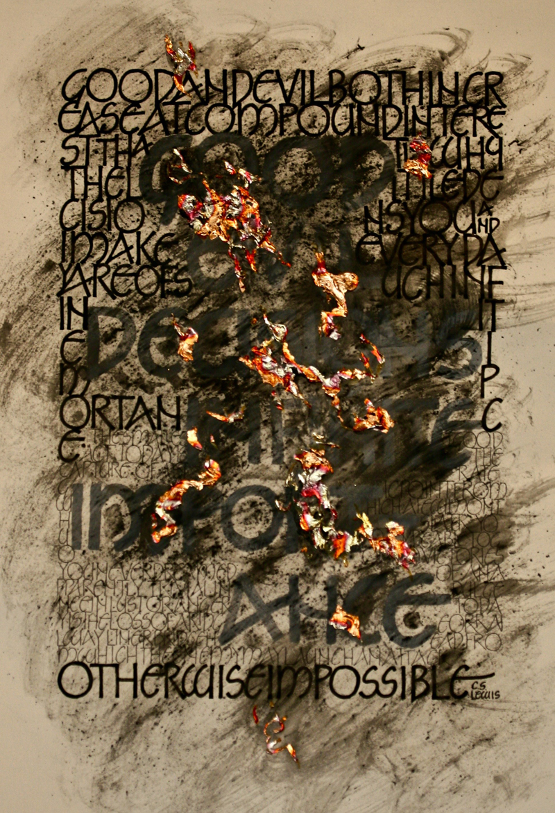
This work was done by Phil Hoagland in Louisville this year for the session “Variations on Romans”, in 26 Seeds: a Year to Grow. In his own words:
|
The goal of the piece was to render a text using Neugebauer's
letters in three different weights. I chose for my text the
following paragraph from the C.S. Lewis' classic Mere
Christianity: "Good and evil both increase at compound interest. That is why the little decisions you and I make every day are of such infinite importance. The smallest good act today is the capture of a strategic point from which, a few months later, you may be able to go on to victories you never dreamed of. An apparently trivial indulgence in lust or anger today is the loss of a ridge or railway line or bridgehead from which the enemy may launch an attack otherwise impossible." I began with Winsor & Newton gouache on Arches hot press watercolor paper, painting some key words in grey: good, evil, decisions, infinite and importance. The large letters were executed with a brush and finished with a Brause EF66 nib. I then filled in the negative space around them with the full text. The first two sentences, in bold letters, were written in black gouache with a Speedball B4 nib and finished with an EF66. For contrast, the remaining two sentences were written in smaller, thinner monoline letters with a Faber-Castell PITT pen, size XS. With the words finished, I wanted to add some texture to the piece, so I scraped some graphite shavings onto the paper and misted them with water. I still wasn't getting enough texture, and water was pooling in a few spots, so I began to wipe the graphite with a paper towel to get some swirls. |
Unfortunately, the grey gouache loosened up
as well and smeared in several places. The words were still
legible, but my crisp, tidy design was now a visual mess.
Disgusted, I put the ruined piece away until I had time to re-do
it. After almost a week--and a pep talk from a classmate--I pulled it out, determined to see if I could salvage it: add some color to the page and restore the grey letters by going over them with a pale muted green, perhaps? I stepped back about ten feet away from it to get a sense of the overall image and at once saw what appeared to be an aerial view of smoke plumes from a wildfire. In that moment, the last line of the quotation came roaring to life. Because of the World War II allusions in the text, I immediately had the sensation of flying over a target that had been pounded by bombers--the enemy attack; and so I decided to set the landscape aflame with some Golden extra-heavy gel molding paste gilded with Instacol and Sepp red variegated leaf. The piece thus evolved to physically represent the disastrous results made possible by our evil decisions. Since the piece now only represented the negative of Lewis’ message, I decided to create a companion piece for this work--neat, orderly and elegant--to represent the triumph of good decisions. In order to prepare for it, I went back to Lewis' book and re-read the section from which the quotation was taken. As I neared the target passage, the imagery of the fire in my work suddenly took on a further, unexpected, wrenching significance for me. In the lines immediately preceding those I had rendered, Lewis cites the Germans' treatment of the Jews as an example of how hatred and cruel behaviors perpetually propagate one another. The connection of my piece to the atrocities of the Holocaust is now inescapable. |
* * * * * *
Week #38
This work was done by Sarah Taylor in Louisville this year for the session “Variations on Romans”, in 26 Seeds: a Year to Grow. In her own words:
|
While looking at the homework and drawing a blank on what to
write, I texted my sister to ask if she would like me to do a
piece for her. She responded back with this, her "verse of the
year". The homework was to do 3 pieces using variations of roman
capitals and colors from the color wheel. This was the first of
my attempts for the three. I chose to do something really fun so
I would be encouraged to complete the others. I do a lot of my work on canvas, so I wanted to start incorporating my mixed media into my Reggie homework. I painted a 12x24 gallery wrapped canvas with black gesso, then to add some depth i smudged a little titan buff in places, then some golden acrylic purple paint over that. Before writing, I coated the surface in Golden Super Loaded Matte Medium so I would have enough tooth on the surface. I based the lettering on one of Reggie's handouts from class. It was using a dark background and light writing and had a few different variations of roman caps (session 3, pg 23). I thought they were all pretty fun letters.I scanned the handout, separated the letters to arrange on my computer using paint.net ( a free watered-down photoshop ). I played with the layout and varied the sizes & spacing so everything fit together, as many words as possible touched, and it was all balanced. I hoped for a layout that was fun, but easy to follow when reading. I printed out my design and transferred it to the canvas using the Seral transfer paper. I realized my lettering took up too much of the canvas, I could hear Reggie in my head telling me there wasn't enough white-space and it diminished the importance of the lettering. So, I took a black eraser and erased it all, re-sized my design, reprinted, re-transferred. |
Now happy that my design was the correct
size, I mixed the gouache with the lighter values of red & pink
so they would be visible on the dark purple background. I did
the initial lines with a Speedball B nib in a couple of
different sizes depending on the letter size then filled in and
sharpened the letters with the EF66. I varied the colors in a
random order, based on which words I wanted to stand out a bit
more and trying to keep the same color from touching itself in
other words. After the writing was complete and dried I went back with some pink chalk pastel and ran it around the edge and smoothed it around the outside to create a bit of diminished contrast. I would love to tell you that I then sealed it with a clear coat and lived happily ever after. However, I was impatient and put the matte clear spray on too thick. This resulted in white splotches and I tried to fix that by just painting on some liquitex gloss medium & varnish. I forgot gouache wasn't waterproof so this resulted in my lettering getting smudged a lot, especially the lighter colors. So I watered down some of the same purple acrylic and did a wash over the whole canvas. It was dark enough to cover my mistakes, which now look like fun background texture, and thin enough I could still see my lettering so it was easy enough to redo. I repainted a coat of matte medium. I did some research online and went ahead and added a small touch of matte medium to my gouache to make it less likely to smudge later. Then I did about 20 super light coats of matte spray while adding layers of pink pastel around the edges. It was a learning experience for me and my sister loves it. |
* * * * * * * * * *
Week #39
This work was done by mary lou Sherman in Louisville this year for the session “Variations on Romans”, in 26 Seeds: a Year to Grow. In her own words:
| Here's my story...hmmmm...stuck in traffic...again. But this time I'm at a dead stop. Turn of the engine and look around. On the highway are these beautiful flowers...so I mentally study them capturing all their beauty. Traffic begins to move again and I arrive home. Drop my things and get to my studio. Find a piece of water color paper and try to capture those road-side beauties. So this is what I remember them as...the jewels in life that add the sparkle. The other jewels are Allison Urwick letters from 1981. |
Beautiful drawn letters that just seem to
add more sparkle. I had read about mixing mica pigments with
some gum Arabic and painting with them. So, that's what I did
with the word 'life'... and gold...another jewel I love. Tom
Perkins letters...jewels. And the magic of the Hot Foil
pen...another...jewel. And, thanks to Reggie for bringing so
much to my life...a living jewel. So, being stuck in traffic and
seeing a 'jewel' in life gave me the opportunity to create...and
I'm thankful for that. Mary Lou. approx 12 x 18” |
* * * * * * * * *
Week #40
This work was done by Joanna Zdzienicka in Chicago this year for the session “Illumination on Vellum”, in Primitive to Modern.
In her own words:
|
Our homework assignment was to use design techniques from the
Codex Aureas and make it our own. In my piece I wanted to marry the 'primitive' and modern. I layed out the words in a very simple way, following the structure of lines of writing in the Codex Aureas, with 'e' little twist. To make all letters fit into an even grid, I turned the 'e' in the word 'let' into a round shape, that was mimicking the decorations from the rest of the letters. Having the layout ready, I started working directly on vellum. While making the piece, I followed Reggie's list of steps for an initial copy we did in class. After every step I thought the hardest part was over... until I continued with the next thing to do... I really gained huge respect for anyone who dares to make a whole page in this style, not to mention a whole book! One of the challenges I faced was choosing the right colors. For gilding I used moon gold, which is so interesting and beautiful, but kind of hard to determine it's warm/cool range. I started painting with dark blue gouache, mixed from primary colors. Then, during a sleepless night, the idea of using neutral beige came to my mind and I went for it the next day. I think it really made the whole piece look clean and modern, maybe a little unusual in context of the historical example. |
While trying to figure out details in the circles within
letters, I wanted something contemporary. I was looking for some
inspiration on-line and to my surprise I realized, these
decorations in Codex Aureas are actually quite modern in their
geometrical simplicity. I ended up loosely copying the patterns
from the original. My conclusion - by copying an art piece I can learn a ton of things, sometimes discover surprising matters. And --- don't be fooled, when Reggie says "flood in the bands with pointed brush".... (bands - lines drawn closely to each other with ruling pen). You would think there is finally something easy and quick to do.... WRONG! There is nothing easy and quick in the process. Making anything in this style is a true Lesson On Patience. Vellum off cut is about 3.5x7.5" |
* * * * * * * * *
Week #41
This work was done by Amy Bebee in Philadelphia in 1995 year for the session “Variations on Romans”, in 26 Seeds: a Year to Grow. In her own words:
| Hi Reggie--great to hear from you. Materials-watercolor, collage pieces, gouache for lettering. I began with the one on the top, middle is 2nd one done,and bottom is what I consider the outcome of the first two. I wanted to use more letterforms to loosen up the layout & have more fun. I was making the piece for my granddaughter. | Over the years I've given small prints of this to many friends for their new grandchildren. I will always remember the year long class with much pleasure & appreciation for the great time we had & for the great teaching we got. It's an honor to be on your pic list. Thanks so much for everything!!! Amy Beebe (I'm guessing 18 x14" for size) |
* * * * * * *
Week #42
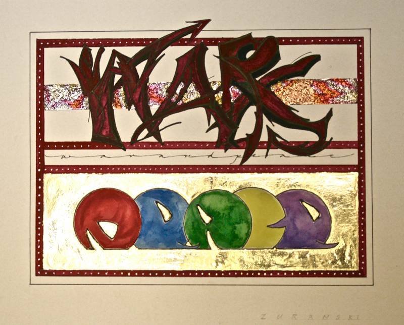
This work was done by Bob Zuranski in Chicago this year for the session “Illumination on Vellum”, in Primitive to Modern. In his own words:
| ‘War and Peace’ is designed to play on the emotional difference between the two words. The words are graffiti based; ‘war’ started out as Romans and I sketched the letters into the pointy, dark, angular and emotionally ugly word that it is. Originally the band in the middle of the word was black. It was so emotionally draining that I had to brighten it. I used a textured acrylic medium and variegated foil to brighten it up a bit. |
‘Peace’ is round, soft and colorful; bubble gum; one might call
it bubblegum. The shapes, color and surrounding gold mitigate
the heaviness of ‘war’. The piece is executed on Arches text wove using crow quill, ball point nib, various brushes, pencils, micron markers, gouache, watercolor, Doc Martens bleed-proof white, 23k gold leaf on Instacol and variegated leaf on Mona Lisa. 5.5" x 7.5". |
* * * * * * * * * * *
Week #43
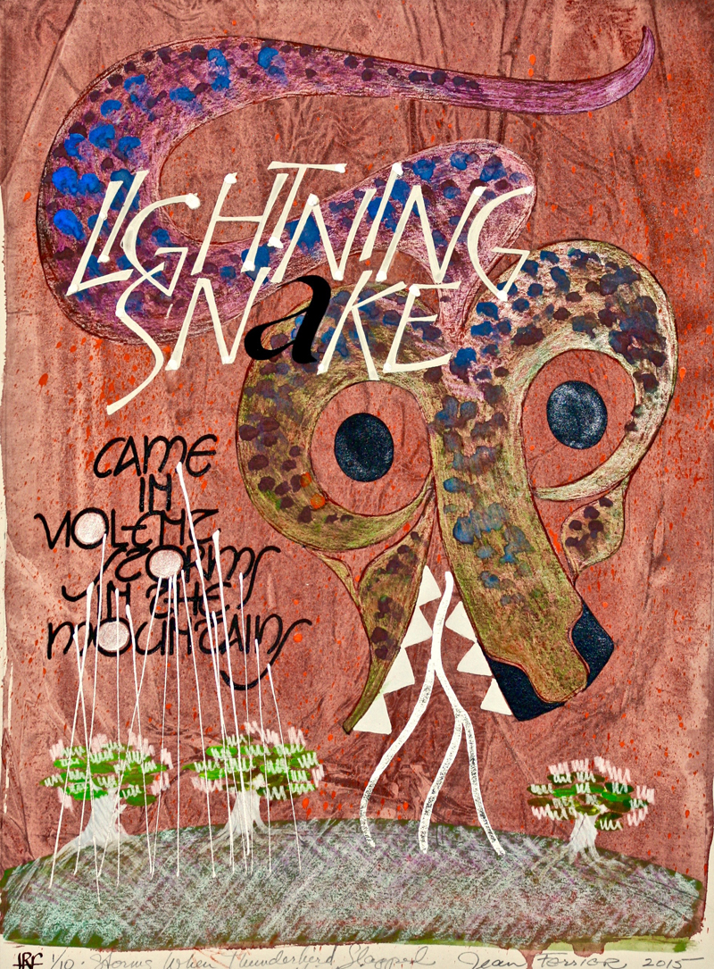
This work was done by Jean Ferrier in Seattle this year for the session “Variations on Romans”, in 26 Seeds: a Year to Grow. In her own words:
|
This 'Lightning Snake piece is 12x16 plus margins, on 140 lb Stonehenge gray. The thicker paper is less likely to buckle if flooded with paint. For background I used acrylics with plastic wrap impression. The snake and lettering are gouache with color chart in mind. I also used Dr. Martins Irridescent Nickel for the rain. |
I used white gold on Instacall for the lightning. This character appears in a story about Thunderbird hunting Whale. When Thunderbird flaps his powerful wings, you hear thunder. Then lightning snake appears. No one knows what he looks like, so….. your choice. Maybe next time you are in a thunderstorm, you will see lightning snake flash across the sky! |
* * * * * * * * * *
Week #44
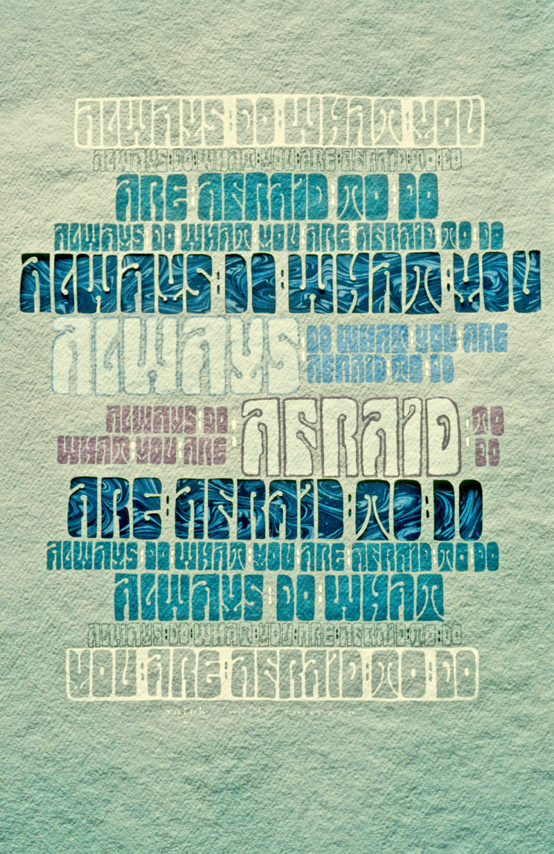
This work was done by Jean Formo in Minneapolis in 1988 for the session “Variations on Romans”, in 26 Seeds: a Year to Grow. In her own words:
| In Reggie’s class I was introduced to lettering styles from Art Nouveau. They fascinated me and I went on to use them in the years beyond our class. I especially admired the experimental letters of Alfred Roller (1864-1935), a principal member of the Austrian Secession movement which typified the Austrian expression of Art Nouveau. Roller was a painter, and a graphic designer. Later in his career, he designed sets for the operatic productions of Gustav Mahler. Roller’s aim was to use a unification of illustration and lettering in poster and typographic design. The lettering style in my 1988 piece is adapted from a well-known Roller creation characterized by bands of bold, condensed, pattern-like letters which create a vibrant visual texture. | The quotation from Emerson, “Always do what you are afraid to do.” seemed especially appropriate in view of the renegade nature of the young, progressive artists who were active in the Secession. Roller was famous for his graphic posters, many of which promoted specific Secession exhibitions in Vienna. I wanted my piece to look poster-like, using bands of lettering to create a graphic rather than fine art look. I drew the bands of letters in various sizes, then painted them with gouache. The largest letters are cut-out and backed with an indigo French marbled paper. The base paper is Saint-Armand’s handmade cotton paper – slate grey. 22 x 30 |
* * * * * * * *
Week #45
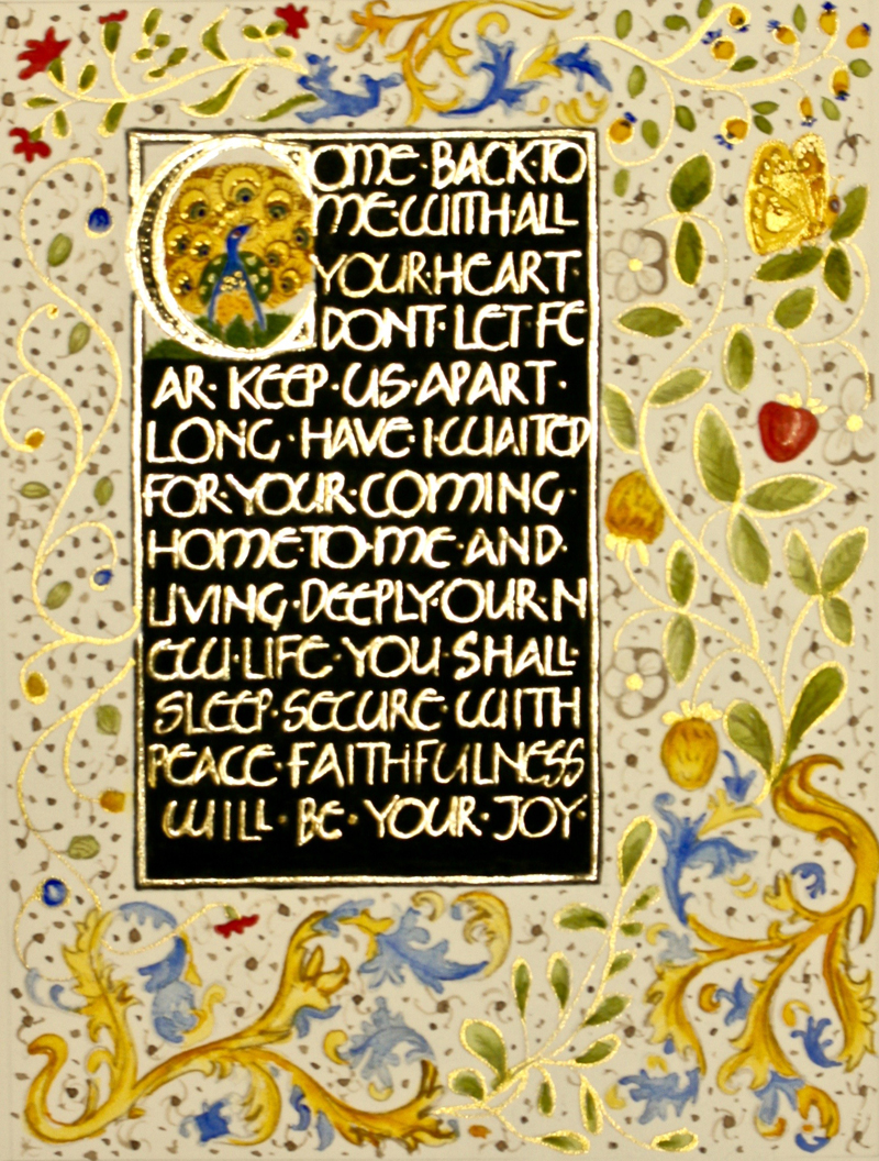
This work was done by Mary DeChillas in Fort Worth this year for the session “Variations on Romans”,
in 26 Seeds: a Year to Grow. In her own words:
| This piece was done for one of the homework assignments in which we were asked to gild something and paint in a dark background using a Roman Cap variation for the lettering. I chose the Neugebauer half uncial for the lettering. The text is from a hymn that was sung at my niece’s funeral mass this summer. I wanted to make something that would be a remembrance of her and as well as the funeral and the summery time of year. For inspiration, I turned to an assortment of medieval Books of Hours and shamelessly imitated many of the vines and flowers as well as the “framed window” format that so many had. I chose the vines, the peacock, and the butterfly for their beauty as well as their symbolic connotations. I like to work small and had intended for this piece to be a page in a book -- it measures 8x6 inches. | For the text, I laid down three thin layers of Instacol on Arches hot press using a rubinato nib and my trusty EF-66. The first two layers I let dry overnight. For gilding, I used two layers of patent gold. Next I painted in the black background using Winsor & Newton ivory black gouache. And finally, for the colors of the vines and flowers in the surrounding frame, I used Winsor & Newton and Daniel Smith watercolors, Tom Norton walnut drawing ink, and FineTec Arabic Gold watercolor. The vines and leaves are outline in gold. I painted the colors in threes -- three splashes of red around the frame, then three splashes of blue, etc. -- so that the colors felt balanced. The last step was filling in the holes with little brown dots or "seed pods." |
* * * * * * * * * * *
Week #46
This work was done by Linda Langley in Fort Worth this year for the session “Carolingian and Variations”, in 26 Seeds: a Year to Grow. In her own words:
|
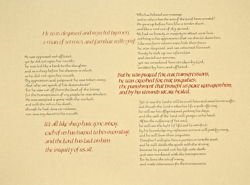
Isaiah 53 is the scripture I chose for the Carolingian
variations piece. This passage prefigures the suffering and
death of Jesus Christ. My goal was to present the words in a
style which depicted the meaning. The color red was used to highlight certain verses which spoke to me. The lightness of the red text on the left side shows the loneliness of the cross and our need for a substitute to face the punishment that was due to us. I used the bolder red text on the right to give a sense of the suffering He went through but leaving it very readable. |
The work was done using stick inks on Nideggan paper (approx.
19” x 25”). The black text was lettered using a #6 Mitchell nib
with a 2mm x-height. Vermillion stick ink, a 6mm x-height, and
15 degree slant were used for the red text. The verse at top
left was done with a pointed nib. Bottom left was done with a
Mitchell #3.5 nib. The red text on the right used a Mitchell #3
nib and a more compact style. Since I did not want to draw all the guidelines, I used a light table and was challenged by the wavy laid lines of the paper. The Nideggan paper, however, is a delight to work on and the stick inks flowed well. I love the Vermillion against the paper color. |
* * * * * * * *
Week #47
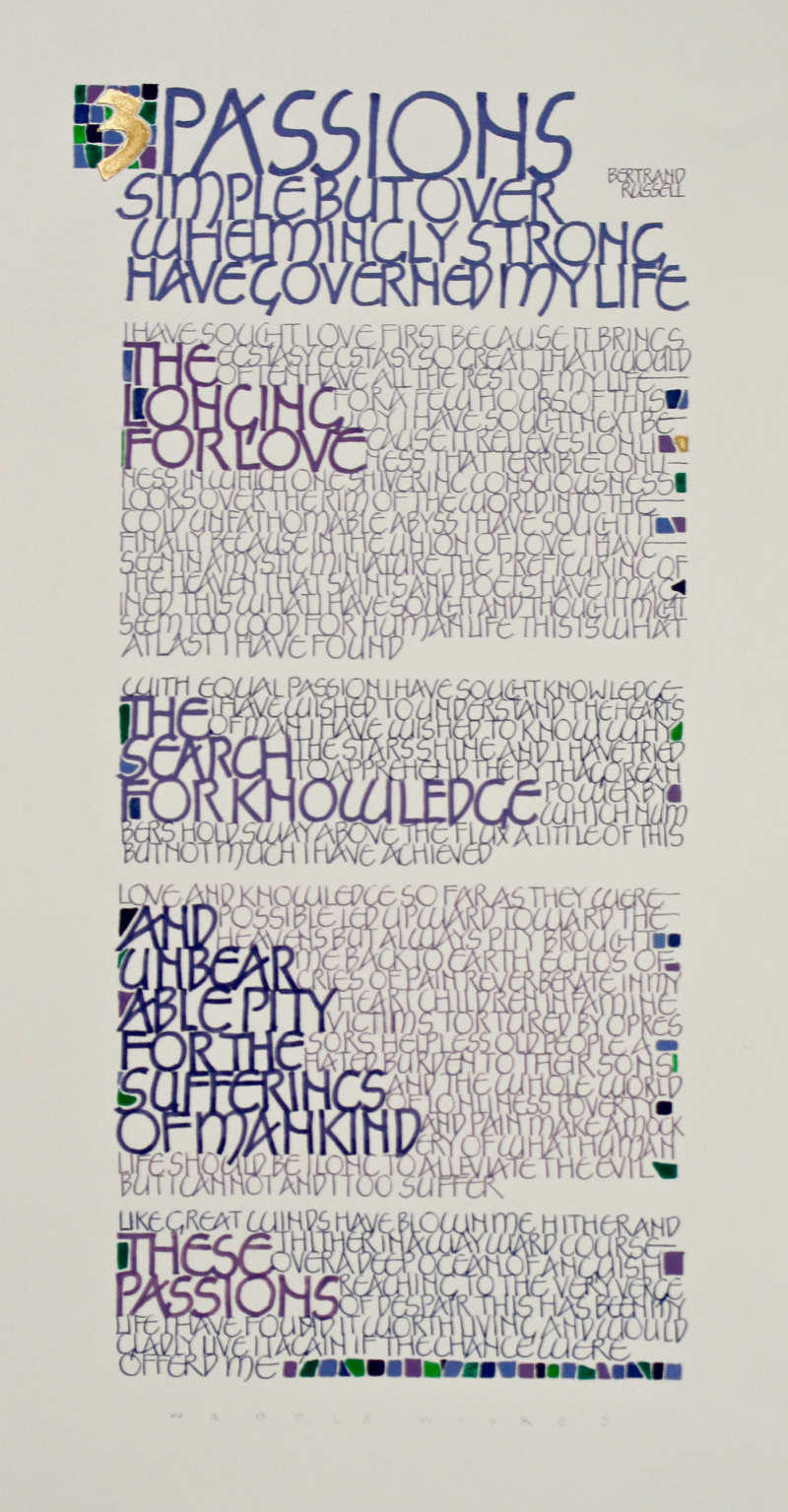
This work was done by Gayle Waddle-Wilkes in Seattle this year for the session “Carolingian and Variations”, in 26 Seeds: a Year to Grow. In her own words:
|
For this Bertrand Russell quote I wanted to use letters based on
ones by Friedrich Neugebauer and create a texture of writing
around bolder headings. The headings were written with a
Speedball B-3 and B-4. The text was written with pointed pen
(Nikko G). The quote was made up of distinct sections so I considered each part a building block. I made rough drafts of each section to get an idea of spacing then cut them apart to try different layouts. My original idea was to create a horizontal layout with the sections going vertically across the page of Arches 90# hot press water color paper. That layout created a spacing challenge as the sections really varied in size. The vertical layout was much more accommodating. While doing the rough drafts I experimented with many colors of gouache. Instead of using the traditional color red for passion, I decided on blues and violets which I felt were strong enough for the seriousness of the quote. |
Using blues and violets provided enough variation to have
contrast between headings and text and also between each section
but still be related in order to maintain unity throughout the
piece. The small blocks of color at the end were an afterthought. I noticed with only one word on the last line it seemed incomplete. So I filled it in using the text colors and added some green to liven it up. At the same time, I noticed the ragged right margin and thought what worked for the bottom, might work there too. Then the left side looked left out, so I added some color to the white spaces created by the larger letters in the headings. Then the top looked plain, so the gold “3” (Holbein, brilliant gold) got a background grid of color which served to balance the line of color blocks at the bottom. The process seemed a little haphazard but it was based on an intentional design that I just “dressed up” at bit along the way. |
* * * * * * * * * * *
Week #48
This work was done by Lisa Tsang in Seattle this year for the session “Roman Variations”, in 26 Seeds: a Year to Grow.
In her own words:
|
This quote was done in honor of a dear friend whose middle name
is "Bird" who has been living with Stage 4 metastatic cancer for
the last 7 years. Yes, that is a miraculous seven years! She is
a source of inspiration to our circle of survivors. We were
introduced to Reggie's script, Raucous, in our study of Roman
variations and I loved how the words could flow into each other.
A couple of practice pieces were done on computer paper, and
subsequently cut apart to arrange the design. The hummingbird outline was drawn and cut out from cardstock to create an embossing stencil. Then I taped the sheet of Arches text wove to my light box with the layout underneath. |
I used Speedball B2/ B3 nibs to execute the body of the letters, using an EF66 nib to corner the ends. I mixed a "hummingbird" green gouache and slowly added a combination of primary/ultramarine/thalo blue as each line was written to create the color transition. Although I did back paint the embossed hummingbird with red ochre gouache, it still didn't stand out enough so I used the stencil to mask off the area and dusted chalk pastels in to give it more clarity. Unlike some of my other work which gets heavily embellished, this piece has a very clean and simple look to emphasize the message, a gift of friendship and hope. |
* * * * * * * * * * *
Week #49
This work was done by Katie Garrod in Chicago this year for the session”Primitive to Modern”, in Primitive to Modern. In her own words:
|
"This image is a very old black and white photograph of my
husband when he was about 3 years old, taken at his home near
Wolverhampton, UK before he emigrated to Canada with his
parents. The photo was stained and damaged. I took an image of
it with my iPhone and imported it into an App - "Brushes" on my
iPad and cleaned it up the best I could. I had known this Photo
had to be used in a piece of calligraphy ever since I came
across it. There is such an innocence and joy about this little
boy (who is almost swamped by his coat and scarf). I also loved
that someone bothered to catch this moment in time with a
camera. Has he escaped the house without his boots on? I am not
sure, the picture was not clear enough to tell. I was blessed to find the Shel Silverstein poem on-line (All Hail The Internet!). I printed the photo on a piece of Arches Watercolour HotPress on my Canon Inkjet printer. I took the liberty of imagining what colours might have been in the scarf and very gently put a little green and warm rust colour into it. |
Then I thought about how we had used bands of colour in class
and thought about how the colours in a Plaid mingle and form a
family of tones, so used these to create the bands of colour to
be the background for the poem. Then in order for the lettering
to blend in yet remain readable I had to create a palette for
them as well. I have found out a lot about the need for "dirty whites" in these projects especially when the backgrounds are not bright white. (Reggie asked me where the style of lettering came from ... partly Neugebauer and partly what I thought Neugebauer was without referring to it!) I lettered two words in the Schminke gold because I wanted the un-fettered optimism to be the brightest part of Mr. Silverstein's poem. We have much to thank poets for in being able to say in a few words what might otherwise lurk unspoken in our souls and it is a privilege to use them in pieces of calligraphy. Thanks also to my hubby." |
* * * * * * * * *
Week #50
This work was done Deanna Fava by in Fort Worth this year for the session “Italic And Variations”, in 26 Seeds: a Year to Grow. In her own words:
|
This drawing is 2 ½” x 2 ½” in scale placed on vellum that is 4” x 4 ¾”. The “H” was drawn on paper to a 2” scale. I found an image of a hummingbird I liked on the internet and printed the image for reference. Then I made a drawing and reduced the hummingbird sketch down to 2” and transferred an outline of it to tracing paper. Used the traced image to lay over the “H” to determine where it should be placed (remembering Marie Angel’s work with animals and letters).
Because vellum is so transparent I placed the “H”, taped under the vellum with the areas marked for the hummingbird, on the light table and proceeded to lay the Instacol and then the gold. At that point I decide to use my drawing and lightly trace the bird onto the vellum. |
The watercolor was applied to the hummingbird using the picture printed from the internet as a color reference. Then I sketched in some flowers and leaves to complete the piece.
I used Yarka, White Nights, Russian water colors. I learned about them from Paper and Ink. The watercolors were applied rather dry, not too wet as I was worried about excess water on the vellum. Ended up using an old off-cut piece of vellum I had on hand because I was worried about ruining the good piece Reggie had given us. This was my first attempt at doing anything like this. |
* * * * * * * * *
Week #51
This work was done by Mike Kecseg in Chicago in 1986 for the session “Brush Lettering”, in 26 Seeds: a Year to Grow. In his own words:
|
This piece was intended be a portfolio of various lettering styles using the words of famous lettering artists. Each page of the portfolio would have the artists name at the top done in pointed brush script with a quote of theirs underneath in a different hand that would reflect a particular lettering style they were known for. The pages would nest together in varying heights to create the portfolio. |
I never got a chance to finish the piece but it ended up serving
as a template to the Pointed Pen Variations folder that I
produced and sold. This was another piece where I was still in
the process of learning how to create good letterforms with a
pointed brush. At the time I was alternating a lot between
lettering with a pointed pen and a pointed brush and exploring
the relationship between the two tools. |
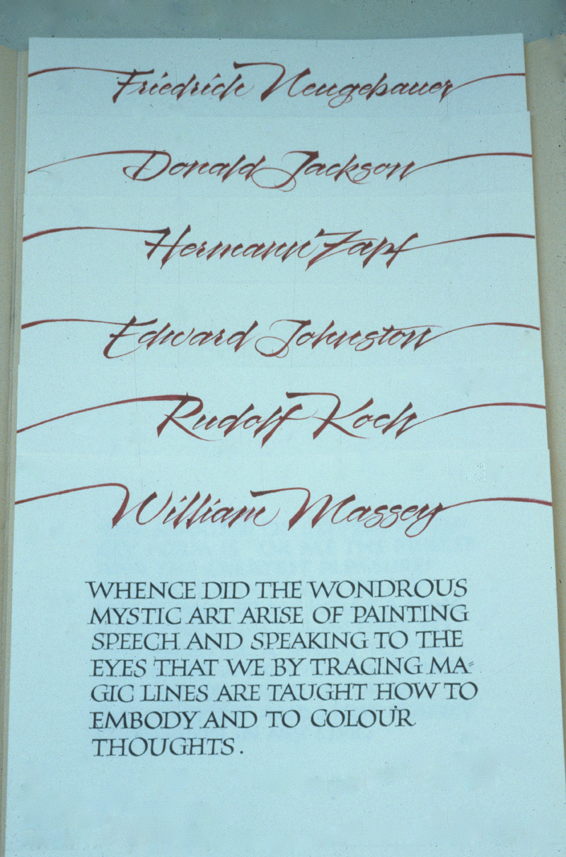
* * * * * * * * *
Week #52
This work was done by Jocelyn Curry in Seattle in 1988 for the session “Brush Lettering”, in 26 Seeds: a Year to Grow. In her own words:
|
"No Power on Earth" was done on a sheet of Sea Pen Press
handmade paper (14"x18" or so). |
I used gouache, a flat brush or maybe balsa wood, and a small B nib for the contrasting words. I found the text in Viktor Frankl's book Man's Search for Meaning which I found to be very moving. |
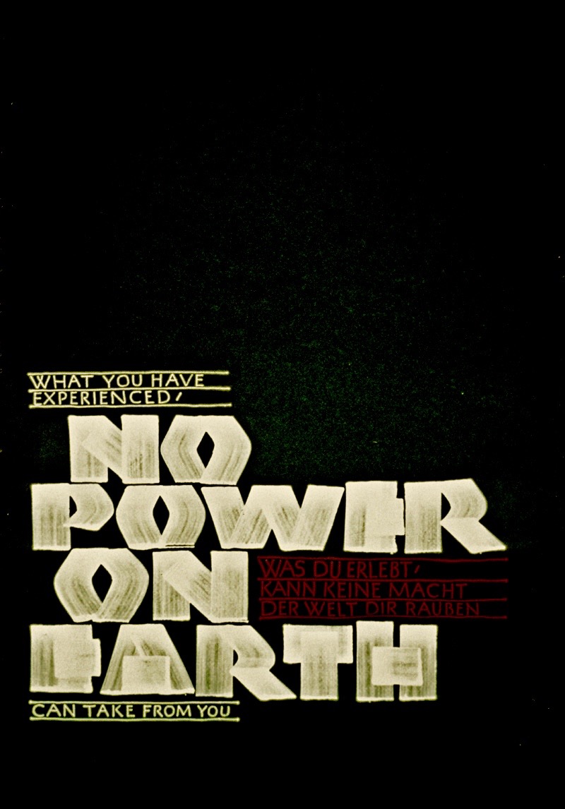
* * * * * * * *
|
The answers to most of your questions regarding “Primitive to
Modern” or “26 Seeds: a Year to Grow” can be found
through the main page at the web
www.reggieezell.com .
Click to see several short (free) Calligraphy videos:
http://www.youtube.com/reggieezell  Full length calligraphy videos by Reggie: www.reggieezell.com NEW for 2015: PORTFOLIOS of individual calligraphic styles and GUIDELINES FOR CALLIGRAPHY. Click here for descriptions. |
|
|