* * * * * * * * * *
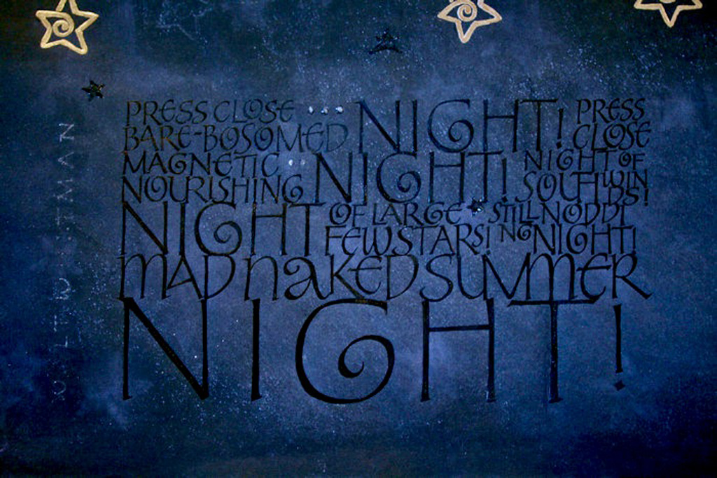
This work was done by Lydia Batten in Boston for the third session Roman Variations in 26 Seeds: a Year to Grow.
I set out to work on black paper, since I hadn't finished that part of the homework for the June session and still wanted to do it. After finding the Whitman quotation about summer for our Vermont Study group's July project, which coincidentally suited itself to black paper, I set out on my 'journey' to a finished piece. I started on white paper for practice and layout of built up Roman caps (based on what we had played with in the June session and what I was finally reconnecting with from previous studies), then moved to black Strathmore Artagain paper, and then finally, the Arches Cover black. Somewhere along the way I decided I wanted to write black on black to give emphasis to the stark yet rich description in Whitman's poetry. I settled on Ziller's Glossy Black (all the blacks I tried looked great wet, but then, sadly, dried flat...). Since part of working on black paper is to lay down a layer of white first and then apply colors atop it to make them 'pop', I wondered if this would also hold true for black???? Experiments and models followed--several of them! I started out on the Arches cover and immediately made a mistake--as usual! When I tried to scrape it, the paper looked so gouged, I scrapped it. And besides, it seemed to uniformly black. Hmmm, what else did I have for 'black' papers???? I began rifling through the drawer with my hoarded pile of paste papers from years gone by and found this sheet of black Ingres (I believe) paper on which I had attempted a 'night sky' motif. But honestly it was the most hideous paste paper in the collection--truly awful--what made me think that white and pink were good colors to use on black paper for a night sky???? And as I was preparing to put it away, I noticed quite by chance, some interesting bleed-throughs of the white color from that hideous front appearing on the back side. This bleed-through created the subtle changes in black that I had seen in my head, and even the star rubber stamp images I had pressed into the front faintly appeared on the back too, only much more subtly--I experienced a moment of serendipity! I had found my piece of paper! So, this piece measures 12 1/2" x 17", which, I believe, is a half sheet of Ingres paper (within the 11 x 17 I had originally intended for the project).
I spray fixed the back side of the paper, laid down the guide lines, mixed up the white gouache, took MANY deep breaths, then using my drafts as models, began lettering! I used Mitchell 4 nib for the smaller lettering, Mitchell 3 for the mid range size, and Mitchell 2 for the last word 'night', all the while combining both double stroke techniques and pressure to get the effects I wanted. It looked great. I sprayed again, then began applying the Ziller Glossy black with the same series of nibs and strokes (this was much more time intensive). I even surprised myself at how nice it looked. When I came back the next day I saw that the black had crackled... it looked like distressed leather and I thought it would add texture, until, after handling the piece and doing the gilded stars, I saw that the black crackles were flaking off here and there (I think I laid the gouache down too thick underneath). That's when, in frustration, I walked away from the project... and when I came back a few weeks later I did what I knew I had to do--spray fix and add another coat of black (another 2 1/2 hours of work). It paid off though. Then I added more stars, another gilded one using the dame Moon Gold, on top of two layers of Gesso and a coat of Instacoll (I had four and was promptly told it had to be an odd number--4 was the number of death in Japanese design...yikes), and some smaller ones that I applied using a combo of black gouache and WN Iridescent Medium mixed in on top of which I applied Liquitex Pour Acrylic Gloss Medium to give them some shine. The dots in the first lines I created with Golden Glass Bead Gel and a toothpick. Walt Whitman's name on the left side of the lettering was done with the same black/iridescent mix I had used on the stars with a Mitchell 5 nib. I opted to not use the Pour Acrylic on the name--it was too viscous to apply and I wanted the name to be more subtle.
What I learned: yes, white underneath does make the black pop on black paper (just use it a bit thinner); using spray fix during HUMID weather causes problems (if only I'd read the caution on the label!) which this time were to my benefit--the small random flecks of white here and there when I sprayed that second coat on a really hot, humid day created the night texture I was seeking but 'ruined' the pure blackness of the Arches Cover I also sprayed; perseverance pays off, especially in light of unexpected difficulties, and contributes to a very worthwhile learning experience!
Click for info/enroll: https://www.reggieezell.com and to sign-up

Click on http://www.reggieezell.com/thepick
You can enjoy all the Pics of the Week from 2009 through 2020,
archived on the home page of my website www.reggieezell.com
——————————————————————————
You can contact me directly: contactreggie@comcast.net
or 773-202-8321
__________________________________________
Click to see several short (free) Calligraphy videos:
http://www.youtube.com/reggieezell
____________________________________________________
Full length calligraphy VIDEOS and PORTFOLIOS by Reggie:
www.reggieezell.com


Follow me on Instagram and Facebook (@reggieezellcalligraphy)
https://instagram.com/reggieezellcalligraphy?igshid=148dz3cpok6
https://www.facebook.com/reggieezellcalligraphy/
UNSUBSCRIBE from these emails - click below.