* * * * * * * * * *
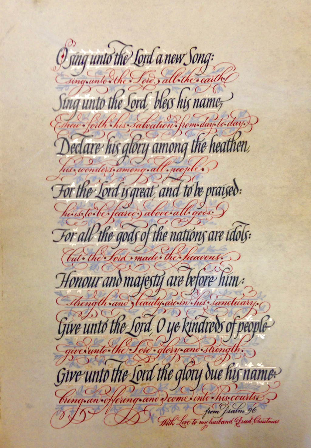
I had come back to this “design” several times over the past three or so years. My first version was on dark blue paper with pink ink. Quite interesting and horrible at the same time. There were sketches and color samplings in between. Then this. I picked the idea up again for Reggie’s class this past year when the homework was to be something italic. I found at my studio the former trials, all neatly together, and even a ready deer skin that I had obviously planned to use, already lined in pencil. Ready to go. So I decided to make learning day out of it.
This piece is mostly study in texture and color, layout came third and is rather basic if not a bit lopsided in alignment. My study was to use two slanted lettering styles together, each with a different slant, not often done, I guess. Have them play off each other at different angles. See if it’s any pleasant to the eye. I used rather
simple narrow italic and very flourished copperplate. It is obvious on that piece that my italic is a bit rusty. I don’t practice it every day as I do copperplate.
I also reversed the basic historic manuscript color rule. I did more important lettering in black and rather unimportant part in red.
Yet the combination is absolutely classic and almost glows on the skin, as anything would. The red script is just a lacy decoration for the serious black text. Play on contrast in more ways than one.
Then I went right on to my own “rule”, or character flaw, some would say. It is: more is more, more is never enough, if you can add, just add. (Actually I’m trying to make “Step away while you can!” my new rule. But here I obviously added this interesting light violet blue and rose god watercolor leafing to the design to literally fill all of the space.
And even though the interlinear space is nonexistent, totally squeezed out, the piece has overall light and airy feeling if you step back and look at it at the distance. The black letters seem to float atop of the lacy elements. Even though the Black was done first.
The metallic watercolor gives it just a bit of illuminating lift of subtle shimmer, as true gold gilding would have heavily overpowered the feel of the piece.
Materials used: deerskin parchment, black sumi ink, various gouaches, metallic watercolor, Mitchell nib, pointed pen, ruling pen.
a Year to Grow” is filled. However, if you send
me your name (not money) I will place you on a
waiting list. If any places open up I will immediately
contact you. Thank you. Reggie
Email me at contactreggie@comcast.net
Click for info/enroll: https://www.reggieezell.com and to sign-up

Click on http://www.reggieezell.com/thepick
You can enjoy all the Pics of the Week from 2009 through 2020,
archived on the home page of my website www.reggieezell.com
——————————————————————————
You can contact me directly: contactreggie@comcast.net
or 773-202-8321
__________________________________________
Click to see several short (free) Calligraphy videos:
http://www.youtube.com/reggieezell
____________________________________________________
Full length calligraphy VIDEOS and PORTFOLIOS by Reggie:
www.reggieezell.com


Follow me on Instagram and Facebook (@reggieezellcalligraphy)
https://instagram.com/reggieezellcalligraphy?igshid=148dz3cpok6
https://www.facebook.com/reggieezellcalligraphy/
UNSUBSCRIBE from these emails - click below.