December, the following year there was often an exhibit of works that had
been done in the course. There were many different venues. The quality and
quantity of the work from the classes in Seattle in 1988 and 1989 was of
such an extraordinary standard that the Frye Museum sponsored the
exhibit! One of the class members, Jocelyn Curry, was commissioned to do
the poster for the exhibit. As you will experience in viewing this video she
surpassed all expectations.
This work was done by Jocelyn Curry.
V
oicesWhile I'm sure I must have done some design sketches for this complex work, I don't remember the preliminary steps I took. In addition to the classic
calligraphic hands we studied, I knew I wanted to render the tools and materials we all used. I decided to do this by creating a trompe-l'oeil approach over a field of written words. I used the most legible hands for the poetry and passages that were drawn from those used in class exercises as well as from my own writings and some from other classmates, too. But I didn't want static, horizontal lines of text so I did the writing on an angle, penciling in the shapes of the tools and materials, the geranium and other objects prior to starting the background calligraphy.
On the original artwork there was no color used. We had the budget to do a spot color in addition to the black ink, and it seemed that a vermillion-like
color would be appropriate and would emphasize and punctuate the information as well as design elements.
I felt fully invested in creating the original artwork and really liked the neutrality of the simple palette of white and grays on the natural fiber handmade paper. Had I kept track of the hours spent on the artwork it would have been impressive, yet I enjoyed every hour and every design decision along the way. But I was excitedly anticipating the addition of the red which would come from the printing press, not by paint. But when the first posters came off the press, I was speechless with disappointment. It was a shock to see red on the low visual impact comprised of graphite drawings and gouache lettering. The upheaval of emotion I felt over seeing the red on the artwork was so difficult for me that when I drove into my garage after driving home from the printer with a sample of the poster in the back seat, I burst into tears.
Fast forward 35 years (now) and I like the addition of the red somewhat better than I did at that time. I think it was the best solution we could afford for
the purpose of the poster. I have enjoyed the "tour" of the poster that this video gives the viewer because it focuses on the many parts of the design upclose, and does so with caring and reverence. Thank you, Reggie.
________________________________________________________
www.saintjohnsbible.org
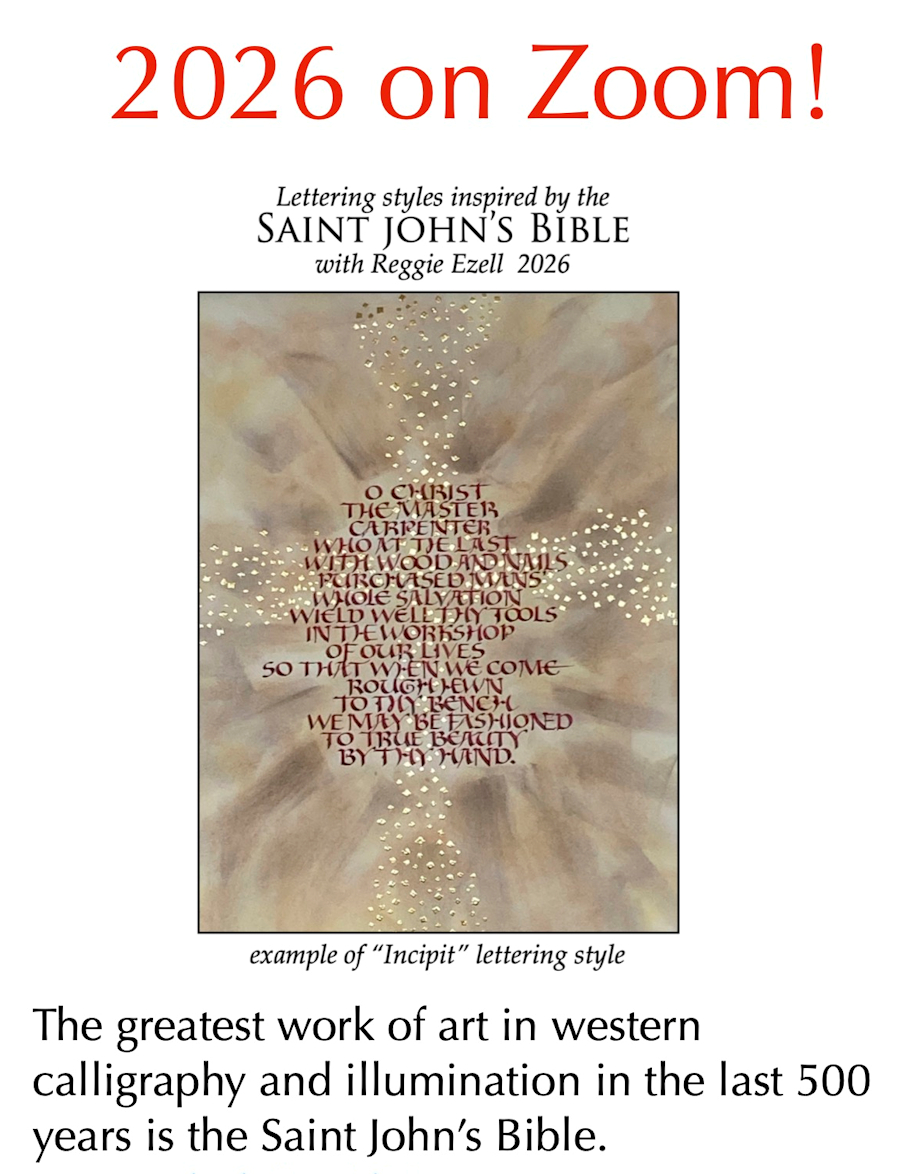
It is written out in essentially four different lettering styles:
incipt, standard bible script, free form capitals, and versals.
We will be analyzing, writing out, and creating finished
works inspired by and based on these.
Class dates:
Feb 14, March 14, April 18, May 9,
11 am to 5 pm Central time US & Canada
All the classes will be on Zoom. They will be recorded
and available to students for at least two month after the
class dates.
Cost: $300.00
To enroll click on:
Active
Link:
www.reggieezell.com
www.reggieezell.com
Click to see
several short (free) Calligraphy videos:
_____________________________________________
Follow
me on Instagram and Facebook
(@reggieezellcalligraphy)
https://instagram.com/reggieezellcalligraphy?igshid=148dz3cpok6
https://www.facebook.com/reggieezellcalligraphy/
If you wish to no longer receive these
mailings simply unsubscribe by clicking the
following link:
https://www.reggieezell.com/unsubscribe/index.html
UNSUBSCRIBE from these emails - click below.